- Digital and Design Strategy
- User Experience
- Web Design
- Updated 01/04/2022
50 Point Conversion Optimization Checklist
An optimized website can convert ten times as many users as a non-conversions optimized site. The amount of information on conversion optimization is vast, a quick Google search reveals over 578 million results on “Conversion Optimization.”
With so much information on the subject available, it can be difficult to identify where to start or what factors to evaluate. To simplify the process, we’ve put together seven overarching areas with fifty individual checkpoints that you can use to maximize the conversions on your website.
Let’s go over them.
1. Site Appears Professional and Trustworthy
It’s probably no surprise users are reluctant to purchase or provide their personal information to a site that doesn’t appear trustworthy. Perceived trust is a critical factor in conversion, the more trust you instill, the more conversions you’ll see. When evaluating this criteria, consider the following:
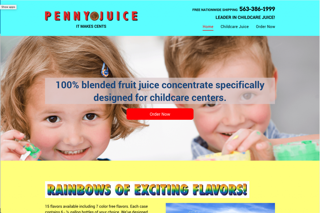
- Is the design familiar and consistent with modern design conventions?
- Does the design follow usability conventions in common contexts? e.g. Does the check-out process feel familiar?
- Is the design aesthetically pleasing? See the “Halo Effect“
- Does the site load in less than two seconds?
- Is the site free of spelling, grammatical and technical errors?
2. Design Minimizes Perceived Risk
Psychologically most of our actions are guided by thousand year old “software.” Our brain continuously and subconsciously evaluates if we’re in a fight or flight situation. Thousands of years ago, survival required readiness to escape or fight at any moment. Our mind applies this same survival lens to modern life– even though there is no lion attempting to make us it’s dinner.
We evaluate websites under the same lens. Does this site feel risky or safe? For conversions, this means identifying and minimizing all possible perceived risks.
Common examples include:
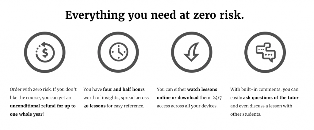
- Clearly label and explain your privacy policy or terms and conditions, especially at places where users will be giving up their personal information
- Clearly label and described your return policy and/or guarantee
- Clear description of the process to set expectations
- Clear indications of legitimacy, e.g. “This sounds like a real company I can trust.”
3. Site Minimizes Cognitive Load
Cognitive load is a fancy way of saying “effort from thinking.” Mental effort requires energy much like physical effort. Subconsciously we’re programmed to conserve energy, when the world was more dangerous you couldn’t afford to waste energy on non-essential tasks.
Because we’re always attempting to conserve energy, the more energy required to convert the less likely it is to happen. In short, if it gets too hard the user will leave instead of follow through.
You can minimize cognitive load by:
- Minimize the number of choices and fields (see Hick’s Law)
- Use an appropriate amount of whitespace (more whitespace feels open, less cluttered and requires less mental processing)
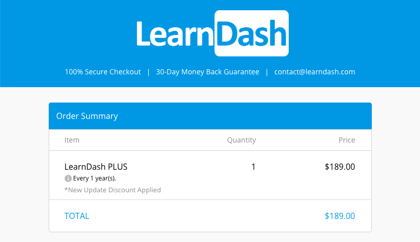
- Remove all unnecessary elements, especially on a conversion page (this is why you see check out pages with no navigation.)
- Clear information hierarchy
- Clearly indicated next steps (what do I do next?)
- Autocompletes and auto-fills are where possible
- Design, language, and labeling that mirrors the user’s mental models
4. Design and Content are Persuasive
Every element on the page should help convince the user you have what they’re looking for. Now, this doesn’t mean you should go “used car salesman,” rather use psychology to persuade a curious user into someone who desires your solution.
The exact language and imagery will different based on context, but the common considerations include:
- All steps of the conversion funnel are addressed (Attention, interest, desire and action.)
- Headlines and copy incorporate emotional power words
- Copy meets customers needs and describes a solution to their problem
- Pain points are identified and addressed to reduce buying resistance
- Features and benefits are clearly communicated
- Copy and design evoke desired emotional response
- Copy conveys a sense of urgency
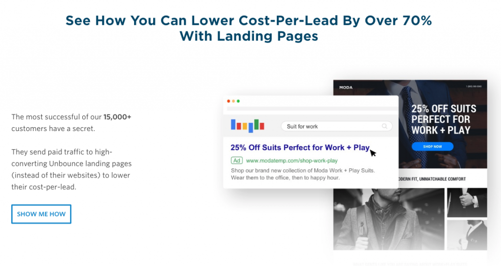
5. Design Facilitates Easy Decision Making
While we already discussed minimizing cogitative load, it’s worth addressing the decision making separately. Conversions happen when someone makes a decision – be it a decision to call you, make a purchase, join an e-mail list or even change their mind.
Making a decision is hard. Even small decisions use mental energy. The more decisions you make, the less endurance you have to make additional decisions (see ego depletion and cognitive dissonance theory.) To maximize conversions you must minimize decision making effort.
You can reduce effort by:
- Minimize options and choices (see Hick’s Law)
- Break complex decisions into smaller, manageable steps
- Answer common questions before or adjacent to a conversion step
- Minimize distractions and remove unnecessary elements
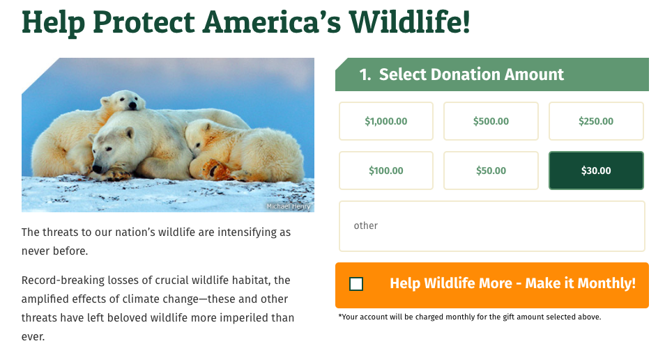
- Set Default options where possible
- Intelligent recommendations are made to eliminate unnecessary decisions
- Conversion points are effortlessly accessible at all times
- Facilitates fast decision making
6. Site Builds Authority and Credibility
We look at trust in two different layers. Your site needs to have a baseline level of professionalism to prevent the users from bouncing (addressed above.) Surpassing this threshold doesn’t mean your job is done. Just because your site has a minimum level of professionalism doesn’t mean users will part with personal information or money.
Maximizing conversions requires additional layers of trust, credibility and authority. Here are the ways you can do so:
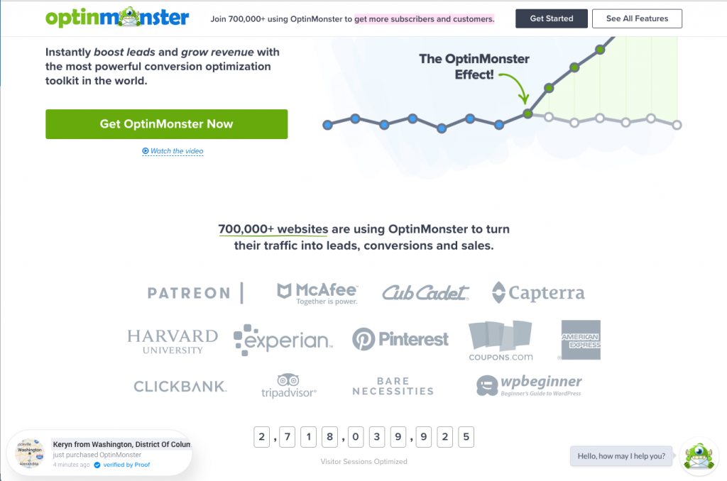
- Incorporate social validation (testimonials, reviews, etc…)
- Incorporate authority signals (associations, awards, accolades, etc…)
- Showcase previous successes through case studies, testimonials, etc…
- Provide quality content that educates prospects on the
subject matter - Provide easy to find contact information (e.g. you’re not hiding)
- Provide a clear privacy policy
- Provide clear terms and conditions
- Include ample “about us” content and company/organization background
- Communicate the process and manage
expectations
7. Calls to action are compelling and optimized
Calls to action are one of the most important factors for conversion. If you’re not familiar , a “call to action” is any place you ask the user to take action — ideally related to converting.
For example, “sign up to our newsletter” or “add to cart.”
This is a critical step, here the user will decide to convert or not. If calls to action are not compelling and obvious, users won’t convert. Here are the elements you should be evaluating:
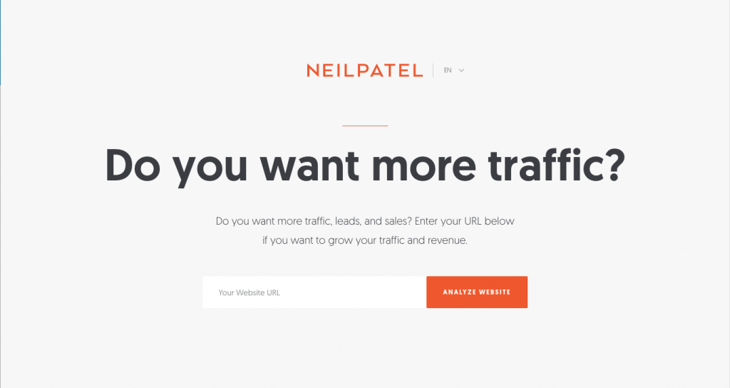
- Calls to action are clear, visible and present on important pages
Copy is compelling and encourages users to act- Copy incorporates loss aversion
- Calls to action offer future commitments (where possible) – e.g. $5 a month vs $60 a year
- All barriers to conversions have been previously identified and addressed
- Copy and design user priming to get users into the ideal mindset
- Pricing uses anchoring to encourage larger orders
- Calls to action clearly convey benefits worthy of conversion
- Calls to action incorporate contrast and imagery to command attention
Summary
Conversion optimization is both art and science. Even knowing what elements to consider, the best solution for your business, target audience and context might not be obvious.
This checklist is intended as a jumping off point, identifying what needs improvement. You still need to identify specific changes and test for performance gains.
Expect some changes to produce a dramatic impact, others will be negligible. If you adopt an iterative process where you’re continually learning from current behavior and testing new approaches there is potential to increase conversions two or even ten fold.