
- User Experience
- Web Design
- Updated 08/24/2024
10 Psychological Principles to Design With

Updated Aug 2024
Design is most effective when executed with knowledge of psychology. Knowing how people react to visual stimuli allows the crafting of an effective design; without psychology, you are guessing. Psychology is a vastly fluctuating and massive subject, but that doesn’t mean you need a Ph.D. to use it in your design. There are simple psychological principles you can use to improve the effectiveness of your design, even without knowing the theory behind it.
While there are numerous principles, this article will cover the following ten concepts that can be used to improve your designs’ aesthetic quality, usability, and comprehension. They are:
- Visceral Reactions
- Cost-Benefit Analysis
- Hick’s Law
- Gestalt Psychology
- Pattern Matching
- Facial Recognition
- Social Influence
- Progressive Disclosure
- Selective Disregard
- Dual-Coding Theory
1. Visceral Reactions
You may consider yourself self-aware and in complete control… well I’ve got news for you, you’re not. For centuries cognition has tricked humans into believing their actions are entirely thought-out and preplanned. Modern psychology says otherwise. Much of human behavior is still rooted and influenced by our “old brain,” the part of our mind controlling the survival instincts that kept our ancestors alive (Weinschenk, Nuero Web Design, 2009.) The old brain reacts much faster than conscious thought and is triggered anytime we’re exposed to a representation of food, shelter, danger or reproduction. These are called “visceral reactions” as they originate from the central nervous system (Norman, Emotional Design, 2005.)
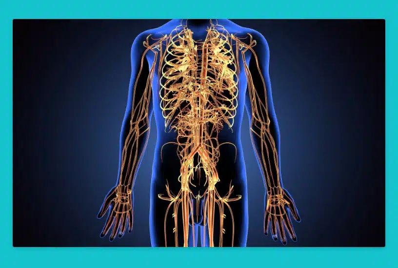
Old brain signals are faster than conscious thought and influence us without our knowledge (ie, visceral reactions are subconscious.) Ever love a design but have a hard time explaining why? Chances are you had a visceral response, and your old brain reacted to the visuals positively. Because visceral reactions are rooted in our genetic makeup, the responses are relatively consistent across all cultures, genders, and demographics. As a result, visceral design produces very predictable reactions.
Visceral reactions are responsible for our preference for beautiful websites. Aesthetically pleasing websites feel safer. Logically speaking, an unattractive website could be more valuable than an attractive one, but the attractive site triggers a feeling of trust and safety.
Visceral design is broad enough that it could (and probably will) have a blog post dedicated to it. To keep things short, I recommend using design elements representing old brain triggers. Specifically, use elements representing survival, threat, or reproductive opportunities (sex sells.) For example, you could use an aqua blue similar to fresh water, bright colors reminiscent of fruit, or a clean open design similar to a safe environment.
Learn more about the three levels of emotional design with this article.
2. Cost-Benefit Analysis
Related to visceral reactions is the cost-benefit principle, which surmises behavior is regulated by the perceived difficulty of a task concerning the perceived reward (The Journal of Neuroscience, 8 April 2009, 29(14): 4531-4541.) Basic human behavior can be summed up as opportunity seeking and threat avoidance. For example, your body is hardwired to seek energy-dense food, which is why calorie-dense foods like french fries and chocolate are more challenging to resist than lettuce. Because the fuel for energy (food) used to be scarce and took energy to obtain, we have developed an uncanny drive to conserve energy where possible. Our ancestors survived by limiting their energy usage to activities that would provide high benefits.
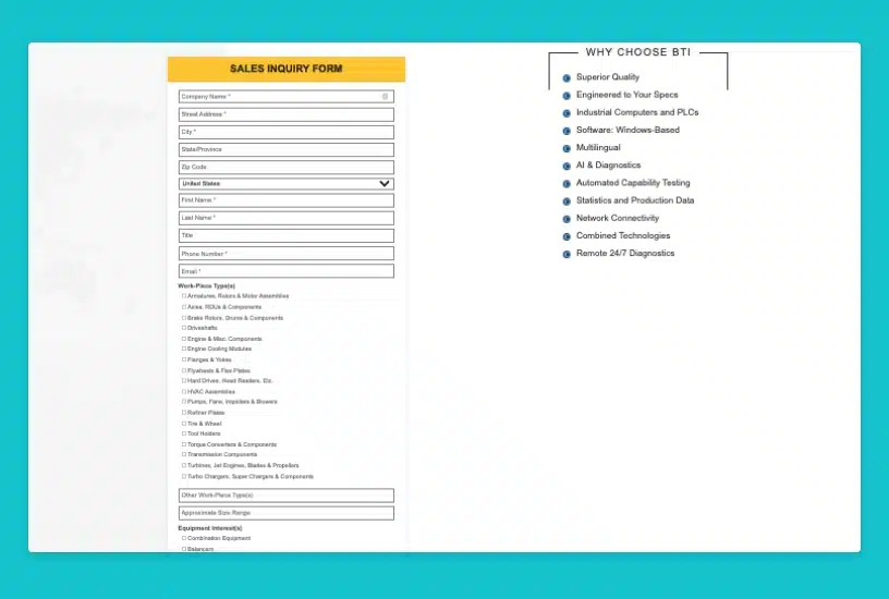
Despite the centuries of evolution between our nomadic relatives, we exhibit much of the same behavior. Subconsciously we are continuously evaluating the potential energy expenditure for a given activity and our perception of the reward of doing so. On the web, users are unlikely to complete a task unless the reward is of high value or if a task appears to have a high energy cost. The most common example of this is form fatigue. Long forms take a notable amount of energy to complete. Users who receive something valuable for filling out the form are more likely to complete the task. If the user wants information about a product or service, they will likely abandon the process and find a website that requires less effort.
Remember that energy expenditure is not limited to physical activity. Mental activity can be just as taxing (although in a different form.) Requiring frequent decisions, hunting, memorizing, learning, or contemplation will slowly drain the user’s energy until the cost of proceeding outweighs the benefit of completing their task.
3. Hick’s Law
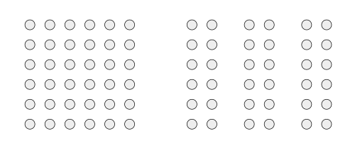
I originally covered Hick’s law in my post about 10 Laws to Design By. Simply put, the law states that the more options one is exposed to, the longer it takes to make a decision (Hick, On the rate of gain of information. Quarterly Journal of Experimental Psychology, 4:11-26, 1952.). Many claim they would like more options in a decision-making scenario, but their behavior illustrates the contrary. The difficulty of making a decision increases with additional possibilities, and in extreme cases, it’s so hard we’ll opt not to decide.
The classic example is a study that tested the effect of jam options at a busy grocery store. The study used a jam-tasting display with two configurations—one with 24 different jams and the other with only six. With the 24-option display, 60% of people passing tried the jam, and 3% purchased. With the six jam display, a lesser 40% of people stopped. Still, almost 30% purchased (Iyengar, Shena S. and Mark R. Lepper 2000. When choice is demotivating: Can one desire too much of a good thing?. Journal of Personality and Social Psychology.79:995-1006). When faced with 24 different jams, their nuances made it too difficult to select. With six jams, it was easy to determine which one tasted best, and more purchased as a result.
Hick’s Law directly relates to the cost-benefit principle. The more options a user must pick from — navigation, products or images to look at — the more energy it takes to decide. Eventually, the energy required to make the decision becomes so large the benefit of making it doesn’t seem worthwhile.
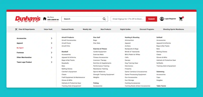
On the web, Hick’s Law tells us to keep options to a minimum. This applies to everything, including content on the page, navigational elements, images, etc… Anything on the page gives the user another option of something to read, focus on, or click. Removing everything unessential reduces the number of unnecessary options and makes user decisions easier.
4. Gestalt Psychology
It only takes a little exploration into cognitive psychology to smash the illusion that we have a firm grasp of the world around us. It seems our brain loves to take shortcuts and make assumptions while reassuring ourselves that everything has been well thought out. The most nefarious of examples are the Gestalt Principles. Developed by german psychologists in the 1920s, the principles describe how our brain assumes unification or relatedness to visuals based on proximity and whitespace. For example, visuals in close proximity are perceived as related when not necessarily the case. Another example is similarity, where elements that look similar are considered related and elements that look different are unrelated (Humphrey, G. (1924). The psychology of the gestalt. Journal of Educational Psychology.)
Beyond proximity and grouping, the principles include similarity, continuance, and figure-ground perceptions. Gestalt principles are complex enough that I could write a post about them specifically (and probably will), so if you want to know more, it’s time to do some research. Otherwise, people will make assumptions about what they see and find meaning in visuals that might not be there. Ultimately, it’s critical to be intentional about what appears on the page and how it’s treated.
5. Pattern Matching
Pattern matching (or pattern recognition) is how we process everything we see, from people’s faces to the written word. When visual stimuli enter our eyes it immediately starts a chain reaction in the brain. We subconsciously hunt hunting for anything similar to the current stimuli that we have experienced in the past. If the stimuli match a preexisting pattern, we recognize what we see. Otherwise, the stimuli are perceived as being new. This process goes beyond recognizing forms and colors; it also triggers any cognitive associations with the matched pattern.

Look to the figure on the right; how do you know the silhouette is a dancer? Despite the lack of detail, the shape fits a pattern matching dancers you have previously experienced. Now reflect on your thought process upon seeing the image, did your mind wander to previous experiences, encounters, and feelings surrounding dancers? This is the pattern-matching system at work.
Pattern matching also influences how familiar something feels. The more you see something, the more patterns you have stored and easier related patterns are to identify. When patterns are easily matched, they feel familiar or “normal.” Unmatchable or difficult-to-match stimuli feel foreign and can even be unsettling. While drastically different, these new visuals are more memorable, at least at first. Like anything else, repeated exposure dulls the “shock” value of the stimuli, eventually making it feel ordinary.
6. Facial Recognition
Facial recognition is one of the most active forms of pattern matching. No pattern that we recognize has more impact than the human face. We are a socially driven race, as demonstrated by the rise of social networks and the role of social organization in human evolution. But most interactions were face-to-face before computers, smartphones, and text messages.
Historically, interactions with other humans were high risk. We’ve developed a highly sensitive ability to analyze faces to determine if someone is safe or dangerous. While you can attempt to control your expressions, most humans express micro facial expressions that we subconsciously identify. As a result, we’re naturally drawn to human (and animal) faces.
This phenomenon is aptly demonstrated by a study where participant’s eyes were typically drawn to unhappy faces in a sea of people (Facial Expressions of Emotion: Are Angry Faces Detected More Efficiently? Cogn Emot. 2000 January 1; 14(1): 61–92.).

Related to web design, faces can draw attention or set a mood. People will naturally identify with images of people over objects, landscapes, or abstractions ( Neilsen, Eye Tracking Usability, 2010.) Furthermore, the expression of the depicted person will influence how the user feels about the website. Happy and smiling will convey a sense of welcome, whereas a picture of sad, starving children will convey sorrow and desperation. The more authentic the photo, the more effective it will be… this means dropping the stock photography and being intentional about what photos you take. Users will pick up on the emotions of those depicted, so avoid photos of people looking uncomfortable at all costs. This requires effort, as the average person feels self-conscious when being photographed.
7. Social Influence
The influence of others extends far beyond facial expressions, there are specific actions that have predictable influences on human behavior. There was a time when being able to work together provided more significant avoidance of threats and more opportunities for food and reproduction. As a result, the basic “systems” of human interaction still exist in our DNA. In the article Persuasion in Design, author UX Designer Elisa del Galdo references the six universal principles of social influence. These principles are hardwired into the human psyche, and developed as a necessity for human survival.
As described in her article, the six principles are:
- Reciprocation: We are compelled to return favors, often in greater value than the original.
- Authority: We trust experts and those of high status or power.
- Commitment/Consistency: We want to act consistently with our commitments and values.
- Scarcity: The less available a resource, the more we want it.
- Liking: The more we like people, the more we want to say yes to them.
- Social Proof: We look to others to guide our behavior.
Smart designers can use these concepts to influence users toward desired actions. Giving away free information or tools can be used to persuade users to volunteer their contact information via the reciprocity principle. Signs of authority or expertise can increase perceived trust. Low inventory numbers might indicate scarcity and move someone to purchase sooner than they would otherwise. Identifying powerful ways to design using social influence doesn’t take too much creativity.
8. Selective Disregard & Change Blindness
You see and notice everything that happens around you, right? Well, you might be surprised. Our brain does a surprisingly good job of tricking us into thinking we absorb everything we see, but we often miss things that happen right before us. This phenomenon is called Selective Disregard and happens out of necessity as it’s impractical (and arguably impossible) to process every visual in our peripheral vision (Nielsen, Eye Tracking Usability, 2010.)
Just walking down the street, you are exposed to millions of visuals that could demand your attention, but unless necessary, your mind filters them out as if you never saw them. If you are looking for “Main Street,” any street sign will catch your attention and be processed. If you know where you are going, the signs will enter your field of vision only to be ignored because they are unnecessary. This phenomenon is known as selective disregard, in which your mind proactively forgets anything irrelevant.
This most apparent example of selective disregard is banner blindness. Users have become so accustomed to ignoring online advertising that they can’t tell you if the website they surfed five minutes prior had ads. Selective disregard applies to more than just advertising, users often gloss over anything that doesn’t appear related to their task. Sometimes users will miss critical elements because designers have strayed from convention. Because the search form doesn’t look like a search form, the mind ignores it and continues. All elements should be clearly labeled for usability and follow conventions matching the user’s expectations.
The more extreme brand of selective disregard is change blindness. Change blindness occurs when the state causes blindness to significant and noticeable changes. As discussed regarding the cost-benefit principle, our mind does all it can to conserve energy. One way it conserves energy is by assuming nothing has changed unless there is a clear indicator otherwise. There are a few amusing and exciting demonstrations of Change Blindness on YouTube.
In the javascript-laden, non-refreshing web of today, change blindness is a thorn in any designer’s side. If something changes on your page, you better make it obvious, less you brave the scorn of frustrated users. Always remember that small loading GIFs and flashing content might not be enough and make changes painfully obvious when in doubt.
9. Progress Disclosure
Ever get the feeling that learning increases in difficulty with age? Think again; learning is complex regardless of age. Storing information is a high-energy, high-focus process. The process of converting stimuli into stored memories is complex and influenced by hundreds of factors. You don’t need to understand learning theory to be a great designer fully, you need to know that to conserve energy, people prefer to recognize information rather than store and recall it (ie, learn it.)
Furthermore, when learning is required, most people have a limit to the information that can be absorbed in one sitting. If you overwhelm someone with too much information, their eyes will likely glaze over, and their attention will divert elsewhere. Remember that sinking feeling in your stomach when you visit a website with a seemingly endless page length? That’s the overwhelm I speak of.
This doesn’t mean you should opt to reduce the amount of information on a website; after all… content is king, right? Instead, you should present information so that it’s easier to absorb. Progressive disclosure is a presentational method that does just that. It’s a technique where information is given to the user in small bites with the option to learn (or disclose) more if desired. This prevents information overwhelm and ultimately leads to more effective websites.
Some argue against more clicks citing the infamous “Three clicks rule,” but pay no mind as Neilsen debunked it ages ago (Neilsen, Prioritizing Web Usability, 2006.) Instead, focus on small digestible chunks of content with a strong scent towards more information (where necessary.)
10. Dual-Coding Theory
Instructional design is rarely mentioned in web design discussions despite its overarching relevance. With the rise of web applications, web designers often find themselves as stand-in instructional designers. But even outside of direct instructional design, there is value to be learned from the study. One of the most relevant (in my opinion) is Dual-Coding Theory. Published in 1986, the theory explores the relationship between memory and learning through verbal and non-verbal communication. The theory stipulates two cognitive systems, one that deals with verbal stimuli (words, spoken language, etc…) and another for processing imagery.
The key takeaway is that people learn and remember best when presented with both forms of stimuli, verbal and image-based. As explored in a previous post on mental processing, most people can comprehend image-based messaging faster than verbal. The most significant retention level is achieved when imagery and oral communication combine. In today’s text-heavy web, Dual-Coding means a shift in design methodology. Rather than simply designing the layout and “framing” the content, designers need to start contributing to the design of the content itself. Whether you include diagrams, videos, infographics, or relevant photos, clients need assistance in providing the second content channel.
Design is 90% Psychology
If your design is intended to be used by other humans, the best designs will be created by understanding the people you’re designing for. Human behavior is not unique; we all have similar primal, sub, and semi-conscious wiring that influences how we interpret and react to the world around us. You can improve the effectiveness of your designs by leveraging proven psychological principles to achieve your desired outcome.
To learn more, check out our essential guide to psychology in web design.
We’ve successfully implemented these principles in many client marketing campaigns and websites. 3.7 Designs is a B2B digital marketing agency that can help you incorporate design psychology into your digital marketing or website redesign. Contact us for a free strategy session.
FREE TOOL: OPTIMIZE YOUR SITE
Grade Your Entire Website in Seconds
Submit your website link and get a detailed report on how you can improve page performance, SEO optimization, mobile usability, and more.