
- Digital and Design Strategy
- User Experience
- Web Design
- Published 12/18/2020
Reducing Bounce Rates Through Design
Your website won’t be successful if users leave the site shortly after they arrive. Bounce Rate is the measurement of what percentage of users leave your site without navigating to another page. It not only informs you of how engaging your site is, but it can also significantly impact search engine rankings as well.
Reducing bounce rate all comes down to time, and you don’t have much time to work with. On average, you only have about 15 – 30 seconds to convince the user to stick around.
In this article we’ll be looking at reducing bounce rate through the stages of the user journey.
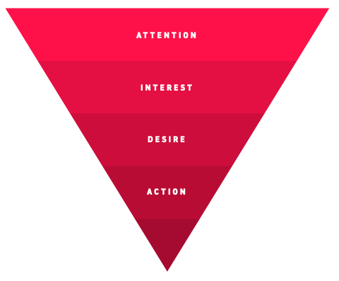
Bounce rate is influenced by the first two stages, Attention and Interest. Let’s dig in.
Capture Attention
Attention on the internet if fleeting. Users have countless distractions and little time. Keeping users on your site means capturing enough of their attention that they overcome the impulse to click back and try another option.
From a timing perspective, you need to capture the users attention in the first 5 – 10 seconds. This can be done via:
- Minimizing delays
- Clear messaging
- The halo effect
Let’s discuss each one in more detail:
Minimizing delays
If you only have 5 – 10 seconds to capture a users attention you don’t want to spend half that time waiting for the page to fully load.
This could mean some design compromises like reducing or dropping that large hero banner at mobile sizes, or it could mean prioritizing the delivery of assets like text first so meaningful content is visible sooner rather than later.
Clear Messaging
Landing on a new website is actually a pretty jarring experience. When the page first loads you don’t know what to expect, if this is the right site to be looking at, or how to use it.
One of the first things users want is reassurance they’re headed in the right direction. Meaning, will this site help them accomplish their job to be done?
To accomplish this you need to clearly answer these questions at the top of the page:
- What’s this website about?
- Who is this website for?
- Why should I care?
Generally, you’d answer these questions in your website’s “hero area” or the large initial section at the top of the screen with a primary headline and supportive copy. Your brand could also have a tagline that helps clarify these questions.
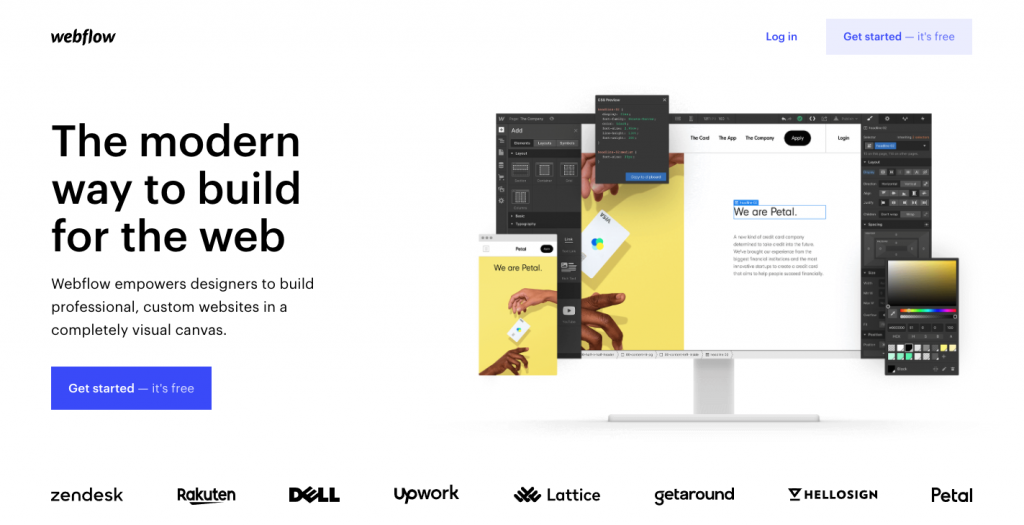
Simple, concise communication is generally more effective. “We design productive workspaces for small businesses” is easy to understand, where “Providing strategic productivity-enhancing collaborating environments for forward-thinking innovators” is really hard to deduce.
Because of dual coding theory, imagery that reinforces the message will reduce the effort required further.
The Halo Effect
Humans are interpretive machines. The moment we receive visual stimuli our brain reflexively starts a chain reaction of associations and assumptions based on what we see. Color schemes, images, typography, messaging, all instantly give us a subconscious feeling about the website.
The feeling will include assumptions about who is behind the site, is it trustworthy, what’s the “personality” of the site/brand, etc…
If those feelings are positive and align with the user’s expectations about the type of site they need, you’re more likely to capture their attention. Additionally, a positive first impression will influence the remainder of their visit and even subsequent visits. This is a phenomenon known as “The Halo Effect.”
If you’ve addressed these three elements well you’ll have another 10 – 15 seconds to build interest and encourage their next action.
Build Interest
At this point, we’ve only prevented the user from leaving the website immediately. We still need to get them interested enough to spend a full two or three minutes on the site.
Luckily, there is a simple framework you can use to do so.
- Convey you understand their problem
- (Briefly) describe your solution
- Suggest a next step
Let’s step through each step in more detail.
Convey you understand their problem
Humans love to be heard and understood. Spend a moment to think of a time where someone knew exactly what you were going through. Didn’t it feel good just to have someone understand? Didn’t it make you want to talk with them about it?
That’s what you want your website to do, clearly articulate the problem your users are trying to solve. This requires actually knowing what these problems are of course. If you’re unsure, we recommend creating user models to find out.
(Briefly) describe your solution
Once you’ve described the users problem they’ll want to know how you can help them with it. Here you want to introduce the ways you can solve their problem.
This can be accomplished by describing corresponding products or services or could be more general if your target audience doesn’t fit into neat little buckets.
This section should be brief as you don’t want to overwhelm the user, remember at this stage they’ve maybe spent 10 – 20 seconds on the site and haven’t decided to continue their journey. You want to build their interest in a particular pathway, not convert them on the spot.
Once you’ve described your solution it’s time to suggest a next step (or action.)
Suggest Next Actions
As bounce rate is measured by how many people leave a site without visiting a second page, our ultimate goal is to encourage users to click on another link.
To you, the next steps on your landing page might be obvious. A layman who knows nothing about your organization will have no idea.
When faced with uncertainty some users will leave a site rather than make a decision. By making the next step obvious, you reduce uncertainty.
Technically we’re talking about including “calls to action,” however in this case they’re not intended to get users to convert (nor should they.) Instead, want users to continue their journey.
These micro-calls to action can be a simple “Learn More” button, although benefit-driven labels like “Learn how we can help you” will perform better.
While we are discussing these actions at the end of the interest phase it’s worth including them in every section we’ve discussed. Some users will need less convincing before they’re interested and you don’t want them to have to think about what to do next.
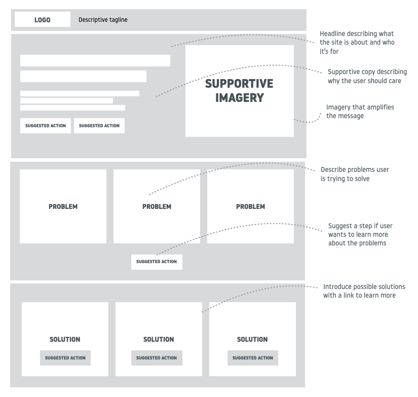
What this might look like
See the block frame below to get an idea of how these concepts might work with a typical website layout.
Remember, reducing bounce rate is about capturing attention and building interest within the first 15 – 30 seconds after landing on your site. This is done by validating the user has arrived on the right place, validating you understand their problems, and demonstrating you can help solve them. Once you’ve perked their interest you provide an obvious next step to keep them on your site and heading towards conversion.