
- Web Design
- Published 11/04/2019
Why Your Website Doesn’t Generate Leads (and how to fix it)
You’re homepage is beautifully designed. It’s clear all the ways you can help. You’ve articulated why someone should hire you. You’ve validated your claims through case studies and testimonials, yet…
You’re not getting the volume of leads you need.
Sure they trickle in every month, but it’s not enough to grow your business.
What are you doing wrong? Where are the leads?
You’re not alone. A vast majority of websites underperform in this arena.
While conversion optimization is a large practice and small changes can have significant impact, there are three core areas causing underperformance:
- Conversions are too far down the sales funnel
- Lack of psychological connection
- Failing to differentiate
Let’s discuss them.
Conversions are too far down the sales funnel
Would you buy your new home from a website?
This is a common mistake. The conversion points are too far reaching for the context of the buyers journey. You wouldn’t buy a new house from a website, but you’d certainly schedule a visit.
We work with a consulting company that used to generate less than ten leads per month from their website. Leads were so infrequent, they didn’t consider their website a lead generation tool.
In discussing the sales process with our client, we learned the average sale takes eight months to a year before closing. This was a critical detail.
A year long pipeline means that site visitors are often in an early research phase. It’s rare they’re ready to start a conversation and when they are, they’ve already determined which companies they’ll contact.
The conversion point on their website was too far down the sales funnel. When someone was ready to request a call they’d typically forgotten about our client.
We created new conversion points targeted around the research phases of the buyers journey. This allowed our client to get prospects into the funnel at an early stage and nurture them along the process until they were ready for a more serious buying discussion.
In this case, the result was a 1500% increase in leads generated through the website.
There are six stages in the sales funnel:
- Awareness
- Interest
- Consideration
- Intent
- Evaluation
- Purchase
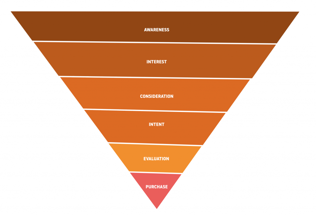
If you target a stage that’s beyond the target audiences level of comfort you’ll see extremely poor results. In the case of our client above, they were targeting the “evaluation” phase when their audience was landing on their site in the “interest” and “consideration” phases.
Typically you’ll want several conversion points, ensuring there is a comfortable way for users to engage regardless of what stage they’re at in the funnel.
This isn’t just an issue for high priced goods and services. Sara Dunn from 11Web previously spoke about a gym client they helped who was having poor results from their website.
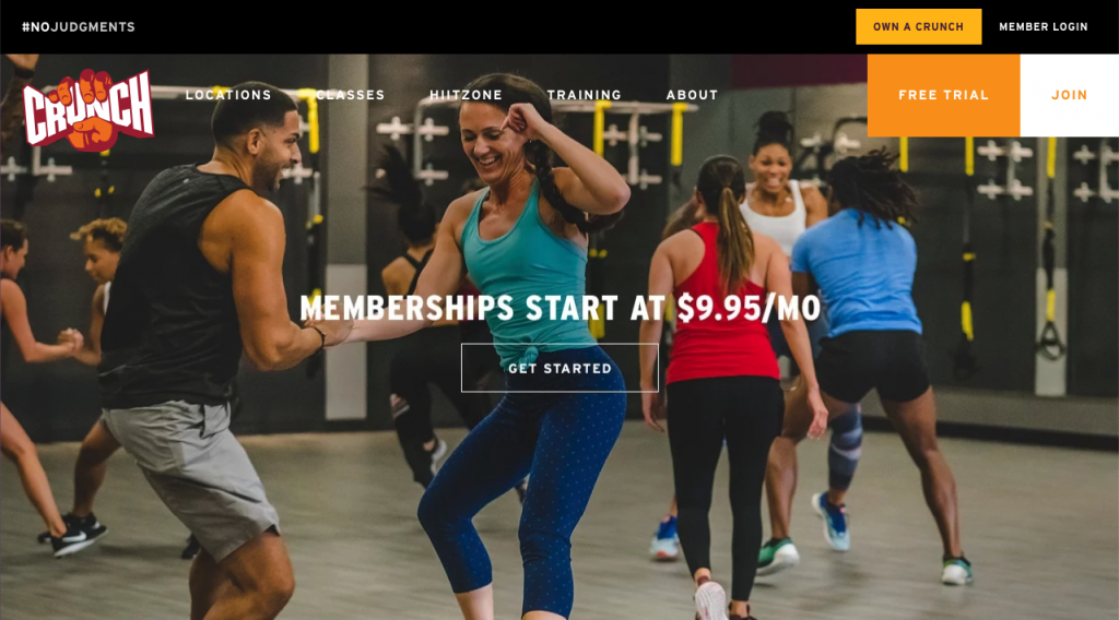
Originally, the primary call to action was “Sign up for a Membership.” Turns out, most people are unwilling to sign up for a gym membership from a website. Once they changed the call to action to “Schedule a Tour” the leads and memberships increased.
Design lacks psychological connection
How many websites do you visit per day? Per week? Per month? Per year?
How many websites truly speak to you? From the moment you arrive on the tone, language, content, and visuals match exactly what you were looking for?
Probably not many. When it does happen, I bet you’re hooked.
This is what it feels like when you use design psychology. With design psychology you speak directly to the target audience and as a result, they feel heard. When they feel heard, they trust, and when they trust they convert at a higher rate and value.
There are two critical components to making a psychological connection.
- Understanding who you’re targeting
- Using the appropriate persuasive design patterns
Understanding who you’re targeting
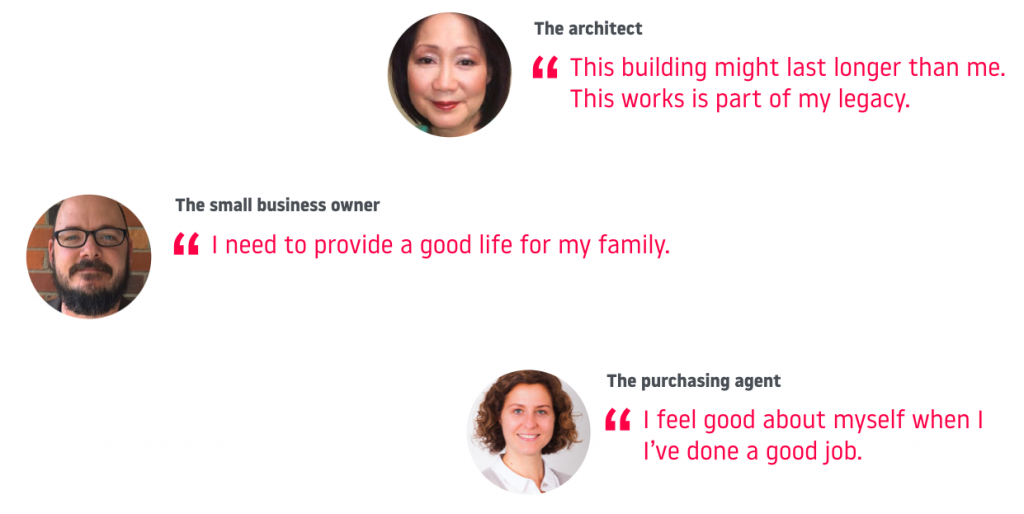
You can’t speak to your target audience if you don’t know who they are. Yet, so often people fail to create a referenceable audience model to guide the design of their site. Specifically, I’m talking about personas and customer journey maps.
Personas are most valuable when you focus on psychographics over demographics. What do these people care about? What motivates them? What’s their job to be done?
Once you understand the psychology of who you’re targeting, you can identify the right psychological devices to incorporate into your design.
Utilizing persuasive design patterns
There are over fifty design psychology techniques that can be used to motivate your target audience towards conversion. Which of the fifty you want to use heavily depends on who you’re targeting and the context they visit your website in.
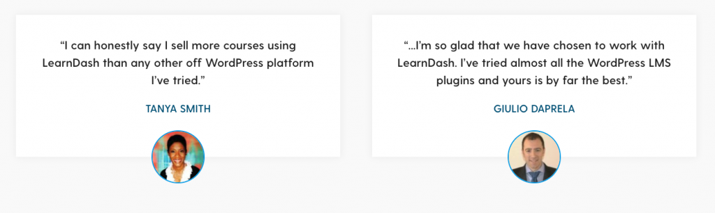
Some patterns are fairly universal, like “Social Proof.” Most people respond to evidence of popularity. If other people like it, it must be good. Generally we’re also conditioned to trust companies that have signs of authority.
However there are many powerful patterns that only work in the right situation. Loss aversion for example, can be a highly motivating technique… but when used in the wrong situation, will feel manipulative.

The better you understand your personas the more clear it will become what design patterns will be most effective and where to deploy them. It pays to invest more time and resources during the persona development process.
Failing to differentiate
On average users will visit three websites before making a buying decision. The number of websites visited goes up as the price of the sale. If you’re selling a high priced service or good, you can expect users to visit six, ten, or even more of your competitors websites as part of their buyers journey.
This process is cumbersome on the buyer as well. It takes effort to wade through five or more websites and identify who to reach out to and who to pass. As a result, buyers typically evaluate on the most obvious differences and narrow their search to the top two or three options.
This means if it’s not immediately apparent how you’re offerings a different you’re likely to be skipped over.
This all comes down to positioning.
Take a step back and perform a competitive audit on your business. How are you different than your competitors? How can you clearly articulate the value you provide to your ideal customer that the five to ten competitors can’t?
If you figure this out, you’ll see a dramatic increase in leads.
Summary
There are hundreds of factors that influence how many leads your site generates. Conversion rate optimization can be a never ending practice where you test changes both small and large to see what results in a positive change.
With any on-going optimization there is always the question of “Where do I start?” The three areas I’ve outlined above are generally the most impactful reasons sites underperform. Address these key areas first and get more granular from there.