
- Digital and Design Strategy
- User Experience
- Web Design
- Updated 09/19/2024
Hooked: How to engage your website audience in one second or less
You have less than one second to make the right impression.
Almost immediately after landing on your website users will make an uninformed, mostly subconscious judgment about what type of organization they’re interacting with.
This initial judgment will largely be influenced by layout, design, and visual tone. It will not only influence the rest of their experience on the site, but also future visits and overall perception of your organization as a whole. This is a phenomenon called “The Halo Effect.”
The goal here isn’t to have an attractive design, rather an attractive design that communicates the right message.
Visual design is communication. Colors, whitespace, typography, layout, and imagery all tell the viewer a story about you and in this first second the user interprets these visual cues and tells themselves a story about who you are.
When design tells the wrong story it creates confusion, apprehension, and even distrust. When it tells the right story it builds trust, momentum, and resonance.
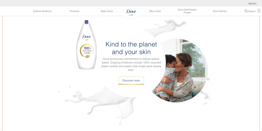
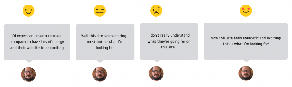
In more detail, users land on your site with a range of expectations. With a financial advisor, they might expect visual language that’s serious, organized, and clean. With educational toy manufactures the expectation might be bright, energetic, and playful.
If the visual language doesn’t meet their expectations, their entire experience and perception is negatively impacted. Simply put, the user thinks “This isn’t the organization I’m looking for.”
Identifying the right message and translating it into your design is critical, but how do you go about doing that?
It’s a two-part process. First, you need to identify the right message and then you can use design archetypes to translate it into a visual story.
Identifying the right message
Clearly communicating the wrong message is equally as bad as poorly communicating the right message. Therefore the first and most important step is to identify what you’re trying to say.
You want a message that accurately represents your brand but also deeply resonates with your target audience. Identifying what you want to say is easy. Identifying what users want to hear takes more effort.
These critical insights are uncovered through design research. When executed properly you develop an in-depth understanding of your target audiences’ underlying psychology.
Specifically, you’ll understand:
- What are they’re known and unknown challenges
- What’s motivating them
- What they are concerned about
- What they are excited about
- What triggers they respond to
- What’s their emotional state
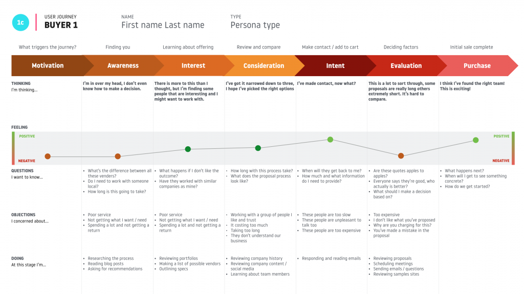
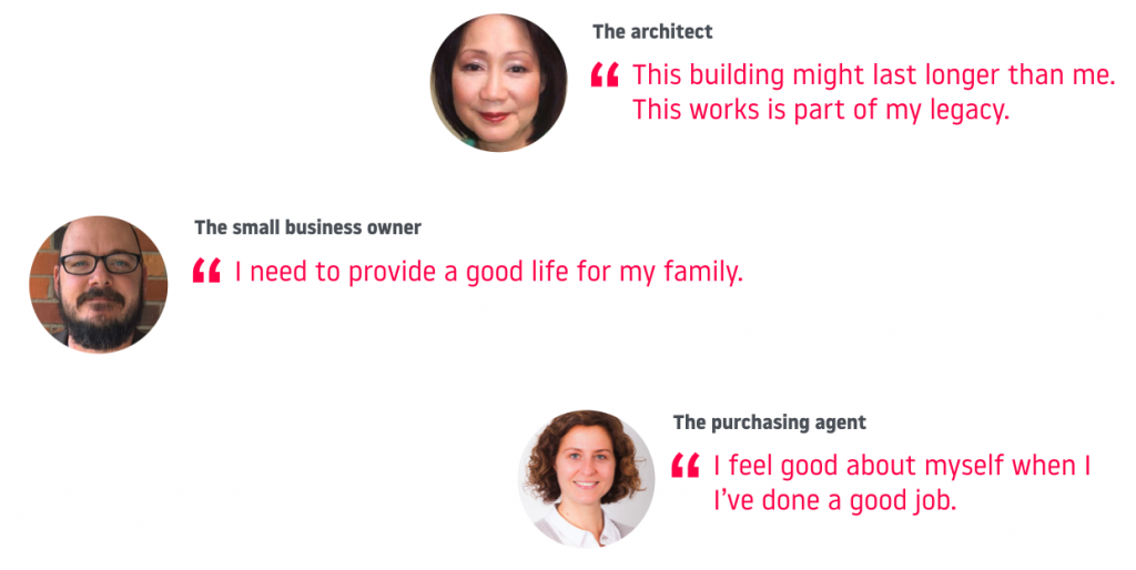
Insights gained through design research need to be stored in an actionable way. There are a variety of techniques at your disposal, we often create user persons, jobs to be done statements, user journey maps, and emotional motivator maps.
The process of creating these assets will uncover patterns and clues as to what the users are looking to hear and thus what story the visuals need to tell.
You’ll end up with a hypothesis that you can then valid through user testing. Once you’ve identified the message that best resonates with your target audience you can move on to translating it into a visual story.
Translating your message into a visual story
You face two significant challenges in crafting the right visual language. First, how do you turn an abstract written idea into shape, layout, color, and typography? Second, design tastes are subjective. You and I will interpret visuals differently.
The solution is using design archetypes.
Archetypes are a recurrent symbol or motif in literature, art, history, or mythology. Psychologist Carl Jung identified universal, archaic patterns and images that are instinctively understood. Jung classified these patterns as archetypal figures, such as the mother, sage, hero, trickster, etc…
Simply put, these are characters or personalities that humans subconsciously and intuitively understand. They are part of our reptilian psychology.
By aligning our visual language with an archetypal figure we can ensure we’re communicating the ideal traits in a way that our target audience will accurately understand.
The archetype you select is determined by overlapping your brand attributes (mission, tone, differentiators) and the psychology of your target audiences (identified earlier.)
For a summary of all the brand archetypes see our blog post here.
Hooked: The result
Visual design, when executed well, has ample psychological influence.
Using a design archetype makes it easier for users to make their initial assessment. Conserving mental energy feels good. If nothing else, the user will be in a slightly better mindset moving forward.
More valuable is the release of dopamine. Dopamine is a naturally occurring neurotransmitter found in the brain that when released creates a feeling of pleasure and satisfaction.
When we browse the web we have an expectation for each interaction, no matter how small. Every click, every glance, every scroll… we expect a specific outcome for each. When our expectation is met, dopamine is released which makes us feel happy and safe.
So when the initial design meets our expectations, our brain rewards us for a job well done.
“You’ve found the website you’ve been looking for! Have some dopamine!”
Dopamine gives us a spark of excitement and our initial judgment is a positive one. While short lived, our positive feelings extend throughout our current and future experiences on the site, and cause us to think favorably of the underlying brand as well (The Halo Effect.)
We’ve seen and validated these concepts first hand.
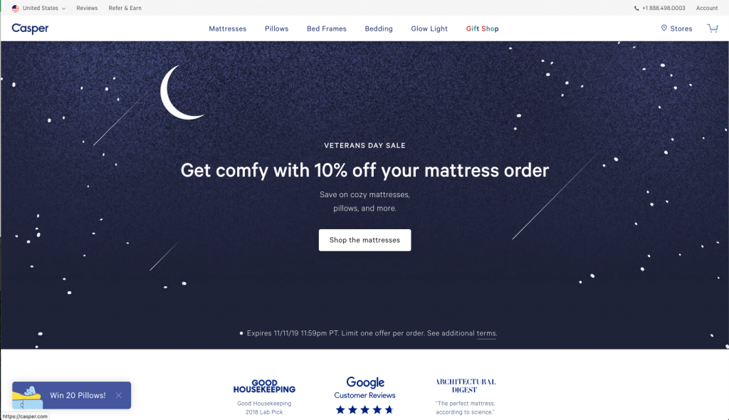
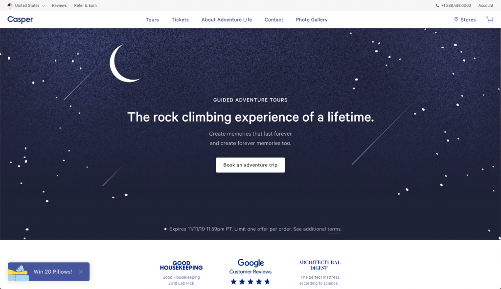
We tested the hero image of a client website. Nothing else changed, even the messaging stayed the same. We found the image that told the right story resulted in 43% longer average time on site and 26% more pages consumed per visit.