- Digital and Design Strategy
- User Experience
- Web Design
- Updated 08/19/2025
10 Website Optimization Tips for 2025
Summarize this post
It’s a new year, a time of reflection and goal setting. Whether you subscribe to new years resolutions or not, 2020 should be the year you stop neglecting your website.
Regardless of how performant your website currently is, it can be do better. You might already know this. You probably realize you should dedicate more attention to your website… but it’s hard to make progress if you don’t know where to start?
We’ve compiled ten ways you can get more from your website in 2020. I’m confident you’ll find at least a couple that you can take action on that will move the needle.
1. Level up your website analytics
You’re probably tracking user behavior on your website, most likely using Google Analytics. This is an important first step, but are you really squeezing every possible insight out of Analytics? Can you learn more about what’s working and what’s not?
Let’s talk about some tracking capabilities within Google Analytics that you need to be using in 2020.
Goal and event tracking
If you’re using Google Analytics and you haven’t setup goal tracking, this should be first on your list. If you’re not measuring what’s working then every marketing effort or change on your site is an uninformed guess.
Goal tracking allows you to tell Google Analytics when something desirable happens. Someone fills out a contact form, subscribes to your newsletter, makes a purchase, etc…
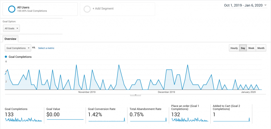
This exposes critical insights like overall site performance, the most effective traffic channels, what pages lead up to a conversion, etc…
If you already have goal tracking, consider event tracking. Event tracking is exactly what it sounds like, tracking specific events! Instead of tracking the end goal, you’re tracking events that lead up to the goal. Clicks on important buttons, video plays, downloads, etc…
This paints a better picture of what’s working. For example, maybe you have two “contact us” buttons on the page — one in the header and one in the footer. Which get’s clicked on more often? Event tracking would tell you.
Go beyond Google Analytics
Google Analytics isn’t the only tracking software you should consider. Services like HotJar.com have a range of different tracking options that provide insights where Google Analytics can’t.
Heat maps are a good place to start, which is a recording of where people click, scroll, and move their mouse.
Where Google Analytics will tell you how long users spend on a page, HotJar’s heat maps tell you what happens on the page. My favorite insight is identifying where users click that isn’t actually a link– a good sign you should add content or a link.
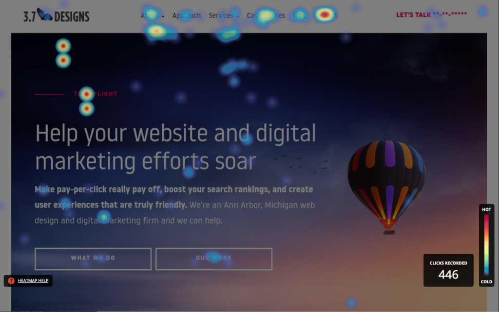
Session recording is another great tracking tool. With session recording user visits are recorded and anonymized, giving you a recreation of how users engage with your content.
Where do they stop and read? What do they scroll past? At what point do they leave? It develops a clear picture of how people actually engage with your site and content.
2. Better conversion tracking
We’ll continue with tracking because strategy is only effective with accurate understanding of the current situation.
We often find goal/conversion tracking “blind spots.” Meaning, even those tracking goals aren’t accurately tracking all of their goals.
For examples:
- Clicks on emails
- Tap to call
- Clicks to third party distributors (where purchases can be made)
- Call tracking
- PDF downloads
If you aren’t tracking these elements you’ll have an incomplete picture of site performance and can’t make well informed decisions. Most of these goals can be setup at no cost within Google Analytics and even third party solutions like CallRail start at $45 a month. At half your typical cable bill, it’s a nominal investment for your business.
3. Run your first A/B test
A/B tests compare the performance of a single variation to an important page. Does page A perform better to page B which is identical except the call to action button is red instead of green?
A/B tests used to be difficult and resource intensive. That’s no longer the case.
Free tools like Google Optimize make it easy to run A/B tests. You don’t need to be a developer to run one, everything is done through your web browser.

If you’re struggling where to start, test something simple like two versions of the primary message on your homepage. Measure engagement like time on site, average pages per visit, and bounce rate.
You might think the difference will be negligible, but we’ve run similar tests ourselves and seen huge differences.
Once you’re comfortable with smaller tests, work up to larger changes and more significant goals like leads and purchases.
4. Start using design psychology
According to Forrester market research, designing with an understanding of your target audiences psychology can boost website conversions by 400%.
If you haven’t created a model of your target audience, haven’t identified their triggers, and haven’t incorporated persuasive design techniques, then your website could be performing significantly better.
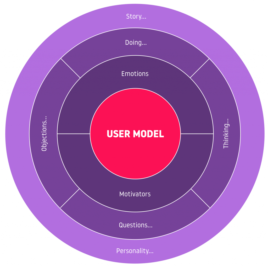
Make 2020 the year you incorporate design psychology into your website. You don’t need to redesign your entire website. Start with user research and develop a strategy for iterate on your existing site.
5. Improve your Calls to Action
Calls to action (or CTAs) are one of the most important elements on your website, yet many neglect them. The concept of a CTA is simple, it’s an element on the page asking users to perform a specific action. e.g. “Call us today.”
CTAs typically ask the user to convert into a lead or sale, which is good practice. However many mistakenly “ask for the sale” (or contact information) too early in the users journey.
I often see buttons to “buy now” or “contact us” on the homepage, above the fold. Most users aren’t ready to buy or contact you within 30 seconds of landing on your website. You could argue that you’re targeting repeat visitors, but I’d still argue there are better calls to action in that spot.
Instead, create a call to action for every stage in the sales funnel. This will nurture the user along until they’re ready to purchase or contact you.
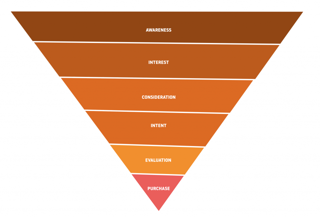
Once you have the right calls to action, you can consider optimizing execution, such as:
- Are they obvious and hard to miss? (i.e. plenty of contrast)
- Have you placed them in the right spots?
- Do they address all possible objections?
- Do they adequately describe the benefits of converting? etc…
6. Update high performing legacy content
Most websites follow the 80/20 rule when it comes to content performance, 80% of the visits are on 20% of pages. Often times the top visited pages are also the oldest.
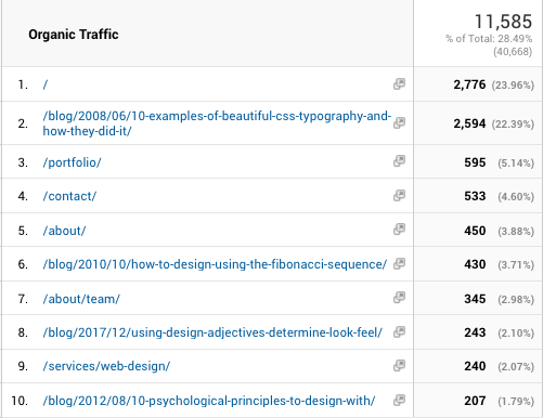
Updating these pages with new, current content, and refocused on your current website objectives will make a significant difference in overall performance.
An example that’s close to home, we have several blog posts from 2008 – 2012 that continue to be our highest trafficked pages. This year we’re going to be updating and optimizing them.
7. Monitor search performance on Google Webmaster Tools
Years ago Google removed a beloved feature from Google Analytics, the ability to see what search phrases drove traffic to your website. That feature has been restored, only it now exists in Google’s Webmaster Tools.
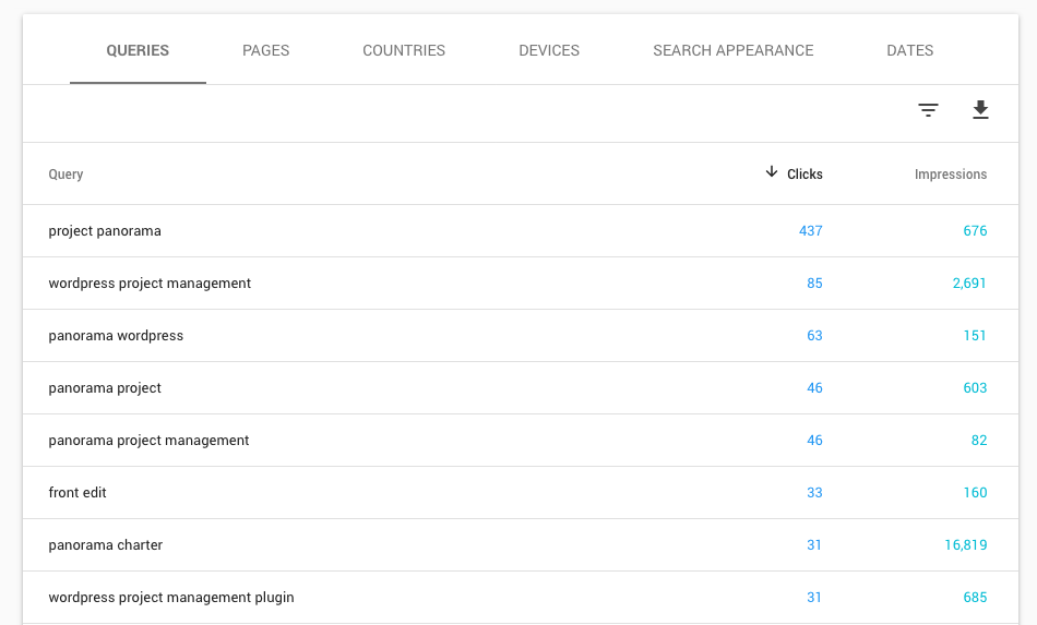
If organic (unpaid) search traffic is important to your marketing strategy, you should regularly review Google Webmaster Tools.
Not only does it give you data on search performance, it will alert you to issues that could be negatively impacting your search performance like missing pages, mobile usability issues, etc…
It’s free and easy to setup. Do it now.
8. Plan Growth Driven Design iterations
We’ve long been advocates of Growth Driven Design or GDD. Simply put, GDD is the practice of making small, iterative improvements to your website based on data over large redesigns every three years.
Left untouched, a website’s performance naturally declines overtime. This is because content becomes dated, technologies change, user expectations change, style changes.
With Growth Driven Design you’re continually evolving and improving your website and as a result, the opposite happens– performance increases over time. You also negate the need for expensive and time consuming redesigns every three years.
The difference can be summed up via this chart:
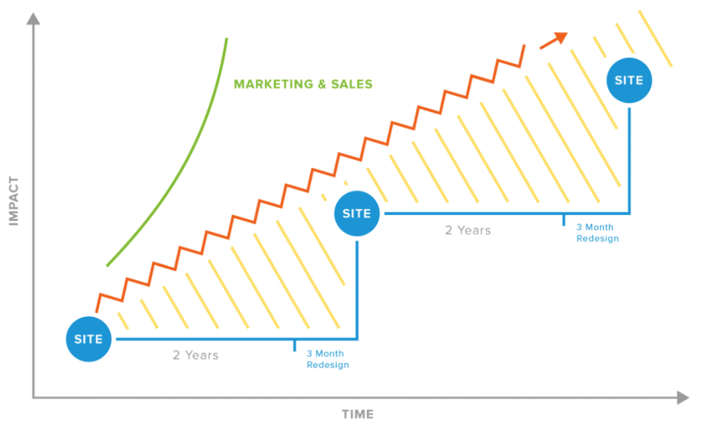
While there is a whole methodology to running a GDD program, start by planning three months of improvements. At the beginning of each month identify what improvements you’d like to make (prioritized by impact potential) and then plan how you’ll execute on them.
As this becomes more of a habit you can explore the GDD methodology including how to use data to inform future iterations and design decisions.
9. Create campaign specific landing pages
If you’re running a marketing or advertising campaign and send traffic to your homepage or an interior page on your website, you’re not getting the performance you could.
Let’s explore this recommendation with 3.7 Designs as an example.
Say we decided to run a Google Ads campaign for our web design service. We identify our keywords, create ad groups, and write some ads sending people to our homepage.
Here’s the problem, while our homepage discusses web design but isn’t completely about web design. This creates a disconnect. Users land on the page looking for information about web design but are confronted with content about a host of other services as well. The copy in the advertisement doesn’t align with the content on the page.
Performance is impacted anytime a user has to expend unnecessary effort. Inversely, when the keyword, advertisement, and content on the landing page align the user has to exert less effort than normal to process and make decisions and performance is increased.
OK, so maybe then we change the landing page from our homepage to our web design services page. This is better, but it could be better still.
Because we can control what conditions our Google Ad shows up, the content within it, and specifically what page users are taken too, it’s more effective to create a custom landing page for each advertisement.
This creates the consistency described earlier. The keyword, advertisement, and landing page all align.
Simplicity is key. Remove all distractions. In fact, the landing page should be a yes or no question– do you want this offer or no?
In our example, we wouldn’t send users to a landing page that just had general information about web design and links to various other pages on the site. Instead we’d create an offer like a downloadable guide, free consultation, or free audit.
This concept applies for all marketing initiatives. Create specific landing pages for each of your campaigns.
10. Re-optimized for mobile
Mobile accounts for more than half of all internet traffic worldwide. When was the last time you browser your own website on your phone? It happens to the best of us, we’ve updated several areas of the website and the mobile experience has unknowingly degraded.
This year, take 30 minutes test your site on a handful of mobile devices. If you don’t have access to many, visit a store like BestBuy. Think deeper than “is this broken,” and really consider what could be done to make your website a first class mobile experience.
For example:
- Maybe the navigation could be more intuitive
- You could make search visible at mobile breakpoints
- You could reduce decorative images for faster load times and less clutter
- You could make buttons and click areas larger
- Key actions could be moved to easy to click areas
As user behavior moves more and more mobile any investment now will payoff for years to come.
What did we miss?
Anything you think is a must-do for 2020? We’d love to hear your thoughts and recommendations in the comments below!