
- Digital and Design Strategy
- Web Design
- Updated 01/31/2025
The Gutenberg Diagram in Design
We’ve written extensively about design principles and guidelines, including specific design laws, design psychology, and emotional design. However, we have yet to cover the “Gutenberg Diagram.”
The Gutenberg diagram is a simple principle that can help us create more effective designs by understanding how users’ eyes are likely to travel when they experience them. With this understanding, you can make more informed decisions about where information and elements are placed.
Let’s start by defining the Gutenberg Diagram and briefly explaining its history.
What is the Gutenberg Diagram?
The Gutenberg Diagram was developed in the 1950s by the father of modern newspaper design Edmund Arnold. Edmund observed that cultures that read top to bottom, left to right, typically move their eyes from the top left to the bottom right when reading a page. This allowed Edmund to segment a page into four quadrants based on how much attention each area would likely receive.
Those quadrants are:
- Primary optical area
- Strong fallow area
- Weak fallow area
- Terminal area

The term “fallow” refers to unplanted land, a metaphor for areas of the page that are either underutilized or receive less attention. Specifically, the top right (or Strong Fallow area) gets some attention, whereas the bottom left (or Weak Fallow area) receives very little. In contrast, the Primary Optical and Terminal areas receive the most attention.
How to Use the Gutenberg Diagram
While the Gutenberg diagram was initially developed for newspaper pages, it can be used in any visual design discipline. According to our information hierarchy, we can place more important elements and content in the Primary Optical, Strong Fallow, and Terminal Areas, which will enhance content comprehension and increase engagement.
By placing the most important elements in the top left, you can be confident they will receive high attention. Similarly, the elements in the bottom right will receive similar levels of attention; however, by being placed at the end of the view, this quadrant becomes a perfect spot to place important messaging like calls to action.
Non-critical, but valuable elements can be placed in the strong fallow area to receive some attention, and anything you want to intentionally demphasize can be placed in the bottom left. Some examples include terms and conditions, copyrights, footnotes, etc…
Let’s examine using the Gutenberg Diagram in web and digital asset design.
Gutenberg Diagram for Web Design
Many of the well-established web design conventions are based on the Gutenberg Diagram; the logo placed in the top left and navigation across the top right ensure users have access to the most basic information required to use a website—answering the questions of what site am I on and where can I find the information I’m looking for.
The “above-the-fold” section of a page is the first place where we can start using the Gutenberg Diagram in web design. This is the visible content upon page load before having to scroll. A common practice for this area is to have what is known as a “hero section.” Hero sections are typically large, visually impactful sections that present the most important message(s) for the page and meaningful calls to action.
The Gutenberg Diagram dictates that the most essential messages receive the most attention in the top left and the calls to action in the bottom right.
The diagram is still applicable even after the point of scrolling. Long-form web pages are typically broken up into individual sections, such as features and benefits, about, latest news, resources, etc… Each section forms quadrants that the diagram can use to enhance comprehension and engagement.
Examples of the Gutenberg Diagram in Web Design
Oh Telecom

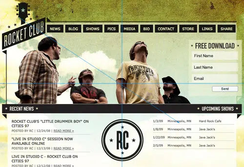
Rocket Club
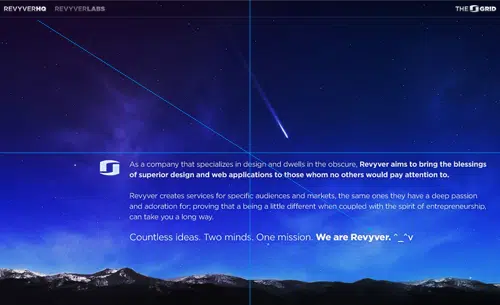
Revyver HQ
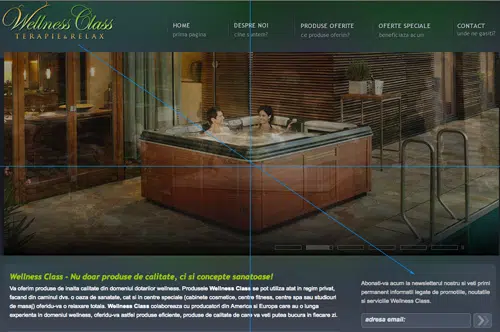
Wellness Class
Digital Asset Design
With digital asset design, any advertisement, ebook, or presentation will have a canvas that can be split into the four quadrants identified by the Gutenberg Diagram.
Placing high-priority elements such as messaging or calls to action in the Pimary Opcital Area (top-left) and Terminal Area (bottom-right) will ensure they capture attention. Less essential elements like supportive imagery and textures can be placed in the Strong Fallow Area (top-right), whereas low-value content like terms, disclaimers, etc… should be placed in the Weak Fallow Area (bottom-left.)
Final Thoughts
While there aren’t many widely publicized case studies specifically focused on the Gutenberg Diagram’s application, if you pay attention to the advertisements and websites that grab your attention and inspire you to act, you’ll see many of them use the principal (either intentionally or intuitively.)
If you’re unsure, try doing a split test using one of the many digital advertising platforms or one of your websites through a tool like VWO. If you need help with the effectiveness of your website or digital assets, we can help. 3.7 Designs is a B2B technology marketing agency specializing in web design and digital marketing.
FREE TOOL: OPTIMIZE YOUR SITE
Grade Your Entire Website in Seconds
Submit your website link and get a detailed report on how you can improve page performance, SEO optimization, mobile usability, and more.