Redundant is Usable
Over the past fifteen plus years of designing websites for other people, I have received countless requests to remove elements from a design because they are “redundant.” The perception is that if something is included on the page once, especially in an obvious fashion, there’s no reason to repeat it elsewhere. Further baffling, it’s my experience many not only believe it’s unnecessary to repeat elements they feel it’s harmful. This is not the case.
Repeating important elements is not only useful, it can have dramatic effects on site usability. The reason lies in human psychology.
How People See (and Miss) What Happens Around Them
We tend to give ourselves a lot of credit when it comes to our skills of perception. We think we see everything that’s happening around us, especially what’s right in front of our faces. The truth is, humans have an extreme case of tunnel vision. We hyper focus on what we feel is important and ignore anything that looks familiar or irrelevant. This is especially true when it comes to the web where proficient users have become hyper-custom to identifying what’s related to their task at hand and what isn’t.
An interesting demonstration is the pass counting exercise. Watch this video and see if you can accurately count how many passes the players in the white shirt make, about 50% of people get it wrong.
What this video demonstrates is how easily we miss big obvious things even when we are practically staring right at them. Similarly, we can completely miss large changes directly in our field of view and not even realize it. This is a phenomenon called “Changed Blindness” and it’s more extreme than you might think. I highly recommend watching this video as a demonstration.
Both tunnel vision and change blindness have significant implications on web usability.
How This Applies to The Web
A certain percentage of users will miss key elements even if they are large, obvious and right in front of them. This is especially true of navigation. When someone visits a website they don’t calming focus on every aspect of the page, analyzing if it will help them accomplish their task or not. Eye tracking studies have shown their eyes dart around the page feverishly trying to catch a glimpse of anything that looks relevant. In this process much of the site gets ignored or missed. In fact, The Neilson-Normand Group reports only 28% of the words on a page actually get read.
If you have key information, messaging or navigation and it only appears in one spot then chances are users will miss it part of the time. If these elements are critical to the success of the website you are doing a huge disservice to only include them once. It’s obvious to you that these elements exist because you are hyper aware of the design. You are aware and care about every detail, a trait users won’t share.
Repetition (and redundancy) has incredible value in many aspects of modern life. Branding and marketing is relies heavily on people hearing the exact same message multiple times. In teaching, one of the best ways to improve comprehension is repeating yourself. And the availability heuristic states that what you consider to be true and important is largely dependent on how often you hear about it.
Repetition doesn’t mean duplicate. You don’t need to literally repeat the exact same representation of an element (be in navigation, a call to action, etc…) to minimize user oversights. In fact, if the user missed it the first time it’s because they didn’t think it looked relevant. Alternate representations are actually more effective.
The most basic example of this is footer navigation. Scrolled to the bottom of the page and didn’t find what you were looking for? The footer navigation is usually visually different and gives the user a second chance to find their link. Let’s look at some examples to demonstrate.
Zappos.com
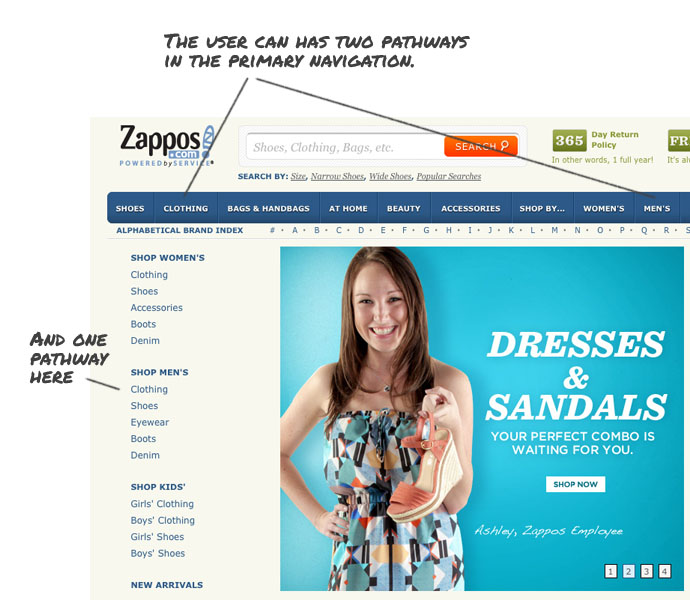
Zappos.com is a great example of effective repetition. If you are looking for Men’s clothes (because I am a man and I like clothes) you can find it through the primary navigation by clicking on “Mens,” or Clothing.
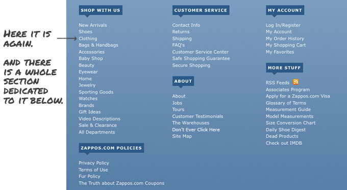
You could also click on the sidebar navigation under “Shop Men’s.” Finally the options are repeated a third time in the footer through a massive footer menu.
One could argue Zappos is being horribly redundant in their design, but they’re not. They have given users three pathways to the same information. That way if the miss one or think about their task using different terminology there are other options waiting for them.
Freshbooks.com
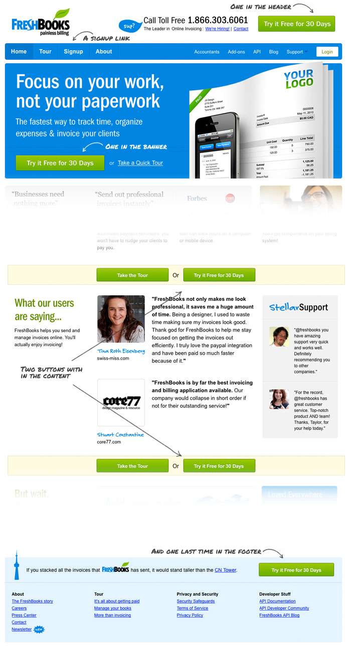
Freshbooks.com, an online invoicing solution has five free trial buttons and a sign-up button in the top navigation. Is having five calls to action repetitive? yes. Redundant? No. In this case not only does repetition improve usability, it increases the effectiveness of the site. One of the primary objectives of this site is getting trial sign-ups, more calls to action means more users noticing them and higher conversions as a result.
Final Thoughts
For reasons beyond me, some people have an aversion to repetition with in design. In most cases, this manifests as the desire to remove elements on the page because they are deemed “redundant.” Redundant by definition means being able to remove without loss of function. In many cases repeating elements doesn’t mean redundant, as function is lost if a user doesn’t locate what they are looking for.
As demonstrated by the change blindness studies mentioned above, we navigate the world with tunnel vision. While we see much of the world around us, our brain actively filters out anything perceived as unimportant. This process trades accuracy for speed. In some cases our subconscious filtering makes mistakes, missing important items. If those items are not repeated the design fails.
Next time you are designing a website think about what critical elements exist on the page and consider how they can be repeated in an effective way. Further, make sure to push back when a client or boss requests you remove something because it’s “redundant.”


