Using Design Adjectives to Determine Look and Feel

One of the biggest challenges in web design is identifying the tone or personality the visual layer should convey.
This is commonly referred to as “look and feel,” however this terminology glosses over an important caveat— something can be aesthetically pleasing while communicating the wrong message (i.e., a website for kids could look beautiful, but the visuals could feel closer to an accounting firm than something for learning environments.
Ultimately we’re talking about communication. The colors, typography, imagery, whitespace, etc… all work together to send a particular message to the viewer. This is the fifth layer in our Six Layers of Design methodology.
So how do you figure out what the design should communicate and what emotions it should invoke? If you’re working with an organization that doesn’t have clearly established brand guidelines or wants to change its visual language, this could be tricky.
You could ask stakeholders within the organization directly, “What should this communicate, and how should it look and feel?” Unfortunately, this rarely produces the right insights. Not everyone has the experience and training to answer that question, and more often than not, responses refer to personal preferences over what’s the best fit. You could ask to see examples of design that the stakeholders feel is a good fit but again becomes more focused on personal preferences than actual outcomes.
Having a conversation is a good starting point, but you need to ask the most efficient questions. This is where design adjectives come into play.
Exploring Look and Feel with Design Adjectives
While everyone might interpret an adjective differently, it’s a good jumping-off point for a conversation. A constructive discussion about how the organization wants to be perceived and how the target audience would feel about the perception might begin with questions like, “Should this feel progressive? Why or why not?”
Comparisons are even more valuable. “Should this feel progressive or conservative?” Now stakeholders will have to think about what feeling the design should invoke and what it shouldn’t invoke—again, understanding the “why” to this question is equally important, if not more important than the answer itself.
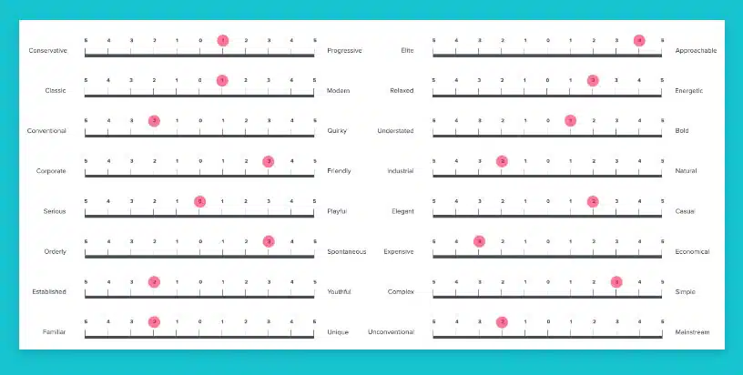
This is the approach we have taken at 3.7 Designs for years, especially when conducting website redesigns for clients. We asked stakeholders to compare near opposites, and while it was effective, we noticed a sticking point–it was too easy to interpret the adjectives as extremes. If we asked, “Should this feel fun or serious?” a typical response would be, “well, we don’t want it to be tax law serious.” So we modified our approach, giving stakeholders a scale so they could indicate 1 – 5 how serious it should be.
Now you’re probably wondering what design adjectives I should use.
Get Your Website Strategy Workbook
Download our website strategy workbook and get the EXACT tools we’ve used to drive +1,000% increases in online sales and leads
The Design Adjectives We Use
We’ve found that characteristics are often more effective than descriptors. For example fun is a characteristic, a personality trait. We can both imagine someone who’s fun, and while you and I will picture different people the interpretation invoke the same feeling. Clean; however, is a descriptor, and you and I will likely have very different interpretations of what a clean design looks like.
With that narrowed down, we’ve found the following adjectives most useful in a wide range of use cases (note: we didn’t invent this list, we’ve just found it to be effective):
- Conservative or Progressive
- Classic or Modern
- Conventional or Quirky
- Corporate or Friendly
- Serious or Playful
- Orderly or Spontaneous
- Established or Youthful
- Familiar or Unique
- Elite or Approachable
- Relaxed or Energetic
- Understated or Bold
- Industrial or Natural
- Elegant or Casual
- Expensive or Economical
- Complex or Simple
- Unconventional or Mainstream
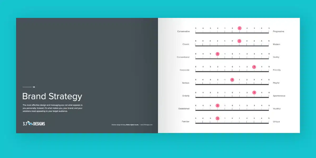
Here is an example of the comparison range we have stakeholders respond with.

What’s Next?
This approach works very well most of the time, but you may run into challenges. One common issue we encounter is the over-reliance on scoring items as 3’s. On a 1-to-5 scale, 3 is a neutral answer; if you were to design something with all 3’s, it wouldn’t convey a strong message. If you find this happening, run through the exercise again and remove three as an option. Stakeholders will be forced to pick 2 (i.e., very little) or 4 (pretty high), and you’ll get a much stronger direction.
If you use design archetypes, this is still an excellent exercise to help the selection of the most appropriate archetype.
Finding the absolute best fit doesn’t stop with having these conversations–these are suggested starting points. It’s worth having similar conversations with members of the target audience and running design tests with early concepts to validate that your approach has the impact you desire.
FREE RESOURCE
Get Your Website Strategy Workbook
Download our website strategy workbook and get the EXACT tools we’ve used to drive +1,000% increases in online sales and leads