Website Usability is Not a Checklist – Usable Doesn’t Mean Useful
The term “usability” receives a lot of attention in the web design space and with good reason. Usability implies users can effortlessly accomplish the goals that brought them to the website in the first place, and is the primary metric in determining whether a site is successful. Implementing usability in terms of simply meeting user goals, however, is only the half the battle. From a design perspective, good usability equates to good design. To realize great design we’ll need to peel the onion of usability down another layer.
Traditionally the term “usability” encompasses two different, and sometimes subtle, aspects of design. The first is usability in the context of achieving and delivering a desired goal; the second is usability in the context of how proficiently the goal was accomplished.
A user can visit your site and accomplish what they originally set out to do. That being said, your job doesn’t end there. There are countless websites and products that meet basic user needs but are not highly sought after or “desirable.” A website that just meets basic user needs might be adequate, but it’s not inspiring. Great design is more than just solving a problem — it’s finding the best solution to the problem. The most successful designs go beyond just letting a user accomplish a task in a timely manor (one metric for usability); they shape the entire experience of using the site.
Usable vs. Useful
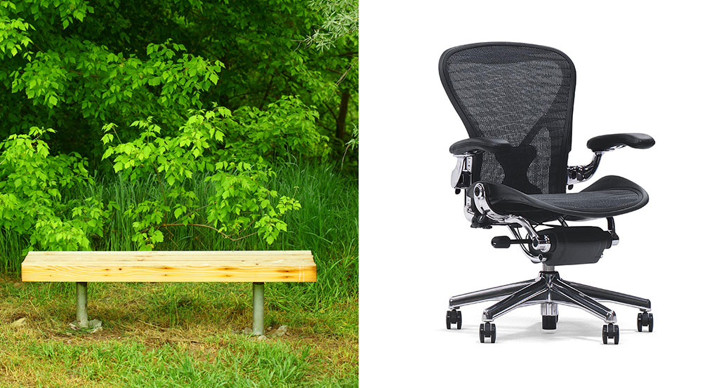
Let’s uncover useful by examining the design of a common household object: a chair. The chair is a relatively mundane entity; it’s been around for so long we don’t know who actually invented it. It has practical applications; before the invention of the chair people used other objects like rocks and tree stumps for the same purpose. In simple terms, we could say the primary function of a chair is to provide a more desirable surface to sit on than the floor.
Design elements of a chair include a flat, stable place to sit and a back to support the upper body. To be functional, the height of the sitting surface needs to be conducive to the task at hand. When a chair is used to sit at a table, the height needs to align proportionally with the table’s surface. The “easy chair” you sit in to watch TV needs to be “easy” to get in and out of–and comfortable. Arms on a chair facilitate a part of this comfort but are not necessary to the core design (for example, a typical kitchen chair does not have arms). Put another way, the core design is often enhanced or refined to provide comfort and convenience for the task at hand, but it’s hard to imagine anything missing from the core design of a chair — it needs to be flat, stable, relatively comfortable, and support the task it was designed for. Furniture design companies like Herman Miller would say otherwise.

Now let’s dissect the design of a chair using the design layers we’ve written about previously. The primary function of a chair is to give the user a place to sit that otherwise wasn’t there. If the chair supports sitting consistently then it was designed in a reliable way. This reliability would be dependent on material and structural design. If the chair were easy to sit on, get off, and move around as required, the chair is usable in the context of design layer principles.
The chair described above is successful in the first three layers of design (functionality, reliability and usability). People who sat in the chair wouldn’t likely complain about their experience but they wouldn’t be excited by it either. The chair would simply do it’s duty in providing a horizontal surface for people to plop their butts onto and never aspire to do anything more.
Some people may argue that, from a strictly technical perspective, a chair doesn’t really need to do any more. It’s serving the purpose of the design in an acceptable way. But acceptable design is not great design. You could create a functional, reliable, and usable chair with a milk crate and a wood plank. Your “chair” is adequate but hardly what one would call inspirational.
Going Beyond Usable
So how do we move a simple object like a chair from adequate into the lofty realm of inspirational? We add a proficiency layer to usability. Proficiency, applied to a given object, improves the way people do things while using that object. A chair that’s proficient is more comfortable for longer periods of time. This in turn allows the user to work with greater concentration for a longer duration, thus making them more proficient at their task.
Key Takeaways
Great design improves the lives of users. This is not limited to industrial design. You have the opportunity to design websites that also impact the well being of those using it. Designed proficiency happens in two forms: designers can come up with a new and improved solution to an existing problem or improve upon a new solution. In both scenarios design can be used to improve users’ skill levels, only the approach is different.
FREE TOOL: OPTIMIZE YOUR SITE
Grade Your Entire Website in Seconds
Submit your website link and get a detailed report on how you can improve page performance, SEO optimization, mobile usability, and more.