Reviving the Hierarchy of Design Needs
When I was approached by a large publisher to author a book on design I was humbled by the notion. I spent a great deal of time researching things I already knew but didn’t limit myself to only web-design topics. I explored all different design niches, from industrial to fashion.
During this time I came across a diagram called the “Hierarchy of Design Needs.” At first I thought it was a silly attempt to use a well known visual structure (Maslow’s Hierarchy of Needs) on an unrelated subject (design.) But the more I thought about it, the more it made sense. I realized that I addressed very few of the needs in my own design practices. In fact, I noticed a pattern: novice designers might address one category of needs, intermediate designers would address two or three, and great designers typically addressed them all.
The Hierarchy of Design Needs was adapted from a set of psychological principles discovered by Abraham Maslow in 1943. Maslow was a psychologist interested in what motivated human beings to act and think in specific ways. His research lead to the publication of a paper titled The Theory of Human Motivation, and the book Motivation and Personality.
Maslow’s Hierarchy of Needs
In his search to understand why some individuals excelled in life and others were “average,” Maslow set out to study people who were deemed “exemplary” and “historically successful,” such as Albert Einstein, Jane Addams, and Eleanor Roosevelt. He also studied a group of college students within the top one percent of scholastic rankings at the time. He sought out fighter pilots, successful business tycoons, and political figures. Maslow’s goal was to understand the motivations that drive “healthy and mentally sound individuals.”
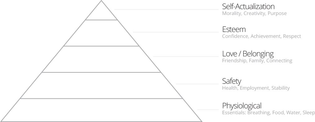
As a result of the above research, Maslow came up with a “hierarchy of needs” (Figure-1.2). The first four layers are considered basic needs, which Maslow labeled “deficiency needs.” Above basic needs, Maslow added the “being needs” layer. He believed successful people typically go beyond the scope of basic needs and strive for constant improvement. He called this mindset “Metamotivation.”
Figure-1.2 Abraham Maslow’s “Hierarchy of Needs”.
Maslow’s theory hinges on the premise that the lowest layer of needs must to be met before advancement to the next level. So a person would have to fulfill their physiological needs before they could begin focusing on safety, then love and belonging. Only after working through the first four sets of needs can one focus on the “being level,” or self-actualization.
Like any radical theory, Maslow’s work was met with both fanfare and criticism; however, even psychologists who disputed elements of Maslow’s theories saw the validity in his conclusions and the implications it contained. After all, how can you possibly be worried about whether you have a sense of belonging if you can’t find food or water?
Now take a moment and consider Maslow’s Hierarchy of Needs in the context of web design. At its core, design is about understanding people, and through that understanding, creating an environment the user enjoys being a part of. This doesn’t happen by chance, but by realizing human motivation.
One of the best ways to become a better designer is to gain a greater understanding of people–and not just in relation to computer interaction. Psychology, anthropology, and sociology contain a wealth of great design theory. Knowing how people behave outside the context of websites gives you better insight into how they would think and behave online.
There’s a fascinating overlap of human needs, motivations, and desires–and how design has the power to satisfy them. Maslow’s theory provides an excellent framework for recognizing and prioritizing the human needs that drive behavior. This research lends itself to designers who can more successfully create usable applications. This adaptation is commonly referred to as “The Design Hierarchy of Needs.”
The Design Hierarchy of Needs
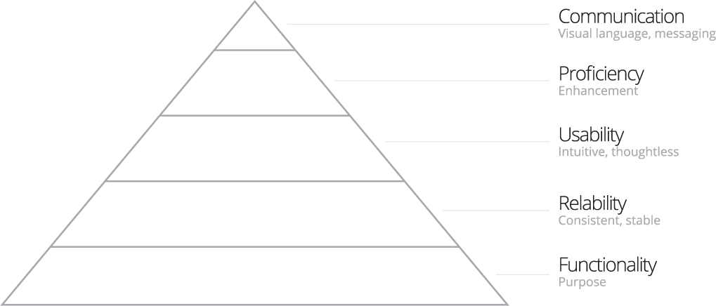
The original Hierarchy of Design Needs references five categories ranked by importance (Figure-1.3.) While I respect the original concept, my research gave cause for a sixth category (emotion) and substitution of the term “needs” with “layers.”
Figure-1.3 The original design hierarchy of needs. A pyramid of five categories.
Design is a system. When you design you’re actually building something in layers, starting with the reason your creation exists and ending with how one feels when they use it.
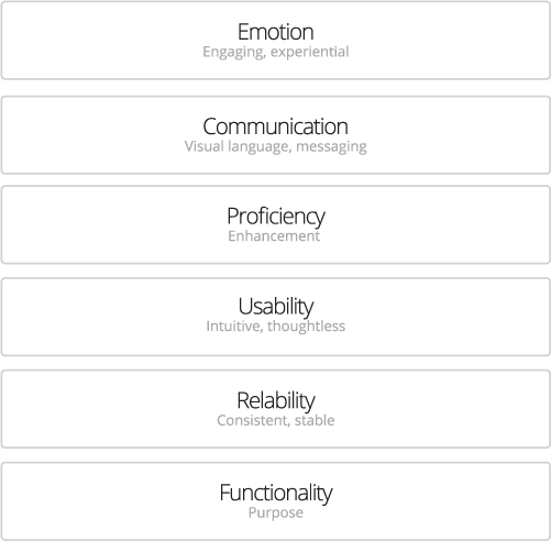
My adapted six-layer concept (Figure-1.4) is a way to prioritize and understand the fundamental needs a design must address. The most important needs are at the bottom and, like Maslow’s model, are deficiency needs. A design that does not meet these needs is unlikely to succeed. As you address the lower layers you’re then able to focus on the higher-level needs such as proficiency, communication, and emotion.
Some might argue lower needs don’t always have to be fulfilled before higher ones. Does one really need to feel loved before he/she can acquire self-esteem? Does one really need safety before he/she can feel loved?
The design layers could be subject to the same criticism. There are plenty of websites that communicate the right message but are almost unusable. For that reason I concede that in some cases we’re not required to fulfill lower-level design needs in order to address higher ones. Keep in mind, though, that the best design will be achieved by meeting the requirements on every level.
Figure-1.4 The lowest layers in the design are the most important for a successful design. After you address the needs in each layer you can focus on the next higher needs.
In practice, you won’t necessarily design using the layers one by one working your way up. You’ll address the design as a whole, concurrently. Every choice will impact the other layers, and it’s important to assess these choices in the context of the overall design.
Let’s start by defining the design layers.
Functionality
The bottom of the hierarchy is the functionality layer—the most important one. This is the intended purpose of the website. I would argue that any website has an intended purpose or objective. Even personal blogs are created with the intention that someone will read them and be interested in the subject matter.
The functionality layer contains elements like site objectives, business objectives, and site goals. This layer states the site has the capability to actually fulfill the site’s reason for existing. For example, a personal blog that can’t be updated fails its function to keep people up-to-date with the author’s life. A company sales website with no contact information fails its function to generate leads. While this may seem obvious it’s often overlooked.
Reliability
If the site can perform the function it was deigned for, can it do so reliably? This isn’t limited to technology and the IT department. The reliability layer addresses a wide range of design questions that are often skimmed over, such as:
- Does the design function across different devices and technologies?
- Does the design provide the best experience across different devices and technologies?
- Can the design expand and contract to fit changing content that flows through it?
Usability
Usability is the study and practice of designing websites to be intuitive and easy to use. This plays a critical role in the design of a successful website. I challenge you to find anyone who hasn’t been frustrated with a website before. Browsing behavior today is fast-paced with low-tolerance for glitches, so usability is the cause for countless lost sales and opportunities.
Proficiency
A design’s greatest potential lies in its capability to affect people’s lives. Great design doesn’t just sell a product or promote a brand—it provides something unique and useful. Design can make people more productive, offer them new abilities, and even inspire them on a personal level.
Many websites and products found their competitive advantages through proficiency. Kayak.com made shopping for the best plane ticket easier than any other site. As a result they took over a large share of the online airfare market.
Communication
The communication layer is where we start using visuals for meaning rather than operation. Now we can start to address how users feel when they interact with a design. When a user comes to the site what do the visuals tell them? How do they relate to them? How do they feel? And, most importantly, what do they do afterward with their experience?
Emotion
Visual design goes deeper than just communicating characteristics and traits. Using a textured background could simply inform a user about the type of website they are visiting, or it could trigger emotional connections which then convince them to respond (or not respond) to a call-to-action. Every decision we make is affected by emotion.
The emotional layer is the most sophisticated to understand and master. Emotional reactions are impossible to predict as they are unique to each user. Culture, age, and socioeconomic status can all contribute to someone’s emotional response to a visual. Triggering a negative emotion could, unfortuantely, be easier than you think.
Companies like Apple and BMW have used emotion to connect with their customers to a degree at which most companies can only aspire. Few companies can make products so loved that people are willing to wait out in the cold to buy it before their friends do, and pay more for it!
A Scientific Approach
Designing with layers shifts design toward a science. We now have the technology to measure the effectiveness of a website and even test designs against each other to see which performs better. Because we can scientifically validate how a website performs, we should design it from a perspective of science as well.
Using the six layers of design is inherent to exceptional design. The layers facilitate your ability to prioritize decisions so you end up with the best solution. The process of satisfying design needs with design principles will ignite a shift from design experimentation to design architecture.
FREE TOOL: OPTIMIZE YOUR SITE
Grade Your Entire Website in Seconds
Submit your website link and get a detailed report on how you can improve page performance, SEO optimization, mobile usability, and more.


