
Author
The Principles of Minimalist Web Design
Antoine de Saint-Exupéry once said, “Perfection is achieved not when there is nothing more to add, but when there is nothing left to take away.” While Antoine’s message was about writing it very much applies to design. The benefits of minimal design are numerous, but most importantly with everything unnecessary stripped away all the focus is shifted to what’s left. This gives design purpose and allows you to explore subtleties that might otherwise be overlooked.
Some question the validity of minimal design—after all, don’t some people prefer the aesthetics of an intricate and decorative design? While this might be the case, there are two design principles—Hick’s Law and Selective Disregard—that demonstrate a design is less effective when unnecessary elements exist.
Knowing the benefits of minimalist design is not all there is to know however. Minimalist design is no easy task; in fact many will claim it’s more difficult to achieve than a more complex design. In the past I’ve found myself struggling to decide what should be removed from a design concept. I knew I had to be ruthless about what remained but had several elements that seemed fairly important. Did they really need to be on the page? How should I decide? Ultimately, I came across the 80/20 rule which examines the origins of outcomes. It now guides my decisions on what to keep and what to cut.
Let’s start by examining Hick’s Law and selective disregard. Then we’ll dive into designing with the 80/20 rule.
Hick’s Law
Hick’s Law dictates that the time it takes to make a decision increases with each additional option a user must mentally process. More specifically, options make decisions difficult. Consciously, we value options, a diversity of selections, and freedom of choice. Behaviorally, adding options induces a state of user indecision.
In the book Neuro Web Design: What Makes Them Click, author Susan M. Weinschenk, Ph.D., describes a study performed by researchers Iyengar and Lepper that demonstrates the gravity of Hick’s Law.
In the study, a jam sampling station was placed in an upscale grocery. Half the time the researchers had six jars of jams on display, the rest of the time twenty-four. In both instances they measured how many shoppers tried jam, how many (on average) flavors were tasted, and what percentage of tasters subsequently purchased.
The twenty-four-option display had 20% more tasters, but only 3% purchased compared to the six-jam’s 30%. Additionally, those who did stop only tried one or two types of jam, regardless of available options.
The study demonstrates that options can be so overwhelming, avoiding decision is easier than making one. Just as tasters struggled to select from twenty-four different jam varieties, users struggle with too many visual options.
In extreme cases, sales-focused sites remove all choices beyond “yes I will buy” or “no I won’t.” The removal of options, such as “should I read more” or “what is on the media room page?” reduced the number of potential decisions, in turn simplifying the decision process. When decisions are easy, more people buy.
The takeaway of Hick’s Law is everything must exist for a reason. The more you add to a design, the more choices the user has, and the more difficult navigating the site becomes. This is not limited to actionable choices, such as which link to click. Just having visual elements on the page forces the user to choose whether or not to look at (and subsequently, process) them.
To battle this cognitive overload, many users have developed a visual defensive mechanism called selective disregard, better known as “banner blindness.”
Selective Disregard
The web has historically been plagued with designs that attempt to cram too much information into too little space. The cause is often traced to misconceptions of “more is better” or “design by committee” where every department needs representation. Regardless, users have been forced to cope with overwhelming websites since their first experiences online.
Savvy users learn how to turn off images, eliminate ads, or simply avoid overwhelming websites. Average users have learned to instinctively ignore what they consider irrelevant. This behavior is known as selective disregard.
Banners were the first prevalent example of selective disregard. As the web gained popularity in the late nineties, more websites supplemented income by displaying narrow horizontal advertisements across the top of their page. Online advertising was new, both in customer base and targeting methods, so the quality of the advertisements was mediocre at best. The banners often distracted users, slowing them down and disrupting productivity. Over time users adapted, ignoring anything banner-shaped (hence the term “banner blindness”).
Banners are easy to ignore because they have easily identifiable patterns including shape, location, and behavior. With experience, users expand their disregard from what is obviously irrelevant, to everything but the immediately relevant.
Selective disregard operates via peripheral vision, similar to how we navigate the world. If you were to walk down a busy street, you would probably see and forget a handful of street signs. Those signs enter your peripheral vision but are subconsciously ignored because they’re deemed unimportant or familiar. If something seemingly important or unfamiliar enters your peripheral vision, you subconsciously shift your attention to it.
Websites are browsed in the same fashion. When something enters your peripheral vision and is identified as relevant your focus is shifted. Everything else is ignored completely; users are unaware they saw anything beyond what they subconsciously deemed relevant.
People make quick, subconscious assessments as to the relevance of what’s in their field of vision. For a given task, most web pages have more unrelated content than related. To maximize productivity, users ignore everything not labeled “relevant” by the brain. This is called selective disregard.
The more on a page, the more users must ignore. Processing everything on a cluttered page is cumbersome and unnecessary to complete most tasks. A page with few elements takes little effort to analyze, so users typically do so with ease, which in turn allows them to complete the task at hand as it was intended by the designer.
A common, but ineffective technique used to battle selective disregard is the application of emphasis. Rather than remove unimportant elements, designers further emphasize important ones. In doing so, they actually make the page more cluttered. With more emphasis there is more demanding the users attention and more they must ignore.
If nothing else, refrain from including anything that resembles a banner, as you can be sure users will ignore it. More importantly, remove any unnecessary elements. With a minimal site, users can easily analyze and digest everything presented to them.
Identifying what’s necessary and what is expendable is not always a cut-and-dry decision. Typically, when something is incorporated in a design it’s because someone thought it was important. When faced with difficult decisions of what to keep and what to exclude, use the 80/20 rule to clarify what’s important to the success of a design and what’s wasting space.
Utilizing the 80/20 Rule
I’ve previously discussed the 80/20 rule to dismiss non-essential site goals and user tasks. You can use this same rule to identify, remove, and de-emphasize unnecessary design elements. Used aggressively, the 80/20 rule strips an interface to its simplest form. A simpler website is inherently more usable.
In summary, the essence of the 80/20 rule stipulates that positive outcomes and their causes are disproportionate. In other words, a small percentage of what’s on a website is responsible for the majority of results. Typical examples include:
- 20% of the pages make up 80% of all page views.
- 20% of all navigational elements get 80% of the clicks.
- 20% of user tasks are shared by 80% of users.
- 20% of the visuals account for 80% of the look and feel.
By identifying the low and/or moderately effective elements then removing them, you shift emphasis to the most effective ones. This amplifies their impact while also making the design easy to use.
The goals and tasks you defined in your design descovery are the starting point for your diet. You already have a prioritized list of critical elements with their supporting content and functionality. Anything in the design not addressed by the list should be de-emphasized, moved to a less visible place, or removed from the site completely. No area of a site should be excluded from this purging process or considered sacred. Navigation should reflect the 20% of pages that receive the most page views. Home pages should feature the 20% of tasks that 80% of users share (often subpages as well.) Graphics should appeal to the 20% of users who convert 80% of the time (recall that conversion is defined as when a user completes a desired action on your website.)
Anything that isn’t in the top 20%, but is worth keeping can be placed deeper within the site. Don’t worry about it getting buried; studies show users will hunt for deep content provided they’re given clear indications of where to find it (Jakob Neilsen 2003).
One of the best ways to make a design more intuitive is to remove all distractions. As more elements make their way onto a page the effort required to use the site increases exponentially. Every element on the page requires the user to choose between focusing on it, analyzing it, or ignoring it completely. By narrowing choices, you increase usability — also exponentially.
Even aesthetic touches like color usage, dividing lines, and icons should be used intentionally. If a graphical treatment doesn’t contribute to 80% of the messaging, style, or visual flow, remove it.
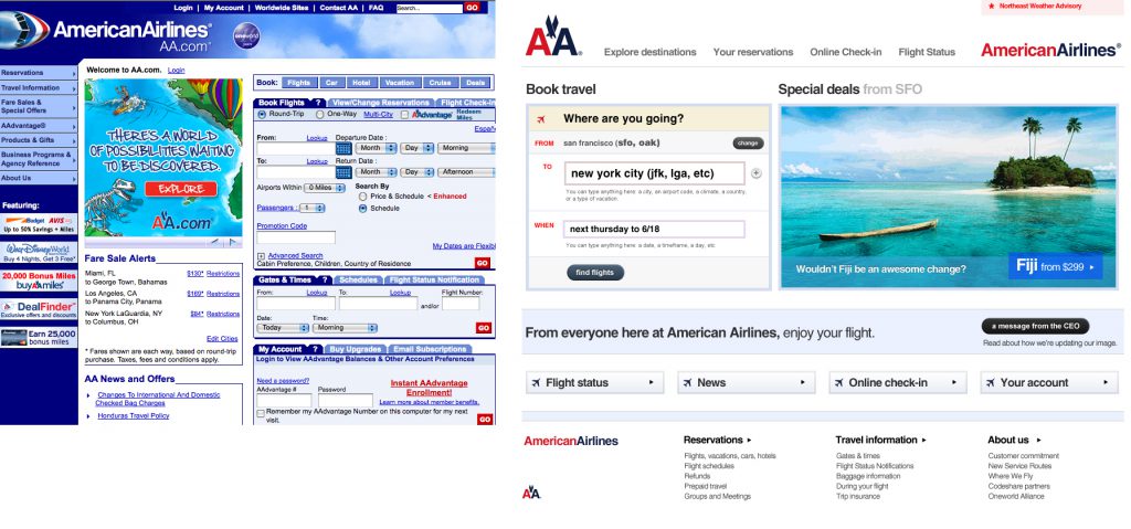
Frustrated with the overwhelming AmericanAirlines.com website, designer Dustin Curtis used the 80/20 rule to design his own easier-to-use version of the site. In his concept, only the elements used by 80% of visitors remain. Even an uncommon task like finding current airline news is easy despite its presence being limited to a text link.
Done effectively, the 80/20 rule ensures every element has a justified reason for its existence. By limiting design elements you prevent Hick’s Law from slowing down users and reduce selective disregard behaviors. There will be times where you’ll need to add design elements to make a page work effectively, be it navigation, content, or graphics, but always ensure you justify those additions with the 80/20 rule and your prioritized list of goals and tasks.
Conclusion
Executing truly minimalist design requires you embody the importance of the practice. Hick’s Law and selective disregard are scientifically validated principles, that demonstrate why removing elements actually makes a design more effective. Once you have the confidence to remove unnecessary elements you can use the 80/20 rule to identify what 20% of the elements relate back to the design objectives and will contribute to 80% of the desired results.