How To Design Using The Fibonacci Sequence
Not too long ago I posted an article that outlined ten laws to design by. I was ecstatic when the post received ample attention and fan fare. I might be a bit jaded, but I have grown very sick of the “fast food” list style design articles that seem to get so much attention these days. While this type of post is entertaining, it will hardly do anything push the design community. These posts tend to promote shallow design practices instead.
So I wanted to continue to talk about lesser known design principles. My hope is that it will both urge me to research and study the laws of design as well as remind others that there is more to design than gradients and shadows.
The Fibonacci Sequence is a great design concept to understand and integrate into your work.
What Is The Fibonacci Sequence?
Simply put the Fibonacci Sequence is a series of numbers with the pattern of each number being the sum of the previous two. So starting at zero the sequence would be as follows:
0, 1, 1, 2, 3, 5, 8, 13, 21, 34, 55, 89, 144…
The sequence could go on indefinitely. As you will notice it is a pretty simple principle and probably seems more rooted in mathematics than anything related to design. To see a list of the Fibaonacci numbers take a look at the article on wikipedia.
How Does It Apply to Design?
By itself it might seem like the Fibonacci sequence has everything to do with mathematics and nothing to do with design. It is just numbers, isn’t it? The sequence actually relates closely to design in a few key ways.
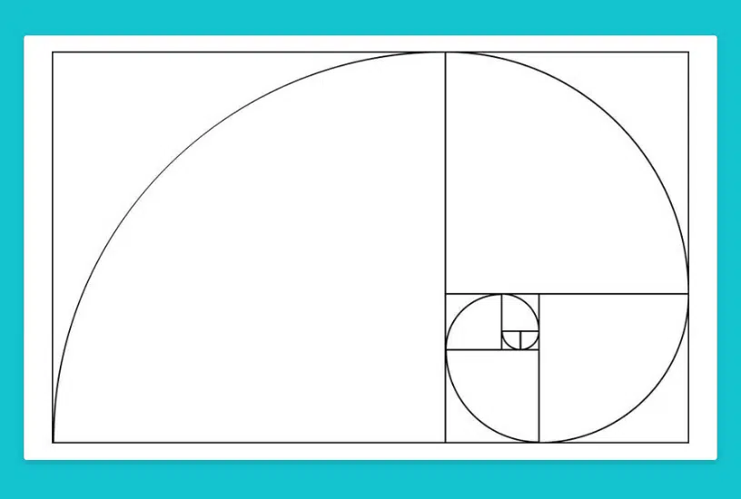
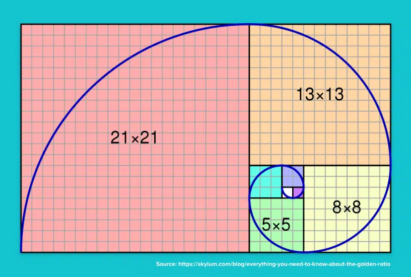
The first area of relevance is that the sequence is actually very close ratio to the Golden Ratio. If you are not familiar with the Golden Ratio I suggest reading up on it here. To describe the concept simply, the Golden Ratio is a design concept that is to create visually appealing proportions in art, architecture, design and even the human body all throughout history.
Secondly the sequence is commonly seen in nature. This pattern and sequence is found in branching of trees, flowering artichokes and arrangement of leaves on a stem to name a few. These seemingly random patterns in nature also are considered to have a strong aesthetic value to humans.
These elements aside there is a key element of design that the Fibonacci sequence helps address. This element is a concept that many designers ignore all together, regardless of their knowledge of the sequence.
Rational Spacing
It is easy to get blinded by the “sexier” components of design. Designers by nature are passionate people so it is only natural that color palettes, typeface choice and photography can excite and blind us. While these components are important elements of design, much of design is actually the management and division of space.
Spacing and the use of space is what holds a design together. Precise and effective space management can make the difference between an average design and an amazing one. Realize that every aspect of our design requires decisions on the usage of space. Everything from the width and height of various sections to the space between a heading and the paragraph text below it.
This can extend further by considering the proportions of our elements. How big is the header compared to the navigation bar? How wide is the photo compared to the sidebar? These ratios are what make or break the balance, emphasis and flow of a design.
Additionally whether we realize it or not we constantly are looking for order and understanding of the world around us. It is one of the traits that has helped our civilization advance at such a rapid pace. The seeking of order and understanding applies to our assessment of visual design as well. Our mind is constantly seeking some reason, pattern or rational for what we are seeing. This is especially true of spacing, sizing and proportions.
Many designers pick size and spacing arbitrarily or based on “instinct.” A 20px margin might seem reasonable and a 400px tall header look good. Now these sizes might not look bad, which is why so many designers can get away with this eyeball approach. But even though these sizing choices may look good to your eye, your brain is trying to find unity in those relationships. If that unity doesn’t exist it will always feel unpolished.
The Fibonacci Sequence is a method of bringing a sizing and spacing system into your designs. One based on a proven aesthetic appeal in design, architecture and nature.
How To Use It
If you look at the Fibonacci Sequence and consider them as possible section, margin and font sizing it should be clear that it can structure your entire design. The smaller range of the sequence (8, 13, 21, 34, 55) is perfect to decide margins, line heights and font sizes. The higher range of the sequence (144, 233, 377, 610, 987) can easily decide column widths and other section dimensions.
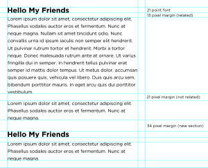
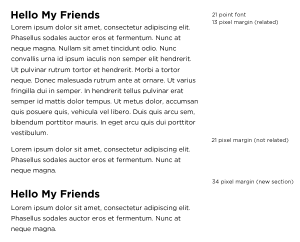
Using it simply one could set the font size for paragraph and heading text, in addition to the margins between them. This creates a rhythm and visual harmony in addition to the balanced and aesthetically pleasing proportions.
Take a look at the two example images. You should note that by intentionally selecting the margins and text size that the simple composition of feels balanced, legible and unified. This is because a system logical system is used to decide the sizing and proportions makes a dramatic impact on the overall composition.
The sequence can extend to every element in the design. The possibilities are endless, ranging from the size of primary sections (header, columns, footer, etc…) to the margin and text sizing.
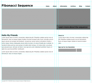
The example above fits with in a 1024 x 768 resolution and has all the sizes based on numbers in the sequence. Again you will notice that the overall composition feels balanced, has a strong sense of rhythm and visually feels aesthetically pleasing. Just the subtle use of the system makes a dramatic impact on a series of squares and text.
Give It A Try
I recommend taking an existing mock-up and try adjusting the sizing and spacing of elements to fit within the Fibonacci Sequence and see how it compares to the original. We’ve tested this effect a handful of times at our web design agency and found clients often prefer the example with Fibonacci-based proportions over more standard conventions.
FREE TOOL: OPTIMIZE YOUR SITE
Grade Your Entire Website in Seconds
Submit your website link and get a detailed report on how you can improve page performance, SEO optimization, mobile usability, and more.