- User Experience
- Web Design
- Updated 08/19/2025
Fight or Flight: Which Emotion Does Your Website Evoke?
Summarize this post
Are you a logical individual? Do you carefully consider all options before making a decision? Are opinions shaped primarily through facts and reasoning? If you answered yes to these questions, you’d be wrong.
We are all emotional beings, and our emotions are the root cause of our thoughts and behaviors. Our logical, conscious thoughts simply tell ourselves a story about why we acted the way we did.
I won’t go too deep into this subject, if you want to learn more read Thinking Fast and Slow by Daniel Kahneman. What’s most relevant is that emotions do influence and drive behavior, especially online.
Why emotion is important
As I mentioned earlier, much of our behavior is unknowingly driven by subconscious emotions including how we behave on websites. Deciding to fill out a lead form, purchase a product, make a donation, or download your eBook will ultimately be an emotional decision, not a logical one.
Recall the last time you filled out an email capture form to download a digital resource. You probably knew this meant getting put on someones email list, but you did it anyways. Why?
At that moment, despite considering the known risks and the perceived reward, your decision probably came down to a feeling. Does this feel like something I should do? Sure, you might have logically considered the factors, but the action was driven by how you felt.
If you want your website to fulfill it’s reason for existing, you need to put users in the right emotional state of mind.
There are three levels of emotion response that you can tap into to this end. Let’s dive into each level deeper.
Levels of emotion
In his book Emotional Design author Don Normand covers the three types of emotional reactions:
- Visceral
- Behavioral
- Reflective
Starting from visceral reactions, each level of emotion cited becomes more conscious, slower to occur, and less influential. Let’s discuss each level in more detail.
Visceral
Visceral reactions occur almost instantaneously and are completely subconscious. They occur in your central nervous system and communicate with your whole body, including your conscious brain.
Ever react before you even realized what was happening? Shielding yourself from an oncoming object or jumping out of the way for example. That was a visceral reaction keeping you safe because your conscious brain was too slow to do the job.
Ever see something that turns your stomach, causes goose bumps or gives you an unsettling feeling? Also a visceral reaction.
Visceral reactions can be boiled down into fight or flight. Your body is constantly scanning to determine if a given situation increases chance of survival or passing genetics, or decreases it?
Our subconscious doesn’t know how safe modern life is and still interprets the world as if danger is looming around every corner.
This often happens on a micro level, where we frequently perceive small threats which in turn raises our natural defense mechanisms. This leads to low level apprehension, anxiety and worry. This even happens on your website and can be the difference between action and in-action.
On the flip side when an environment (or website) feels safe, our guard is lowered, we’re more creative and open minded. Users who trust a website on a visceral are much more likely to convert.
Behavioral
Behavioral reactions occur in response to taking action. This is the satisfaction you get from feeling smart, efficient, having done something skilled or mastering a task.
Behavioral emotions are semi-conscious and slower than visceral reactions.
Outside of the digital world, this could be felt after crossing off items from your to-do list, playing a skilled game of tennis, or cooking for your family or loved ones.
This same positive feeling occurs when you’ve accomplished a key task on a website. Potentially even feeling like you’ve made progress. For example finding a promising vacation rental or finding informative reviews on a product you’re considering.
The key is to minimize effort and friction throughout the user journey. As the user navigates your site, if they feel they’re making the right decisions, clicking on the right links, and making good progress it will generate a sense of satisfaction along the way and encourage them to keep going.
Reflective
Reflective emotions are completely conscious and the slowest of the three. Common reflective emotions are the feeling of nostalgia or deriving meaning from a product or brand.
Some brands lean heavily on reflective emotions to build community with their audience. We all desire to be a part of something bigger, which is another survival technique. Brands like Tom’s use this innate desire to make buying shoes more than just buying shoes… you’re making an impact.
I will note that we often mistake visceral emotions for reflective emotions. The clothing you saw and had to buy was much more likely your visceral brain resonating with the aesthetic qualities than your reflective brains explanation about how that style was so “you.”
Each level of emotion plays a factor in how users behave on your website, but there is more to consider. In addition to the level of emotion we want to illicit, we must also consider the type.
Possible emotions
Over the years behavioral psychologist have reduced the number of emotions humans experience into four distinct categories. While emotions are very nuanced, every emotion is derived from:
- Happiness
- Sadness
- Fear / surprise
- Anger / disgust
Happiness
Happiness is the most common emotion to target. Someone who is happy is much more likely to take risks, put in effort, and overcome challenges.
In this category we’d also include hope, excitement, and relief. If we can make users feel optimistic that our solution will solve their problem, they will feel excited and are much more likely to purchase or reach out.
On a visceral level, this can be accomplished by creating a safe feeling “environment.” For example a clean, open and professionally executed design with warm colors, ample whitespace, clear organization and information hierarchy.
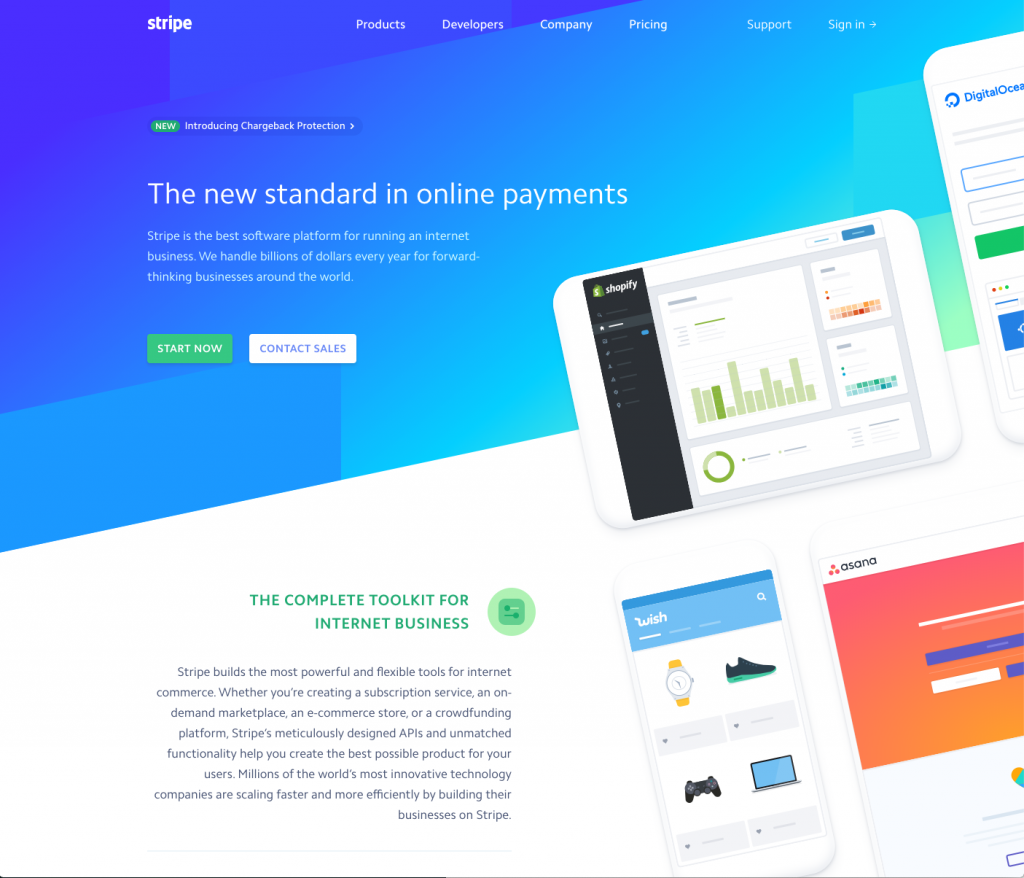
On a behavioral level you can minimize the amount of friction required to find information and complete desired actions. This will create a feeling of satisfaction.
On a reflective level, infuse meaning into your offering. Articulate how this is an opportunity to be a part of something important, bigger than a single individual. Alternatively, use nostalgia and include triggers for common happy events like holidays, family, and childhood.
Sadness
There are times where sorrow is effective in influencing action. Typically these are already serious and sad situations. Non-profits and political campaigns might address tragic events.
From a visceral perspective the design should be somber, cold, even a touch dark. Vivid imagery of people who look sad will trigger the empathetic and mirroring portion of the brain and draw users into a similar emotional state.
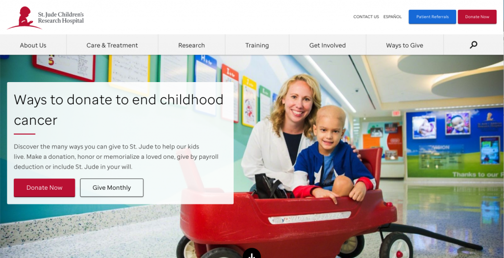
On a reflective level you can again tap into meaning and cause. This is an opportunity to help, to redeem yourself, or to be a part of something bigger than yourself.
Fear / Surprise
Even though fear is often an unpleasant emotion, it’s extremely effective in inspiring action. The most commonly used tactic is loss aversion. We’re naturally wired to be more protective over losing what we have, than pursuing something beneficial and new.
A sense of danger will also raise our self defenses, and if you sell a product or service that deals with security or protection this could be a good thing. For example home security, cyber security, personal protection, insurance, etc…
On a visceral level you’ll want the design to be dark and cramped. You can use visual tension to intentionally make the user uncomfortable. Elements that are too close together, difficult to make out imagery, these are all techniques that will mirror an unsafe environment and make the user unease.
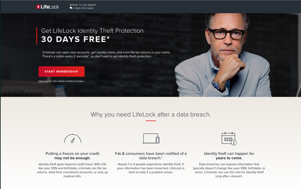
On a reflective level speak to what they risk losing. What will they lose if they don’t act? It’s not buying peace of mind, it’s what will happen if they don’t act.
Anger / Disgust
Anger is a powerful emotion, and while negative, it is extremely effective in inspiring action. It’s also a risky emotion to illicit, as it can feel manipulative and ultimately backfire.
That said, there are times where you want users to feel so angry or disgusted they can’t leave your website without acting. Similar to sadness, non-profits, activists groups, and political campaigns often use this technique to shock people out of complacency. If you’re dealing with a serious subject that requires massive action like global warming, happiness simply isn’t going to work.
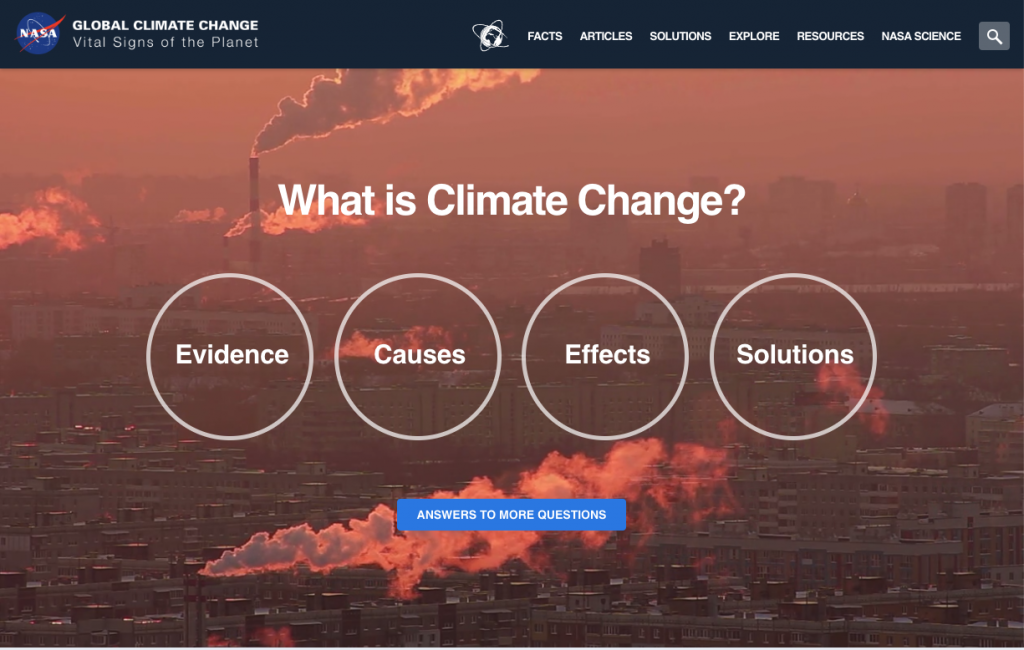
On visceral level you’ll want to use vivid, hot colors. Use of strong contrasting elements will shock the users senses. Similar to fear, visual tension will make them feel uncomfortable. From a reflective standpoint, infuse meaning, speak to the fear of loss, treat the subject matter as an active threat.
So is it fight or flight?
Consider your current website. What emotions is it likely triggering? Or is it not triggering any? Happiness, sadness, fear or anger… there is no right emotion to rely on. It will ultimately depend on your target audience, their journey, and what resonates with them most.
Emotion will be what makes them act or leave, so it’s critical that you find out which emotion best suites your situation and work to trigger it.