An overwhelming majority of websites incorporate the “hero image” design pattern. This is where a large, visually impactful image is used at the top of the page along with key messaging to emotionally engage the target audience.
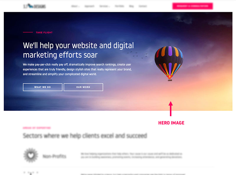
As one of the first elements one sees, the actual imagery used is often subject of attention during the design process. I’ve personally attended meetings solely discussing various different options and approaches.
I must confess, even though I understand the impact of visual stimuli and how it effects our subconscious and actions, I’ve questioned if these debates are worthwhile. How much of a difference can one image make over another?
Recently, we had an opportunity to find out.
The Situation
Late 2017 we launched the redesign of a long term clients website. During this process there was much debate about the hero image on the homepage. The group eventually decided to launch the site as is with the intent of revisiting the imagery at a later date.
After launch, we explored a wide range of design options. Exploring not just the imagery itself but overall strategy, layout, and messaging. We started with a dozen or so rough concepts and iterated on the strongest ones until we had narrowed the options down to three.
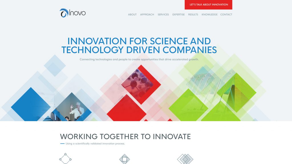
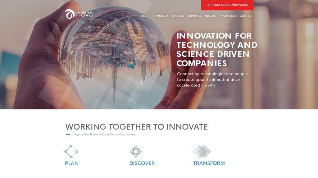
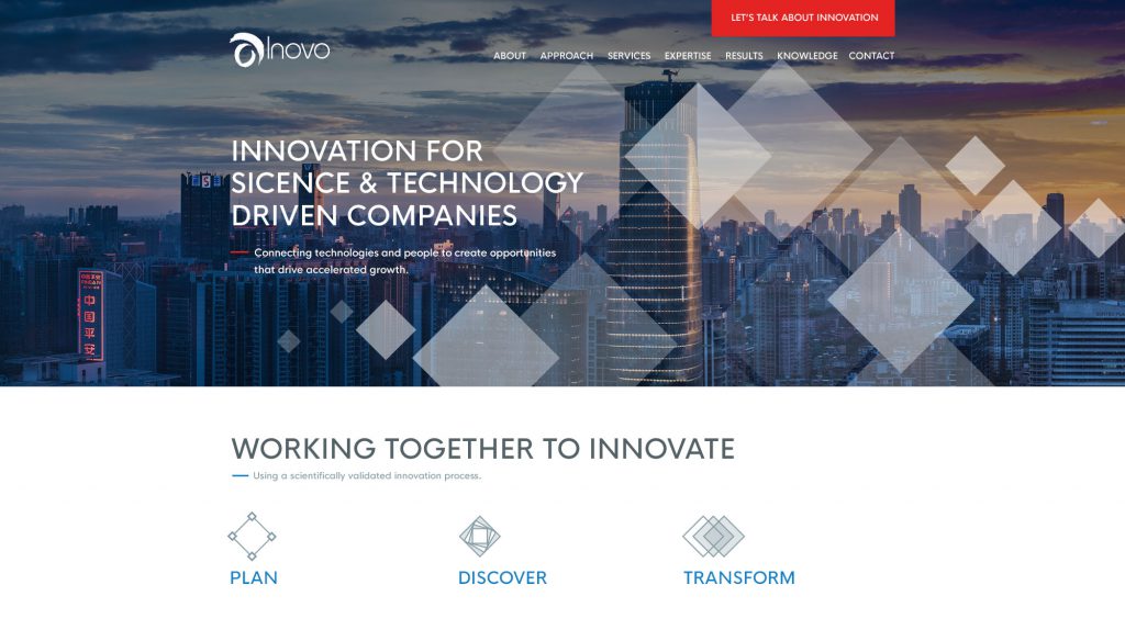
While everyone had their favorite, we all agreed that any one of the concepts could work. Being a forward thinking and innovative company, our client agreed to run a test to see if there was any measurable performance difference between the three.
The Test
To minimize the number of variables we only changed the image itself. Messaging, content and all other elements remained unchanged.
We decided to measure performance through engagement metrics, because this client deals with low volume, but high value leads. It could take years to get enough conversion data to justify one image over another. Specifically we measured:
- Average page view per session
- Average time on site per session
- Bounce rate
The experiment ran for 53 days for a total of 1,382 sessions.
The Results
To our surprise, we saw a significant difference in engagement based on which hero image was displayed.
The clear winner was:

With the following stats:
- Users who saw the winning image consumed 26% more pages compared to the baseline. The runner up (shards) consumer 9% more.
- Users stayed on the site 43% longer with the winner compared to the baseline. The runner up (shards) was a 9% improvement.
- Bounce rate was unaffected.
What this means
This is compelling proof that imagery influences the behavior of users on your website. While I don’t think anyone would dispute that, I suspect like me, we all have trouble quantifying it. This is evidence of how much impact it can make. One image on the homepage meant nearly 50% more time spent on the site.
Imagery is a significant component of the overall visual tone and we can extrapolate that the other contributing elements like color, shape, typography, etc… will have the same effect on user behavior. Meaning, the same website, with the same layout, but a completely different visual tone will perform significantly different as well.
The key here is to accept you won’t know the best approach without testing. While you may have had a “hunch” on which image would perform best and might have some justification as to why, I’d argue you’re thinking with hindsight bias and future guesses would be just that… guesses.
Tools like Google Optimize make it extremely easy to run tests such as these and will give you real world data on what type of look and feel your audience resonates with. Over time you could likely double if not triple how effective a given website is, simply by testing changes and applying what you learn to the rest of the design.
It should become a normal part of any iterative design process.
FREE TOOL: OPTIMIZE YOUR SITE
Grade Your Entire Website in Seconds
Submit your website link and get a detailed report on how you can improve page performance, SEO optimization, mobile usability, and more.