
- User Experience
- Web Design
- Updated 01/04/2022
Re-Prioritizing Usability
Everyone agrees usability is important. Yet every day unusable websites find their way online. It isn’t a matter of professional versus amateur designers, as both parties violate usability principles. There is a deeper, more complicated problem.
I see two common causes for usability blunders:
- Informed designers don’t have enough strong enough arguments to talk management out of bad ideas.
- Designers underestimate the impact of their decisions and the repercussions of usability issues.
To illustrate how seemingly small usability issues lead to website failures, lets walk through a recent real-life scenario:
Unintentionally unusable
My family always looks to me, someone who works in “technology,” anytime they have to make a purchase. Years ago when my mom needed a new cell phone she asked my advice. My subsequent attempt to research phones lead to an experience depicting how usability can make or break a website.
With agreed-upon requirements in hand I logically started by looking at the websites of various phone manufactures. The first was Motorola. The Motorola website boasts a professional, credible, technology focused design. At first glance there was no reason for concern. Oddly enough there was no indication of anything related to a cellphone on any of the initial pages I browsed. Strike one. Instead I was forced to choose to between two high-level, generic selections: “mobility” and “solutions.”
Now, I’m a pretty “tech savvy” guy; I can tell you “mobility” is a goofy way to describe “mobile,” but what about people who aren’t? Even as a web designer who is constantly on his phone the use of jargon was confusing enough to give me pause and scratch my head. Strike two.
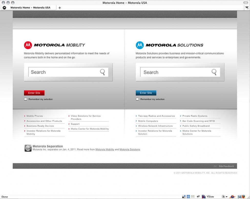
Someone had the common sense to include content describing the sections below each headline; however, undecipherable marketing copy was used instead of plain English. The mobility section description read, “mobility delivers personalized information to meet the needs of consumers both in the home and on the go,” and solutions was described, “solutions provides business and mission-critical communications and products and services to enterprises and governments.” Since I wasn’t looking for an enterprise or government solution, “mobility” won, but only by default. Forcing a user to make navigation decisions by exclusion (mentally sorting what doesn’t fit, leaving one or two options that might) is a hallmark of bad design. Strike three.
The experience improved slightly from this point forward, but overall the site was plagued with usability issues.
My experience I ran into several other stumbling blocks including:
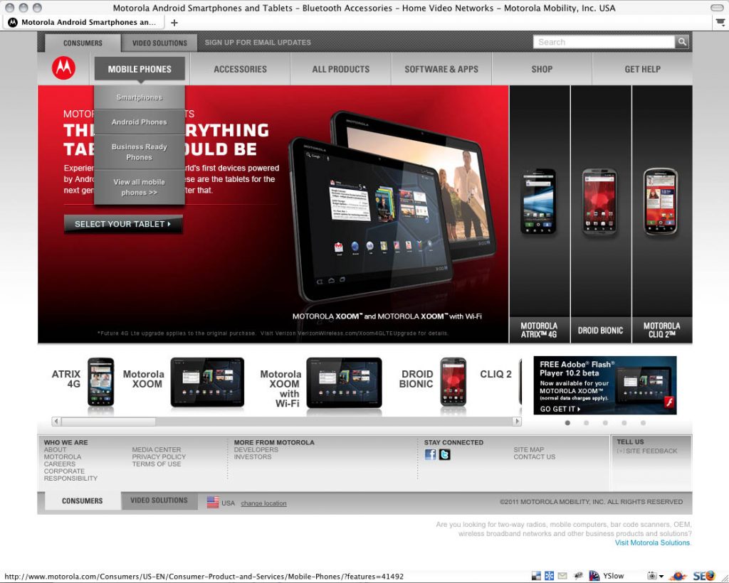
- Generic navigation labels, including “Smart phones, Android phones, and Business Ready Phones.” (Aren’t Androids a type of smartphone that could be used for business?)
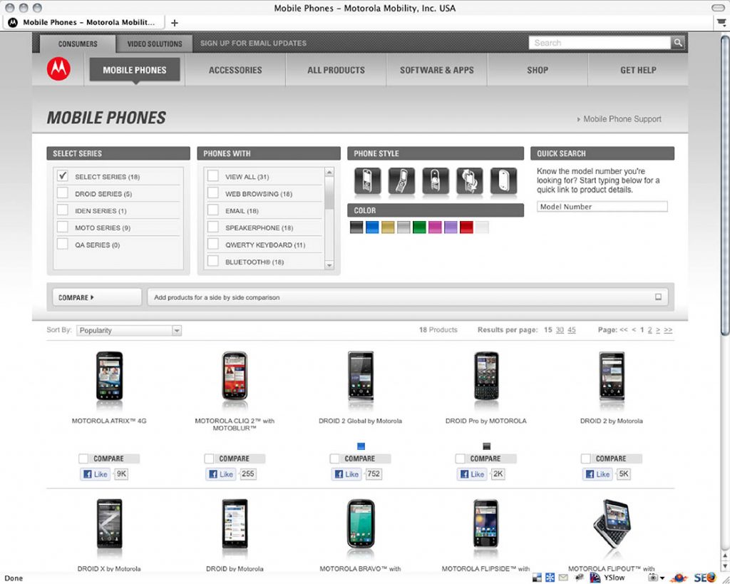
- No method of viewing basic device details beyond clicking each one. Educating myself becomes a tedious trial-and-error process.
- Heavy use of jargon and technological terms rather than product benefits in plain English.
Eventually I gave up on the Motorola brand. We settled on another manufacturer based on the information provided on their website; it allowed me to make an informed, educated choice between models. In the end, my Mom got a cell phone that met her needs, and I was reminded just how important usability is to web design.
Empathizing with the user struggle
Users are constantly faced with bad website experiences. If a designer like myself struggles with design usability, consider how frustrating the same process might be for an average user. Where savvy users are typically comfortable guessing their way through a site, average users just get fed up and leave. In fact, many users are afraid of computers, especially when it comes to the perception of possibly making a mistake. When they encounter an unsure situation, they give up rather than guess.
Poor usability can cause a user to buy from a competitor–the opposite objective of the website.
At best, a user that gives up is a lost opportunity. At worst, the user buys from a competing website.
To design a usable site you must first understand what usability is. In my opinion, the term “usability” is too loosely defined. It’s often used to describe every aspect of website interaction. For example, usability expert Jakob Neilsen’s defines usability as: “… a quality attribute that assesses how easy user interfaces are to use.”
While I completely agree with the message behind Jakob’s definition, utilizing design layers requires a more specific approach. “Easy to use” is too broad a concept. I define usability as
“how successful a user is in accomplishing their tasks when using a designed object.”
The design layers deal with “ease of use” in two parts:
- Usability–how successful a user is in accomplishing goals.
- Proficiency–how productive they are as a result.
Many usability errors are made with the best intentions. It’s easy to start with usability in mind, only to make compromises along the way. For example, if you’re designing a site with a twelve-item menu you may think a vertical navigation is the most usable approach. Later, you change your mind and decide a horizontal navigation is more aesthetically pleasing. It’s a minor compromise; you just need to condense the navigation. The usability implications of fewer navigational options are small, but it probably won’t be the last compromise. Later you decide to:
- Remove area specific navigation because it looked cluttered
- Add decorative graphics to “spice up” a text heavy page
- Increase the banner size because it proportionately looked better
- Add parallax animation to the banner because it makes the design more exciting
The end result wouldn’t be a horribly unusable site, but it won’t be particularly usable either.
The problem is this: user allowance for frustration is highly misjudged by designers. You might assume a compromise would only cause a slow down or a moment of confusion, but it could just as likely cause a user to leave completely.
The web is a tool. There are many ways to make a site dazzle, but they’re detrimental if users just want to get something done. The neatest looking hammer in the world wouldn’t be a useful tool if you couldn’t figure out how to use it.
Usable websites are a product of prioritizing usability and having the right mindset when doing so. The mindset boiled down to a single word would be “obvious.” People take time out of their busy lives to visit a website because they want to accomplish something. It’s a designer’s job to make it obvious how to do so.
In the example presented earlier in this post, I was tasked with finding a phone that fit my mother’s needs. Had there been obvious methods of comparing phones on the Motorola website I could have easily found the right device. Instead I was forced to play a guessing game in hopes I would stumble across the right one. Finding a phone was not obvious.
With regards to priority, other aspects of the site like aesthetics or “wow factor” may seem more important — especially in the eyes of the stakeholder — but the truth of the matter is usability must be your primary design focus. Put another way, while all aspects of higher design layers are important, usability ultimately trumps them all.
Website and user success are synonymous
Many designers fall into the trap of putting their own and/or stakeholders needs before the user. The typical end result is a website that’s hard to navigate or fails to provide the user with the information they’re seeking. This ultimately produces frustration, and lost opportunities. Users go somewhere else. Sales are lost. This is shortsighted, as the website owners only benefit when their users find what brought them to the site in the first place.
I’m not advocating you ignore client needs–they justify the existence of the site; however, it’s important to understand that reaching those goals is actually dependent on the users. Websites are successful when user actions ultimately fulfill stakeholder goals. For example:
- Lead generation sites are successful when people fill out contact forms.
- E-commerce sites are successful when people purchase.
- Awareness sites are successful when people read the content.
Those who use the site determine its success. You are not in control–they are. Ignoring this important fact results in a power struggle between design ideals and user needs, which in the end is ineffective for both parties. Forcing users to do what you want will ultimately backfire making them angry or frustrated. Angry or frustrated users are unlikely to return. Examples include:
- Hiding important information so users have to browse through more of the site.
- Not only disabling outbound links but also preventing them from being selectable.
- Not making it obvious how to remove items from a shopping cart.
Ethics aside, the above attempts at control might convey a sense of “success,” but only if you blindly ignore the obvious. Competing websites are readily available for almost any user-perceived need you can think of. Unless you have a completely captive audience (those do exist), manipulation causes users to seek alternatives because they begin to doubt themselves. Even if you do have a captive audience, you’ll be more successful by empathizing with them rather than disrespecting them.
Prioritizing usability
User needs and wants typically trump all other design decisions. Designing for you or your client’s preferences might result in a site that impresses you, but it won’t impress the user. It’s hard to ignore your own opinion (or the opinions of the people paying you), but do everything in your power to keep the following forefront in your mind and communicate this to your client: only the user’s experience matters. Design to their needs.
At the root of ignored user needs is a misunderstanding of usability itself. Rather than viewing it as an investment it’s perceived as a form of karma. I once heard a stakeholder remark, “a great experience would be nice, but we’re trying to make money here.” The underlying implication of this statement was usability had no impact on revenue. Usability absolutely is an investment; it directly affects both revenue and expenses.