
Author
Psychology of Beautiful Web Design
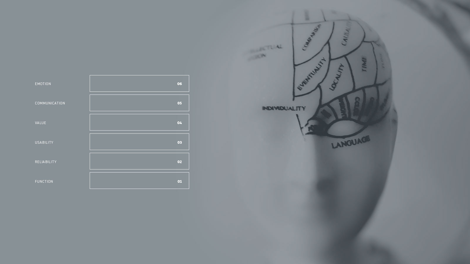
If you’re a frequent reader of this blog you might have noticed I can be critical of visual design. The underlying implication that visuals received a disproportionate amount of attention during the initial stages of page layout and construction. A qualification is now in order: Visuals don’t make a design great, but they’re an essential ingredient. Read that again, carefully. Essential ingredient. All successful systems contain a fixed set of essentials. Without these essentials, the system fails — in one form or another.
Successful web design is all about providing the user with an invisible framework of essentials, wrapped in a package that communicates the right message in a visually appealing way. The average reader will probably not know or even care that you used a centuries-old proportioning rule to layout the page they’re viewing. They just know it looks trustworthy and aesthetically pleasing. On the other hand, if you use a non-harmonious color scheme, the reader will immediately sense this and, without reading a word of content, make a series of assumptions about the site they’re on.
Put another way, good design seamlessly hides the underlying framework from the user in a way that gives the site an aesthetically appealing personality. Ideally, the user doesn’t even know why it’s appealing or even usable — it just is; it just works.
Why Humans Respond to Aesthetic Qualities
Human beings assess, judge, and interact with the world around them based on how things look. Those judgments typically take place on an unconscious level, almost instantly. Not only are we naturally drawn to aesthetically pleasing things, we make snap judgements about what we see based on looks alone.
Visually pleasing websites have the ability to peak the users interest, grab their attention, and create a desire to interact with objects on the page. Conversely, sites that are visually disruptive are a burden to engage with, regardless of how useful or important they may be. Users reject what they see, often without knowing why. They go somewhere else.
Creating functional, attractive, visually appealing design isn’t easy; if it were, everyone would be a design professional. Those that do choose the profession are, generally speaking, bright, intelligent, and enthusiastic individuals. So why is it so many designers struggle to consistently deliver attractive, usable designs? I believe the core reason is a fundamental misunderstanding of how humans perceive and assess beauty. We romanticize the creation of beautiful objects, attributing it to a skill born out of genius, creativity, and eccentricity. Yet beauty isn’t random, there is a psychology to it. Therefor creating beauty in a deterministic way requires an understanding of how humans process and react to sensory information.
Evolutionary Responses
Despite our claims of superiority and advancement over other members of the animal kingdom, humans remain at the mercy of the genetics that shaped our evolution. We assess and act on visual stimuli long before our cognitive abilities have a chance to intercede. While the basic “flight or fight” response has evolved over time, we’re still startled by unknown patterns that jump onto our visual map and react accordingly. Generally speaking, humans react in a predictable way to visual stimuli. If you understand how people react to visuals, you can intentionally create positive reactions.
Don Normand, in his book “Emotional Design“, describes these reactions as “visceral behavior”. Visceral behavior is rooted in the central nervous system and is unintentional and often unnoticed. The nervous system makes fast assessments about whether something is “good” or “bad” to aid decision making. Survival was once dependent on the speed of decisions. Reactions needed to occur without conscious thought, because conscious thought was too slow to avoid danger.
These reactions are not just psychological. A visceral reaction will often cause physical reactions as well. The nervous system controls almost all body functions. When placed in a threatening situation you naturally enter into a defensive state. The heart rate increases, muscles constrict and you perspire. Interestingly enough, when overwhelmed with the color red people have been shown to exhibit similar symptoms including raised pulse and altered time perception. The Power of Color (Avery, 1990), author Morton Walker describes how “Baker-Miller Pink”, a color that is close to the shade of bubble gum, has a subduing power. It seems the color has a short term tranquilizing effect that suppresses aggression and anxiety. It’s so effective that jail cells are painted that color to calm down angry prisoners. Walker goes on to say, “Even if a person tries to be angry or aggressive in the presence of pink, he can’t. The heart muscles can’t race fast enough.”
Natural instincts still drive our normal behavior. This certainly is the case when interacting with visual design. The feeling you get while looking at a design — good or bad — is first determined by a visceral reaction, not conscious thought.
Reactions to design are not entirely visceral, they just happen first. Through evolution we have developed self-awareness. We can now rationalize and interpret what we see on a conscious level. After a visceral reaction, design is further assessed cognitively.
Conscious Reflection
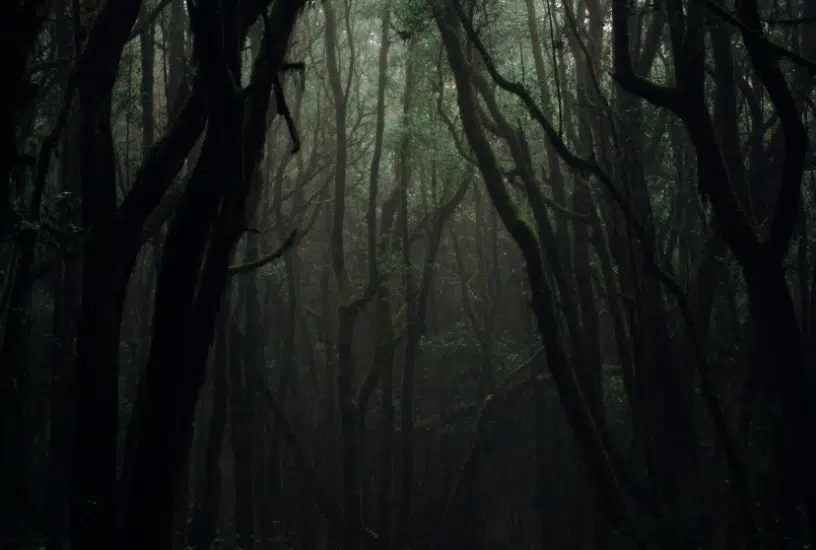
Everything a users sees is interpreted for meaning on some level. Not only will they unconsciously react to what the see (viscerally), they will analyze it using any associations the visual triggers. For example, a user seeing a rustic wooded background may associate that visual with a cabin they frequented in their youth. If the cabin was isolated in the middle of the woods, they will associate your design with isolation. If the background is decorative, you unknowingly altered the users perception of the site. Of course a user could have an opposite association, if their cabin experience included a large extended family the wood texture would give the user a sense of social bonding and family.
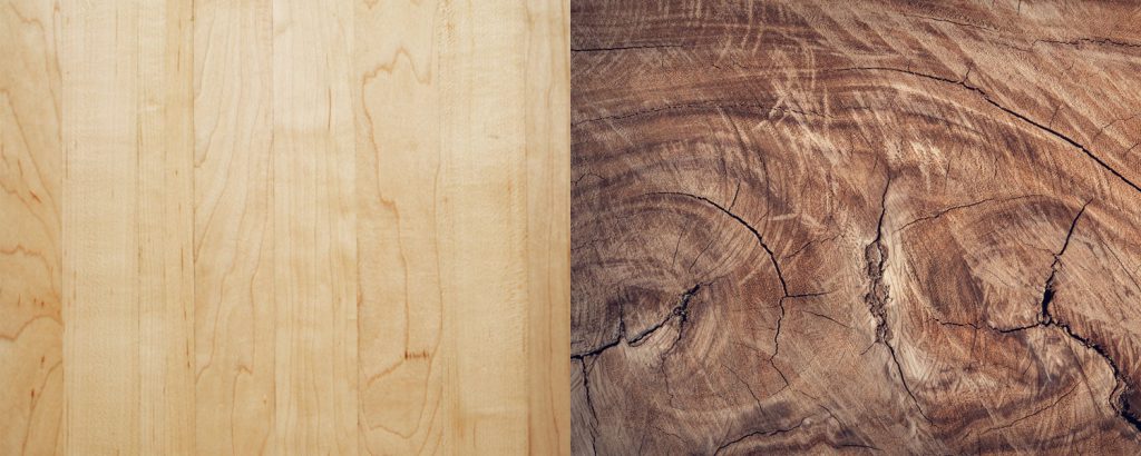
Exploring this concept further, consider how a rich mahogany background might be interpreted compared to birch. The mahogany may remind a user of a fancy desk their previous boss once had. In which case may associate the texture with power, sophistication and class.
Of course you can’t expect to predict the life story of every user who visits your site (and I am not suggesting you try.) The point is users will interpret every pixel you place on a page and assign meaning to it. Not only does this mean you need to intentionally design everything, you must be very careful about it as well.
On an episode of the Polymorphic podcast, author and designer Luke Wroblewski described a designer’s skill evolving by initially adding elements that conveyed the right meaning. He went on to explain that as designers improve they reach a point where their focus shifts and they think about the minimum amount of elements that can be used to convey that same meaning. Some designers continue to add unnecessary elements because they are worried they haven’t done enough to communicate the intended style. What they don’t realize is by they are actually adding distractions and creating more opportunities for undesired associations.
I was reminded of this when working on a project for a home-based education program. The clients had expressed that one of the benefits of using their system was the ability to shape one’s curriculum based on the student’s individual interests. One compelling example was a student who learned science by relating it to their hobby of surfing. Inspired by this, I included a surfer as a focal point of the design. I associate surfing with the sun, beach, excitement, and sports. To my surprise, it turned out the target audience consisted of older moms. They grew up when surfing was largely a counterculture characterized by drugs and vagabonds. Obviously, this wasn’t the message we wanted to communicate and I had to revisit my approach.

Because users will find meaning in your design you should do everything you can to ensure they find the right meaning. This is true of all visual design, but specific aspects of design interpretation apply directly to the web.
Final Thoughts
Think of visual design as icing on a cake. The icing is often the first aspect of a cake that you see. Your initial reaction will probably be a visceral one; Generally speaking food triggers survival instincts. As some of the visual data is passed into working memory for reflection, you consciously (or unconsciously) make a series of judgments. They might include what you think it will taste like, how much it will cost and whether you want a piece or not. These judgments are made based on prior knowledge and experience with cakes. Upon biting into the cake your judgments and expectations are either validated or invalidated.
Oddly enough, the cake experience described above is very similar to seeing a website for the first time. With in seconds of seeing a design you have an automatic, subconscious reaction followed by a series of reflective judgments.
And while a cake is more than frosting, a website is more than the visuals. Just as you would be upset biting into a cake that looks like chocolate but tastes like key lime, users are upset when they come across a website that sets an expectation that is later broken. Visual design must set the right expectations by communicating the right message.
The message is initially communicated by how the page is arranged, or better yet organized. Afterward, the size, proportion and placement of an element tells the user how important it is. Because organization and structure is the first line of communication, it is logical to design the layout first.