Website Navigation Design Paterns
When creating a new website, it’s important to consider how visitors will be able to navigate from page to page. There are many different formats (patterns) you can utilize. You can even create your own unique combination of a number of different options. So whether you opt for a basic navigation bar at the top of the homepage or a more complex system, it’s important to consider the choices available to you and find the one(s) that best fit with your website and needs. Here are common conventions you should consider.
Utility Navigation

Utility navigation usually consists of a list of secondary actions or tools that allow users to interact with your site in some way, like follow, sign up, log in, subscribe, share, change view, print, save, and contact. This type of navigation should be located where people expect and need them, as these activities can make a major impact on visitor satisfaction and engagement.
Body Navigation

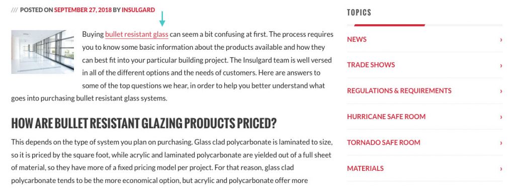
The body of your website is where most of your content lives and probably where most of your visitors’ attention will go. So you can include links to your most popular pages, posts, and actions in this section of your site, especially if it’s where you really want to direct people. These are often included as text links, which can be especially useful if you’re describing a concept or idea that could benefit from deeper context around it. So if people are interested in said topic, this can give them a path toward the information they’re looking for.
Primary Navigation
Primary navigation is a navigation bar that includes your important pages or content that most users are interested in. If you sell products, then it would probably include the categories that people want to shop. If you have a blog, it would probably be different categories of content for people to browse. This navigation bar is usually located near the top of the page and should be one of the first things that people see on any website. It should also include minimal options so as not to overwhelm visitors, ideally less than 10 items.
Secondary Navigation
Secondary navigation is, as the name suggests, for content that is usually of secondary interest to users. So in the case of an ecommerce site, it would be those pages that don’t include actual products but might still be of interest to customers, like your return policy or FAQs. For a blog, it would probably include an about page or media kit. This section should also be easy to find, but not as prominent on the page as the primary navigation.
Local Navigation
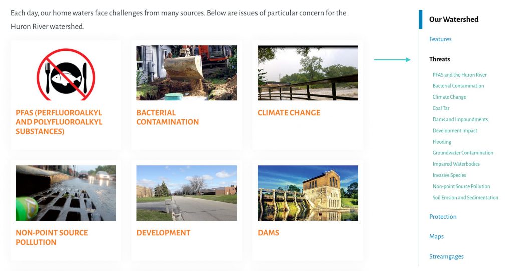
Local navigation is a more specialized option that is only included on a particular web page, rather than the site as a whole. So it should represent a smaller subset of content that visitors to that particular page are likely to be interested in. For example, a clothing company that sells clothes for both men and women could have a page just for women that shoppers can then use to find the particular product categories they’re looking for.
Calls to Action

Calls to action can be included in basically any section of your website or on specific pages. They should call attention to specific actions you want visitors to take. This could include links to complete purchases, subscribe to a newsletter, or follow your brand on social media.
Related Content

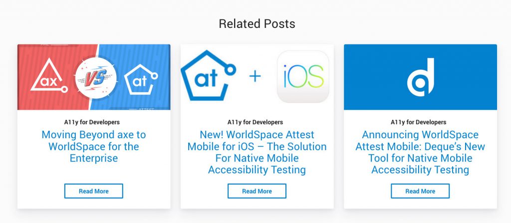
To keep people engaged with the content on your website, it can help to continually show them the posts or pages that are likely to be most relevant to them. Related content is a strategy that is often employed on blogs and content-based sites. It often appears at the bottom of a specific post or page as a list of other posts or pages that are closely related in some way. It can also appear on a product based site, offering suggestions for similar or complementary products.
Tags

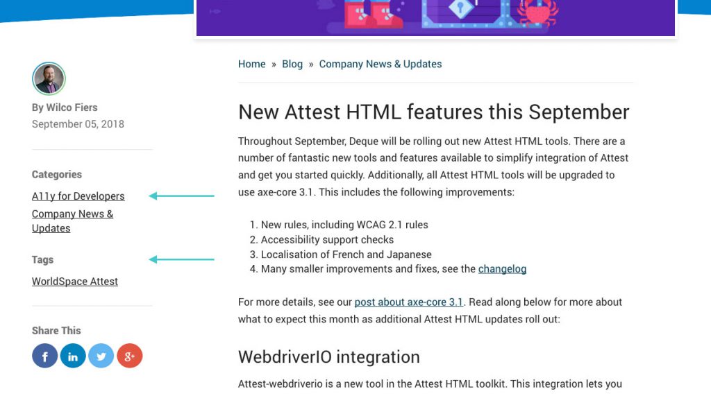
Another format that is common in blogs and similar sites, tags allow you to create clickable links that take you to other posts with that same tag. Say you have a site about digital marketing. You could add the tag “social media” to any pages that fall within that topic. So when someone reads that post and then wants to see others on that subject, they can click the tag to see more.
Categories
Categories are similar to tags in that you can add the distinction to different posts and pages on your site. However, each specific piece of content usually only goes into one category, but can have many tags. So it’s just a more defined type of separation between content. Additionally, categories can be hierarchical with child/parent relationships, whereas tags are flat and do not offer those types of relationships. So with categories, you can essentially place content into specific categories and then place those categories into more general ones, allowing more direction for visitors to navigate.

