
- WordPress
- Updated 09/19/2024
Optimizing WordPress for Google PageSpeed Insights – Advanced Techniques
Speed is important. Users expect fast loading websites, and Google considers page performance as a ranking factor. Google Pagespeed or Lighthouse insights have received more attention over the years, especially now that Google has identified what they call “Core Web Vitals” as a future ranking signal.
Unlike other tools, Pagespeed and the Core Web Vitals measure more than how long it takes for your page to load. Rather they also measure perceived performance, the experience of the page load, and how long it takes before the page is interactive.
Optimizing for Pagespeed can be difficult. Despite the friendly advice output by the testing tools, it’s rarely clear what should be done and what will actually make a difference.
While there are a lot of general articles about this subject, we wanted to take a deeper dive and discuss from a development perspective how you can significantly improve your metrics.
This article won’t cover the basics like use appropriately sized images, be-careful with how many plugins you have installed, etc…
Thank you to Climb Marketing for providing insight and guidance on these metrics, we highly recommend you check out their excellent video discussing the core web vitals in more detail.
Before we get started, let’s briefly discuss pagespeed reports and what you should be focused on.
What’s actually important?
The Pagespeed report spews out a half dozen metrics, a total score, and some recommendations. While it’s easy to focus on the total score, that score is a vanity metric. It isn’t considered by your search rankings and you can have a low score despite a relatively zippy page.
Second, unless your site receives a significant amount of traffic, you’re probably seeing “lab data” rather than “field data.”
Lab data is gather via simulation, meaning when you run the report Google simulates page loads on mobile and desktop and gives you results. Google’s algorithm doesn’t consider lab data, it only looks at field data. Field data is collected from actual users hitting your site. Unless your audience is on slower connections and older devices, chances are your site will perform better in the field than in the lab. So take the numbers with a grain of salt.
The moral of the story is it’s not worth agonizing over the score or specific numbers, rather implement all the optimizations you realistically can and look for the relative difference.
When you are focusing on numbers, pay particular attention to the core web vitals which Google has grouped as:
- Cumulative Layout Shift
- First Input Delay
- Largest Contentful Paint
Cumulative Layout Shift
Cumulative Layout Shift (CLS) is a measurement of how much the layout shifts as the page loads. This can be impacted by pop-up messages (cookie notices) or elements that as they load push other elements around on the page.
A common example I see is the logo when it loads might expand the header and push the hero image further down the page.
Largest Contentful Paint
Largest Contentful Paint (LCP) measures how long it takes for the largest piece of content to render on the initially visible portion of the page. For many contemporary marketing-focused websites, this is your hero image.
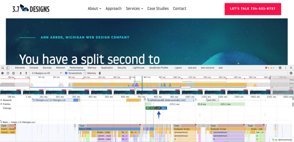
If you’re unsure or want to confirm, you can identify it by opening up your inspector in chrome, selecting “performance” and clicking the “reload button” and then the stop icon when the page has finished loading.
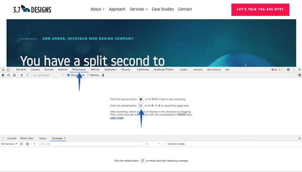
Expand the “Timings” row and you’ll see a waterfall of page load and rendering along with critical moments marked including LCP. Hover over those tiles and it will highlight the element triggering the largest contentful paint.
First Input Delay
First Input Delay (FID) measures how long it takes before the user can interact with your page, such as clicking on a link. FID is less of an issue on marketing and informational sites, and more of an issue on complex web applications.
Now that we know what we’re looking at let’s dive into some advanced techniques.
A reminder, as there are plenty of articles that discuss concatenating and minifying files, enabling page caching, using a CDN, etc… so we’re going to skip past all the low hanging fruit.
Advanced development techniques
Self-host web fonts, and treat them right
It’s common to load web fonts such as Google fonts or icon libraries like FontAwesome from a CDN. While this method is quick and easy, it is an external DNS request which incurs an additional delay.
Serving the fonts from the same domain will be faster and will improve your metrics.
Your work doesn’t stop there, you’ll want to load the fonts using font-display:swap. Without this CSS rule type on the page will be invisible until the font loads which will increase your First Content Paint times.
font-display: swap will render the text using the defined fallback font first and swap it for the loaded font after loading. If you’re not careful, the fall-back font could be puportionately different than the font being loaded meaning the entire layout could shift as the font loads – which will reduce your Cumulative Layout Shift (CLS) scores.
Take the time define a fallback font that is similar in style and size, rather than just ‘san-serif’ or ‘serif.’
For example:
font-family: ‘Open Sans’, ‘Arial’, ‘Helvetica’, ‘san-serif’
Dequeue unnecessary global assets
When only considering PageSpeed metrics, you’d ideally only load the CSS and Javascript required for the page being tested. Even if you’ve minified and combined these assets they can still increase render and load times.
Sadly, it’s common for plugins to add their assets to every page on the site rather than when they’re specifically needed. At 3.7, we often encounter this with Gravity Forms which has several scripts enqueued on every page even if no form is present.
Provided the assets are enqueued properly, you can conditionally remove them when they’re not needed. The example below demonstrates how we’ve trimmed the Gravity Form scripts using the wp_dequeue_* functions:
add_action( 'gform_enqueue_scripts', 'gform_remove_scripts_if_no_form' );
function gform_remove_scripts_if_no_form() {

	if( !has_gform() ) {

		$scripts = array(
			'gform_gravityforms',
			'gform_conditional_logic',
			'gform_datepicker_init',
			'plupload-all',
			'gform_textarea_counter',
			'gform_masked_input',
			'gform_chosen',
			'gform_placeholder',
			'noUiSlider',
			'wNumb',
			'slider_fields'
		);

		foreach( $scripts as $handle ) {
			wp_dequeue_script($handle);
		}

		$styles = array(
			'gforms_reset_css',
			'gforms_datepicker_css',
			'gforms_formsmain_css',
			'gforms_ready_class_css',
			'gforms_browsers_css',
			'gforms_rtl_css',
			'noUiSlider',
			'slider_fields'
		);

		foreach( $styles as $handle ) {
			wp_dequeue_style($handle);
		}

	}

}
I find the easiest way to identify the handles to pass in is just looking at the rendered HTML of a given page and finding the script and link tags referencing the assets. WordPress will automatically add an ID with the registered handle to each asset.
<link rel='stylesheet' id='fontawesome-css' href='//maxcdn.bootstrapcdn.com/font-awesome/4.5.0/css/font-awesome.min.css?ver=5.6' type='text/css' media='all' />In this example the handle is “fontawesome.”
<script type='text/javascript' src='https://3.7designs.co/wp-content/plugins/lightbox-2/lightbox.js?ver=1.8' id='lightbox-js'></script>In this example the handle is “lightbox.”
Set width and heights where possible
External elements like images can cause the layout to shift when loaded as the browser doesn’t know how tall or wide they will be. This can impact your CLS score, but can easily be prevented.
Image elements, videos, etc… that are immediately visible should be given widths and heights either in HTML or in CSS so the layout doesn’t shift after they’re loaded.
Preloading
Pagespeed is largely measuring perceived load time, rather than the full page load. Specifically, how long does it take to load the immediately visible portion of the page.
This matters because you want to prioritize the loading of elements that are immediately visible. Normally, an asset will load when reached in the source order. If you have a hero image at the top of your page the browser will only request it after it’s loaded everything before it.
This could mean that assets and elements which are not immediately visible on page load could be requested first. Additionally, if you have a larger asset to download you’d rather start that process sooner rather than later.
Preload links allow you to load important assets before they’re reached in the source order. Simply reference the asset in the <head> like so:
<link rel="preload" href="/wp-content/uploads/hero-image.jpg" as="image">The “as” attribute can be:
- style
- image
- font
- document
- script
In my experience, you’ll only want to preload important images and web fonts. I haven’t found any particular use for preloading styles, scripts, or documents.
In this example, we’re assuming you have created custom image sizes “Mobile, Tablet, and Hero” with the matching dimensions.
Note: At this time preload is only supported by Chrome and Opera, however, it can impact Google Page Speed metrics.
Preconnect
Similar to Preload, Preconnect allows you to initiate a connection to a separate domain prior to it’s appearance in source order., however, you need to choose from these top-notch wordpress hosting plans the best one for you.
For example, let’s say you have a HotJar tracking script on your site. That script is hosted on a separate domain, when the browser reaches that script in the source it needs to request a connection to the separate domain and wait for a response before it can continue.
Preconnect allows you to initiate a connection to the domain earlier, so by the time the script is reached in source order it can execute the script right away rather than wait for the connection negotiation.
This can also be very helpful if you’re using a CDN, you’ll want to preconnect to the CDN early so you’re not causing an additional delay for the first images loaded.
Similar to preload, preconnect is done through a <link> element in the <head>.
<link href="https://cdn.domain.com" rel="preconnect" crossorigin>Preconnect is supported by recent versions of Firefox, Chrome, and Opera. It also impacts PageSpeed scores.
Efficiently load render-blocking assets
Javascript and CSS files are what are called “render-blocking” assets, because when a browser comes across one when rendering a page, it stops rendering until that asset is fully loaded.
This is an issue as typically these files contain instructions and scripting that are unimportant to the initial render. We can address this in a few ways:
Source order
The first thing we can do is move any non-critical scripts and stylesheets to the bottom of the page, rather than in the head. This is controlled through the WordPress wp_register_script and wp_register_style functions.
These functions add our assets to the page, and they both can be configured to add the assets to the footer rather than the header.
For wp_register_script the fifth argument will move the script to the footer if true.
wp_register_script( 'custom-theme', CUSTOM_THEME_DIR . '/assets/js/script.min.js', array('jquery'), '1.0', true );When it comes to stylesheets, you’ll need to use the wp_footer action instead of wp_enqueue_scripts when adding the styles to the page.
function my_footer_style() {
    wp_enqueue_style( 'newsletter-signup', get_template_directory_uri() . '/assets/css/newsletter.min.css', array(), '1.0', 'all' );
}
add_action( 'wp_footer', 'my_footer_style' );
Please note that this means the content you’re styling will be unstyled until the page fully loads, so you’ll only want to do this for elements that are not immediately visible or inline critical CSS in the head of your document (more on this later.)
Defer
Defer tells the HTML parser to wait until the entire page is loaded before executing. Defer is valuable when the script has dependencies or needs the entire DOM to be loaded before executing.
While WordPress doesn’t have any native defer capabilities, we can easily add it through a simple filter and function.
function my_defer_scripts( $tag, $handle ) {
    // Just return the tag normally if this isn't one we want to defer
    if ( 'your-script-handle' !== $handle ) {
        return $tag;
    }
    return str_replace( ' src', ' defer src', $tag );
}
add_filter( 'script_loader_tag', 'my_defer_scripts', 10, 2 );
Async
Similar to Defer – Async means that the HTML parser doesn’t need to wait for the script to load and execute before continuing. This is useful for self-contained scripts that don’t need the DOM to fully load. Tracking scripts are a good example, as you want to track users who don’t fully load the page and they typically don’t need the page to load to execute.
Similar to Defer, there is no native capability for Async scripts but we can address it in the same manor.
function my_async_scripts( $tag, $handle ) {
    // Just return the tag normally if this isn't one we want to defer
    if ( 'your-script-handle' !== $handle ) {
        return $tag;
    }
    return str_replace( ' src', ' async src', $tag );
}
add_filter( 'script_loader_tag', 'my_async_scripts', 10, 2 );
Efficiently Deliver Tracking Scripts
Sadly most modern sites have two or more tracking scripts. The Facebook pixel, LinkedIn, Twitter, Google Tag Manager, and maybe HubSpot or HotJar to boot.
These scripts are all hosted on external domains and take a significant amount of time to connect, download, and evaluate. One simple thing you can do to minimize the impact (if these scripts must be used) is to put everything into a Google Tag Manager container rather than having each one on the page itself.
In theory, Google Tag Manager can optimize the timing and delivery of the scripts to prevent them from making as big an impact.
Inline critical CSS
Stylesheets are rendering blocking assets, and typically your themes stylesheet contains a lot of styling that isn’t needed for the current page or at least for what’s immediately visible.
While we can move our themes stylesheet to the bottom of the page (described above) it means our page will look unstyled until the page fully loads and before it “snaps” into place.
Inlining critical CSS is the solution for these issues. In short, you include the styling required for the immediately visible portion of the page at the top of the HTML document so it’s read immediately and the remaining CSS is loaded at the bottom of the page.
Now you could do this by examining what’s typically visible prior to scroll, finding your generated CSS and manually adding it to the head on a page by page basis… but that’s a lot of work. Thankfully there are several plugins that handle this process for you, including:
- WP Rocket
- Swift Performance
- LiteSpeed
- Autoptimize + Free Critical CSS Generator
Speed up image loading
Images are often the largest contributors to poor PageSpeed scores, especially hero images and LCP. There are a handful of techniques we can employ to reduce the time spent waiting for them to load, including:
- Using WebP format
- Responsive images
- Prioritizing immediately visible images
- Lazy loading
WebP Formats
Images are a common source of slow downs and lower scores. I’m going to assume you’ve already compressed your images and used appropriate formats and focus on WebP.
WebP is a new image format that provides better lossless and lossy compression. Simply put, they are 25 – 35% smaller than the equivalent JPG. The problem is, browser support is inconsistent, Sadly Safari is the last modern browser that lacks full support. IE11 has no support, should you need to support that browser.
So you can’t just upload images into WordPress as WebP files. There are however several great plugins that will handle this for you, our top pick being Imagify.
With Imagify you upload a normal GIF, JPG, or PNG and it will create a WebP version, detect if a user’s browser can support WebP or not, and deliver the ideal format.
A caveat here is if you’re manually outputting images onto the page at the template level, you need to go about it a certain way.
Imagify can only tell if you’re outputting an image (and therefore serving the right image) if you do so using the wp_get_attachment_image function.
So you may have to refactor the theme to take full advantage of the capability and replace background images with actual image elements that are scaled using object-fit.
The other benefit of this approach is WordPress will automatically generate the appropriate mark-up for responsive images which will also improve your scores and reduce load times.
Responsive Images
Responsive images have existed for some time yet are underutilized because they’re cumbersome to use. The idea is rather than serving a large version of an image to all device sizes, only to shrink it for smaller viewports, you have several sizes of the same image and only serve the most appropriate one.
Traditionally this is cumbersome, as it requires you to create several versions of the same image, and the mark-up is more complex compared to a typical <img> tag.
Luckily, WordPress has responsive image support that makes our lives easier. Out of the box, images that are inserted through the WordPress editor into a content area will have appropriate responsive image markup.
If you create a custom theme, you can also generate the same responsive mark-up automatically by outputting images using the wp_get_attachement_image function.
Because WordPress will automatically create different sizes of the images based on the registered sizes (large, medium-large, medium, and thumbnail by default,) it does a pretty good job without any additional effort.
Of course there might be times where the default sizes won’t work and you can always output your own responsive image markup.
Prioritizing immediately visible images
Any large image visible on PageLoad will likely drive your LCP score. Typically you’ll see this for article images or hero images for marketing websites. The sooner you can get the browser downloading and rendering the image, the lower your scores will be.
The first thing to be aware of is how the image is getting onto the page. If it’s a CSS background-image, contained in a stylesheet that’s at the bottom of the page (to prevent render blocking) then it won’t get loaded until the entire page is loaded before it.
Having an inline style higher on the page or using an <img> element will be loaded earlier.
Second, we can use the preload technique we discussed earlier in combination with our responsive images.
<link rel="preload" as="image" href="/wp-content/themes/zippy/wolf.jpg" imagesrcset="/wp-content/themes/zippy/wolf_400px.jpg 400w, /wp-content/themes/zippy/wolf_800px.jpg 800w, /wp-content/themes/zippy/wolf_1600px.jpg 1600w" imagesizes="50vw">If you’re inserting the hero image onto the page through WordPress’ featured image or potentially an ACF field, you can write a quick function to automatically add this preload to the <head> of the page.
add_action( 'wp_head', 'my_custom_hero_preoload' );
function my_custom_hero_preload() {
     if( !has_post_thumbnail() ) {
          return;
     }

     $hero = get_the_post_thumbnail();

     echo '<link rel="preload" as="image" href="' . esc_url($hero['sizes']['hero']) . '" imagesrcset="' . esc_url($hero['sizes']['mobile]) ' 768w, ' . esc_url($hero['sizes']['tablet']) . ' 1024w, ' . esc_url($hero['sizes']['hero']) . ' 1600w">;

}
Lazy Loading
Any image that isn’t immediately visible doesn’t need to be loaded right away. WordPress 5.5 now natively implements lazy loading <img> elements through the native HTML loading attribute. While this is useful for images inserted through the content editor, it doesn’t help when you have background images or template images.
In these cases you’ll want need to implement lazy loading on your own. I’ve found the easiest way to do this is through a plugin like WP Rocket which will now automatically detect and lazy load background images.
Replace libraries and frameworks for specific assets and functions
Finally, one of the best way to reduce your score is simply reducing. We developers love libraries because they make our lives easier and reduce our overall workload. It’s common however, to load an entire library when we only use a small portion of it.
Icon libraries often have hundreds of icons when a site might only use three or four. FontAwesome is about 50kb in styling and another ~100kb for the font itself.
Modal libraries might support a multitude of different situations including images, dynamic content, video, etc… when you’re only using them for a simple picture gallery.
Frontend frameworks like Bootstrap and Foundation have styling and scripting for dozens UI components that are rarely used.
If speed is important, consider custom building what you need.
Boosting PageSpeed Insights scores
Increasing your scores and decreasing load times is a tedious, yet rewarding process. Which techniques are most effective will differ based on the site you’re working on.
Roll the best practices into your normal development workflow like preloading hero images, defering non-critical scripts, using WebP, and inlining critical CSS.
From there it will be a matter of trial and error, seeing what makes a significant impact and what doesn’t.
If you need help with your scores or page load times, please contact us. We’d be happy to see what can be done.