
- Digital Marketing
- User Experience
- Web Design
- Updated 04/12/2025
9 Psychological Principles for Website Landing Page Design
Summarize this post

There are two types of landing pages in this world. The ones that make you stop, think, click, and convert. And the ones that boast a measly 0.25% conversion rate have you questioning your life decisions. “Why oh why didn’t I study accounting?”
The difference? A calculated dose of human psychology sprinkled throughout your landing page “just right.”
You probably want your landing page to work, not just look pretty. You can have a beautiful design and well-written copy and still have a dud. What works? Tapping into your visitor’s subconscious. The human brain is advanced, but it also has quirks.
This is where marketing psychology comes in. These are not gimmicks; instead, proven principles of how people think and act.
1. Cognitive Fluency
Ever walk into a restaurant and get a menu with 800 items, three fonts, and a color scheme that hurts your eyes? That’s what most landing pages feel like. The brain doesn’t like working hard to understand what it sees.
This overwhelm is the concept of cognitive fluency, which is the brain’s preference for things that are easy to understand and process. When something feels simple and intuitive, we’re more likely to trust, believe, and act on it—especially in high-stakes moments like deciding whether to click, buy, or sign up.
I’m mentioning cognitive fluency first because you’ll notice a trend with many other psychological principles discussed here — reducing mental effort, or “cognitive load.” The more mental load you place on your users, the less likely they are to act.
I know you want to wow your visitors, but here’s the thing… they don’t want to be wowed. They want to understand if your solution will solve their problem so they move on.
With every landing page you create, your motto should be “Clarity over clever.”
Your headline? Make it obvious. Your layout? Keep it familiar. Avoid cleverness unless you’re sure it’s also clear. When in doubt, dumb it down. People don’t come to your landing page to solve a puzzle.
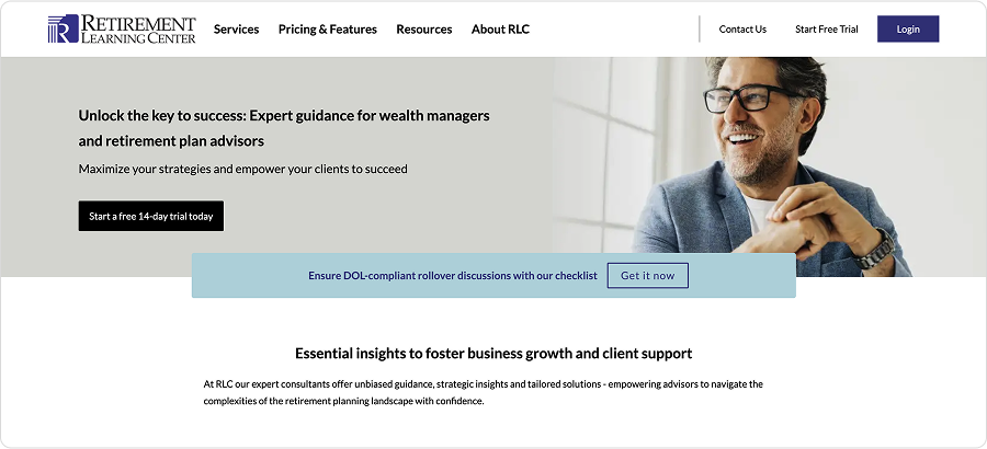
Because users have limited mental capacity, the top of the page is most important. If you don’t hook them with the essentials first, they may not stick around to read the rest.
Make sure your most compelling messages are immediately visible, along with a way to convert, such as a visible form or CTA button.
2. Dual-processing Theory
Now that we’ve discussed cognitive load, you’re ready to learn about Dual-process theory. Psychologists call this “System 1” and “System 2” thinking. But let’s be real: it’s fast and slow brain. Snap judgment versus careful consideration.
How does this relate to my landing page you ask? The first thing users do is feel your page. Not read it. Feel it. This is system 1 firing. Do I trust this? Does this look like the place I want to be?
If the design’s a mess or the messaging is vague, they kick into system 2 or bounce altogether.
When the tone is right, the design is uncluttered, and the crystal clear messaging reassures them they’ve landed in the right place. System 1 stays in the driver’s seat.
When someone is in System 1, they move faster, scrutinize less, and typically move further along the buyer’s journey. Now, depending on the decision, System 2 might be unavoidable.
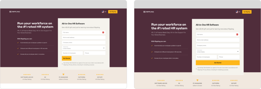
Big decisions with a lot of risk or commitment will always trigger System 2. Booking a meeting is a more significant commitment than sending an email. Three-form fields feel effortless compared to ten. An expensive purchase is riskier than an affordable one.
In these cases, intentionally provide more information and detail. Address every objection and leave no stone unturned, as your prospect will carefully weigh their options.
Now, don’t try to stuff all the details at the top of the page. Provided you’ve engaged the user with your initial messaging, they will continue reading or scrolling to get the information needed to satisfy their System 2 thinking.
3. Commitment & Consistency
Once we begin a process, we naturally feel compelled to keep going. This is the commitment and consistency bias—the psychological tendency to follow through once we’ve started, even when the effort increases.
A similar concept, often called the gambler’s fallacy, explains why people keep gambling to “win back” their losses, even when the rational choice is to stop. The same applies to tasks and time: if someone spends five minutes on something, they’re likelier to stick with it rather than feel like they wasted time.
Commitment and consistency tell us to start small.
Don’t overwhelm cold prospects with a 14-field contact. Instead, give them an easy next step—a short form, a simple tool, or a yes/no choice. Likewise, avoid requesting a big commitment immediately, like scheduling a meeting. Start with a small, low-effort ask that’s easy to say yes to.
Once someone says yes to something small, they’re far more likely to say yes to what comes next.
4. Hick’s Law
More options are better, right? Wrong.
People think they like option. But too many, and their brain bails. Hick’s Law says the more options you give someone, the longer it takes them to decide—if they decide at all.
The concept is simple: With every additional choice, your brain needs to work harder to compare them to understand which, if any, are the right fit. Energy is a finite resource; once someone’s mental energy runs out, they’ll avoid making a decision altogether.
Landing pages with five CTAs, three pricing tables, and two navigations? That’s decision paralysis on a plate.
Cut it down. One offer. One clear CTA. Get rid of all navigation.
Want them to schedule a call? Don’t give them five ways to get in touch. Don’t make them work for it. Make it so easy they’d feel stupid not clicking.
5. Von Restorff Effect
When everything screams, nothing is heard. But make one thing different, make it pop, and the brain will lock onto it like a hawk.
We instinctively notice what’s different. It’s a survival mechanism because, at one point, what was different was a lion.
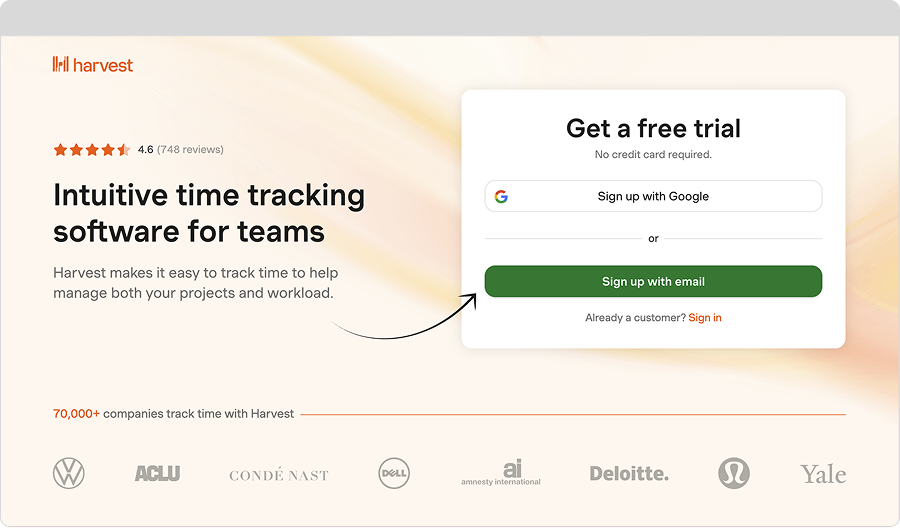
Use this to highlight what matters selectively. Your main CTA button? Make it a color that doesn’t appear anywhere else on the page. Your best testimonial? Isolate it. Frame it. Give it space to breathe.
Contrast is your friend. Use it like salt—with purpose.
Practice restraint; if overdone, you’ll lose design continuity, and everything will look different. Try to have no more than one element in view standing at any time.
6. Framing Effect
How you say something matters as much as what you’re saying. It’s not lying, it’s storytelling. “$1 a day” hits differently than “$30 a month.” “Save 20%” sounds juicier than “Get it for $80.”
This is the concept of framing. Framing is when you present information that shapes perception and influences decisions.
Frame your offer around what they get, not what you sell. You don’t sell software; you sell peace of mind. You don’t sell service; you sell more energy to focus on better things.
6. Authority Bias
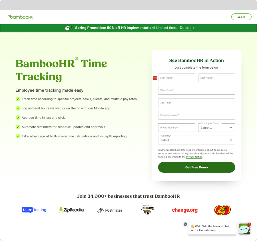
Simply put, we trust people in positions of power or authority. It’s a mental shortcut that allows us to make complex decisions without wasting valuable brain cycles. When brands have credentials, awards, and certifications, we tend to trust them more.
That’s authority bias, and it’s a quiet but powerful persuader on landing pages.
Your prospects are busy, and it’s nearly impossible to determine a company’s trustworthiness based on a landing page.
Rather than spend precious mental energy, prospects look for quick signals that you’re worth listening to.
But here’s the catch: you can overdo it.
Tossing in every award you’ve ever won or cluttering your hero section with logos looks like you’re trying really hard, and undermines the appearance of confidence. Instead, use subtle signals—client logos that match your ideal customer’s world, a short expert quote, a trust badge that actually means something, or a photo of your team doing what you do best. Even subtle cues like a polished design or strong copy elevate perceived authority.
Use it well, and you earn trust before the user even reads your headline. Use it poorly—or not at all—and they click away before you get a chance.
7. Fitts’s Law
Want someone to take action? Make the action easy to take.
This law concerns physical movement, and you may question why it’s on this list.
Hopefully, by now, you’ve noticed the trend that squeezing every ounce of effectiveness out of your landing pages means preserving your prospect’s energy and cognitive load at all costs.
The less energy they have, the harder it is for them to take action.
Fitts’ law relates to size, placement, and visibility of an element on the screen. Put simply, it’s easier to interact with elements that are larger and closer (either to your pointer or finger.)
Oversized buttons are easier to click than smaller ones. A persistent CTA requires less movement than scrolling up or down to find one.
Based on how people hold their phones, it’s easier to click a button at the top right than at the top left.
Put it where thumbs go. Make it big enough to hit. Use action language. “Get the guide,” “Book a call,” “Try it free.” Short, sharp, and to the point.
8. Loss Aversion & Negativity Bias
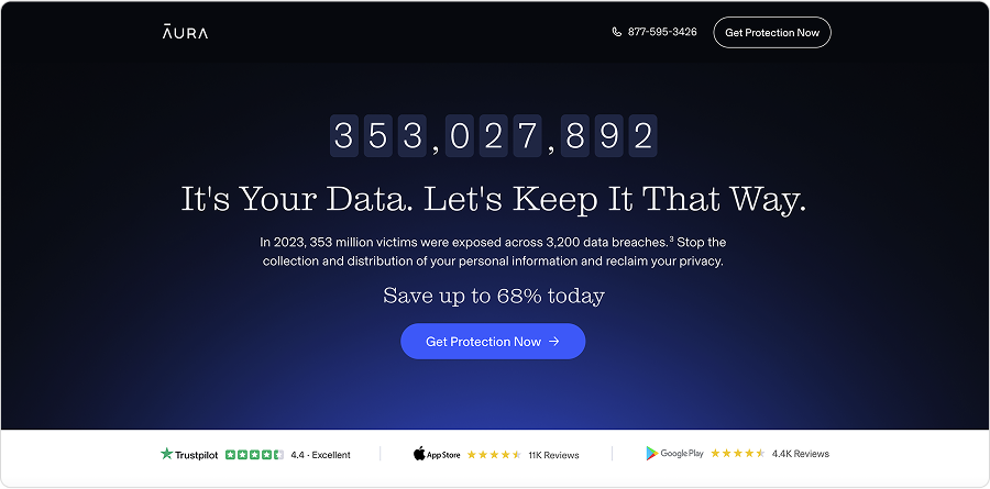
Humans hate loss more than we love gain. That’s why scarcity and urgency work so well.
“Only 4 spots left.” “This week only.” “3,200 people signed up today.”
This isn’t just sleazy countdown timers (though those still work . It’s about reminding people there’s value here, and they might miss i . If you’ve got proof people are taking action, show i . If the offer won’t last, say so.
FOMO lights a fire. Don’t be afraid to strike a match.
Similar to loss aversion, we all have an inherent bias toward negativity. An overactive survival mechanism intended to keep us safe from lions and bears, we typically are focused on what could go wrong more than what will go well.
However, you can address this negativity bias by proactively addressing all of your prospects’ common objections about moving forward. If they’re afraid they need to provide a credit card to access the “free trial,” tell them they don’t.
9. Priming
Before someone decides, they feel. And those feelings? You can nudge them—gently or not—through priming. It’s not manipulation. It’s putting people in the state of mind needed to move forward.
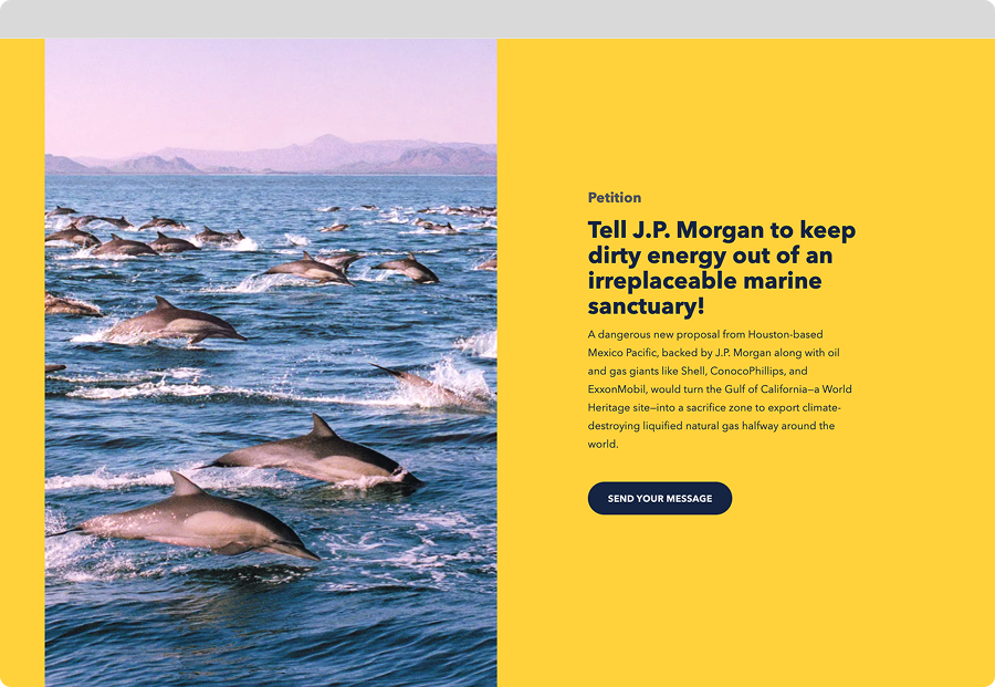
On a landing page, priming happens the second the page loads. Colors set the tone. Headlines whisper (or shout) intent. Visuals create emotional context. Button text either invites or repels. All of it works together to say, “Here’s what this is, and here’s how you should feel about it.”
Want to inspire urgency? Choose active words, intense colors, and bold language that puts time in the spotlight. Want trust? Tone down the palette, simplify the layout, and let clear language and social proof do the talking.
Sometimes, one strong signal is enough—a single confident headline can flip a mental switch. Other times, you must stack the deck: visual, headline, copy, button, all pulling in the same direction. Just don’t overdo it. Users can smell desperation.
The best priming feels natural and unforced, like arriving at a place that already knows what you need and offers it without pretense.
Final Bite
Your landing page isn’t a billboard. It’s a conversation.
Each choice you make—from layout to wording to button color—is you saying something to your visitor. These psychological principles help you say the right things in the right way at the right time.
Use them with intent. Don’t overcook it. And for god’s sake, don’t assume your audience is paying attention. They’re not.
Then watch what happens.