- Web Design
- Updated 08/31/2024
Improve your typography with “typographic contrast”
Summarize this post
Having just spent a week in various countries through out Europe I found myself studying the design techniques of thee various different cultures as well as how it compares to that of the US. Interestingly enough I found myself able to look at the typography of design completely independent of the message (as I did not know the language). This is an oddly effective way to see what techniques of displaying and using type were effective, for what reasons, and why.
With out knowing what anything said I could easily identify even subtle cues as to what was the most important element in type, what was secondary information, and what was practically meta data. This hierarchy of visual importance in regards to type can also be referred to as typographical contrast.
What is “Typographical Contrast”?
Simply put it is the grouping of two typographical elements, then using different methods of traditional design to create contrast. The contrast places emphasis on the important element of type, letting the secondary element command less attention. The result is an improvement in the communication of the overall design message.
If we look at traditional forms of contrast then we have:
- Size
- Color
- Spacing
- Shape
All of which can be used with type to improve our typography on the web. To keep this post short an interesting I will be offering some examples, explain what I did, and move on.
1. Size
This is probably the most common use of typographic contrast and is quite common on blogs and other content that has a time relevance. Many blogs uses this method to provide additional information for those who are interested, but kept it subtle enough where it doesn’t distract or command your attention.
My blog, for example uses large headlines with smaller type for supportive data. The headlines are large as it is the most important element of type in its area. However there is additional content that is of value, it simply is less important (in this case the number of comments, posted date, and author).
The concept is pretty simple, make the most important element of type larger while and supportive type can be smaller. See the example below:
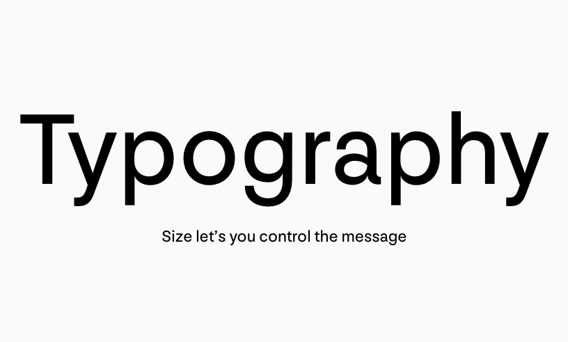
By contrasting large type with small type we get a visually interesting typographical design and it is functional. The most important element commands the most attention, while the secondary element is subtle yet legible. This dynamic builds a visual hierarchy.
2. Color
Color is another common way to develop some contrast between typographical elements. The most common way that we see this in design is having some type lighter than others. Obviously lighter text (when dealing with a light background) has less energy and thus less visual attention. This creates a contrast between it and any darker element.
I have also seen great examples where black is contrasted with color, or the richness or vibrance of colors is used to develop a level of contrast.
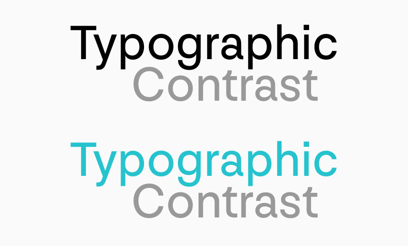
Again this establishes a visual hierarchy as the most important elements will command the most visual attention (and I might note that the lighter type element doesn’t necessarily have to be the at a lower visual importance.)
3. Spacing
The use of spacing can be a tricky technique to master. However when done properly it creates a rich contrast and interesting typography in design. The spacing of type itself can obviously be altered in three traditional ways, letter spacing, line spacing, and word spacing. To be honest I have only see spacing work effectively in line spacing and letter spacing, however I would be more than happy to be corrected in terms of the use of effective word spacing in typographic contrast.
Space can also be altered simply in the placement of type. Right justified vs left, indented vs on the same rule, etc… Any time you alter the typical placement of type you will create tension and visual interest (and thus contrast).
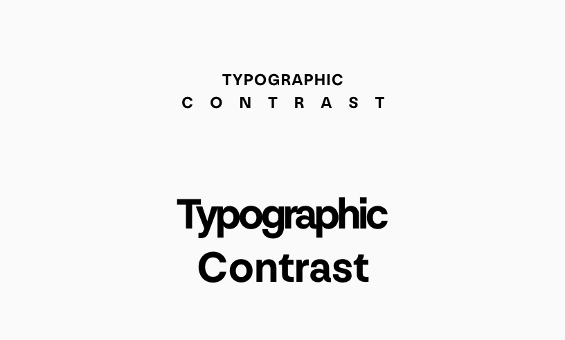
Space works best when used in conjunction with other techniques. It is a tricky technique to master because depending on the situation more space can either increase or decrease the visual weight.
It can either thin the text out, removing visual interest and attention; or it can also cause the element to take up more space more than thinning it out which could cause it to have more visual interest and attention.
4. Shape
When I refer to shape I am talking about either using different typefaces or italic, bold, etc caps vs lowercase, etc… Really altering and playing with the shapes of two different typographic elements.
This can range from something as simple as coupling a serif with a san-serif, or as dramatic as a decorative font with an ultra-simple font.
When used effectively it can be a nice balance between legibility, style, and visual interest.
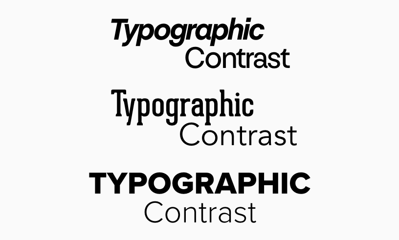
Shape probably has the most capability to create typographic contrast. Because of this you also must be careful of how you use it, it is really easy to create some “cool” design elements that really detract from everything else on the page because they simply command too much attention.
5. Putting them all together
After you have worked with the different individual elements for some time you can start to work them together for an even richer experience. This is another situation where you really want to ensure that you balance the interaction and relationship between the two type elements and everything else in the composition. It is easy to create a lot of visual contrast using all possible elements, only to end up detracting from the rest of the composition.
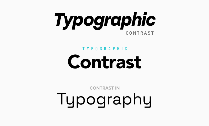
You may notice that I could play with the different elements to increase contrast in one way but decrease it in another. For example, make the type bigger, but lighten it, or make it smaller but a brighter color. It’s a thinner font, but I played with the spacing.
Playing with these elements can create some very powerful typographic contrast. Every adjustment you make alters the message a little bit, and balancing the message and communication with visual impact enriches the visual experience.
If you need help making your brand design effective, we can help. 3.7 Designs is a technology marketing agency specializing in web design and digital marketing.
FREE TOOL: OPTIMIZE YOUR SITE
Grade Your Entire Website in Seconds
Submit your website link and get a detailed report on how you can improve page performance, SEO optimization, mobile usability, and more.