
- Digital Marketing
- Web Design
- Published 09/22/2025
How to Craft CTAs That Actually Convert: A Structured Approach for B2B Marketers
Summarize this post

CTAs don’t get the attention they deserve.
Everyone obsesses over headlines, hero copy, and product descriptions—but then slaps a “Get Started” button at the bottom and calls it a day. In most B2B marketing, the CTA is an afterthought. That’s a problem.
Your CTA is the second most important part of the page. If your headline gets their attention, your CTA is what turns that attention into action. If it’s weak, vague, or irrelevant, the whole page underperforms.
The good news: there’s a structured way to write CTAs that pull their weight. This post walks through the process we use at 3.7 Designs to make sure CTAs don’t just fill a space, they work.
Why Most CTAs Don’t Work
Let’s start with the bad habits.
Most marketers treat CTAs as a formality. They write an entire page of thoughtful messaging, only to stick a generic “Get Started” button at the bottom. It’s easy to assume the hard work is done by the time you reach the button. That’s not true.
Here’s why CTAs fail:
- They’re vague. You’ve seen it: “Submit,” “Click Here,” “Request Info.” These don’t tell the user what happens next, what they’ll get, or why they should care.
- They’re generic. One CTA gets pasted across every page regardless of content. It doesn’t adapt to the offer or the user’s readiness.
- They’re pushy. CTAs like “Schedule a Call” or “Talk to Sales” show up on pages designed for people who are still learning.
- They don’t add value. If there’s no implied benefit, there’s no motivation to click.
A weak CTA undercuts the whole page. You might have nailed the messaging and visuals, but if the CTA doesn’t convert, none of that matters. The page falls flat where it should be turning interest into action.
What Makes a CTA Effective
A high-performing CTA isn’t clever. It’s clear, grounded in context, and focused on what the user needs.
Every CTA should do three things:
1. Match the moment
The CTA has to feel like the logical next step for the person reading the page. If they’re early in the journey, give them something light-touch. If they’re product-aware, get more specific.

2. Offer real value
The copy should make it obvious what the user gets. A free trial? A live demo? A comparison guide? The value should be visible and attractive.
3. Set clear expectations
Ambiguity kills clicks. People want to know what will happen when they click. Will they have to fill out a form? Talk to someone? Download something? Set expectations so there are no surprises.
When you do those three things well, the CTA becomes an invitation, not a hurdle. It feels like help, not pressure.
A Step-by-Step Process for Writing Better CTAs
Here’s how we approach CTAs in our client work, and how you can use the same process on your site.
1. Start with the user’s context
What page are they on? Where are they in the funnel? What questions might they have?
Someone on your pricing page has different goals than someone reading a blog post. Match the CTA to their intent.
2. Pick the right next step
Don’t jump to “Book a Demo” by default. Other options might work better:
- See a feature breakdown
- Watch a short video
- Read a case study
- Compare plans
Lower-commitment CTAs often outperform “conversion” CTAs early in the journey.
3. Make the value crystal clear
“Get the comparison guide” is better than “Download now.”
“See how it integrates with Salesforce” is better than “Learn more.”
Tell them what they’ll get. If there’s a benefit, say it.
4. Write multiple versions
Write 3–5 options for every CTA. Don’t settle for the first one. Play with:
- Outcomes: “Find the right plan for your team”
- Specifics: “Compare packages side-by-side”
- Tone: “Take the 2-minute tour”
Even small wording changes can make a difference.
5. Test and refine
If the page gets traffic, the CTA is worth testing.
Use A/B tools like Google Optimize, VWO, or HubSpot’s built-in testing. Or go manual: swap in a new CTA and watch what happens over a week.
Measure clicks, but also what comes next. A button that gets clicked but leads to a bounce isn’t helping.
Good CTA vs. Bad CTA
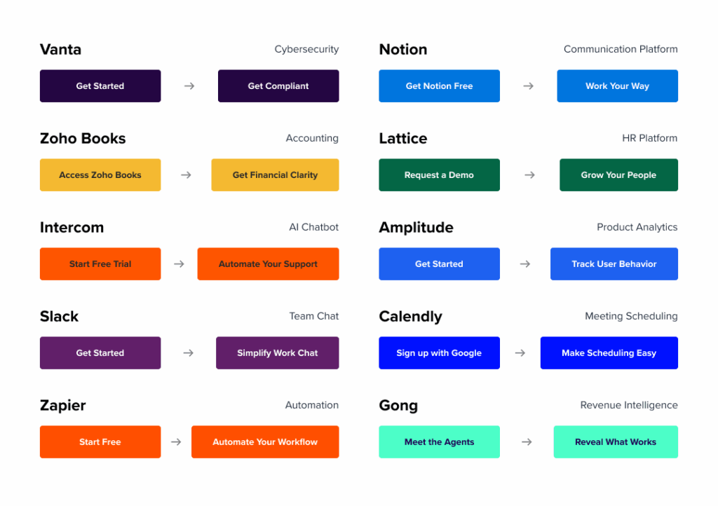
Here are a few real examples (sanitized from client work):
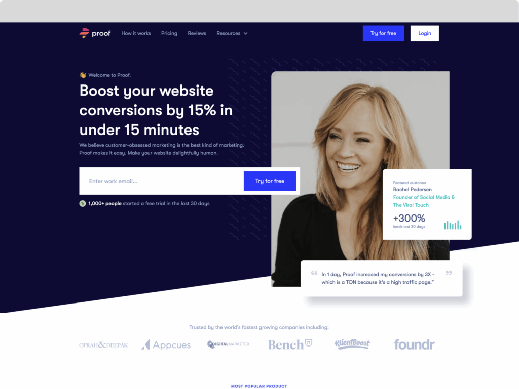
Weak CTA: “Submit”
Better CTA: “Get my free product roadmap template”
Weak CTA: “Contact Us”
Better CTA: “Talk to a specialist about FDA compliance”
Weak CTA: “Download Now”
Better CTA: “Compare pricing tiers in one simple chart”
The difference? The good CTAs feel timely, specific, and useful.
Matching CTAs to Page Type
Not every CTA belongs everywhere. Here’s how to think about CTA intent by page:
Homepage:
- “See how it works”
- “Explore solutions”
Product Page:
- “Compare to [Competitor]”
- “Get feature checklist”
Blog Post:
- “See how we solved this for [Client]”
- “Download the step-by-step guide”
Pricing Page:
- “Talk to Sales”
- “Get custom quote”
Each CTA should feel like the logical next step, not a push, just a pull.
Where CTAs Live
CTAs aren’t just buttons. Think about:
- Top navigation (“Schedule a Demo” or “Free Trial”)
- Sticky headers or scroll-triggered bars
- In-line within copy
- Form buttons (e.g., “Book My Time” instead of “Submit”)
Each one needs attention. Each one should feel intentional.
Tools to Improve Your CTA Game
If you’re guessing about whether your CTA is working, you’re already behind. Tools exist to remove the guesswork and give you hard evidence. They show you what people click, what they ignore, where they stall, and how they behave in real time.
Behavior Analytics Tools:
- Hotjar or Microsoft Clarity can show heatmaps of where users click, how far they scroll, and whether they even see your CTA.
- Use session recordings to watch users navigate your page. Do they pause on the CTA? Do they backtrack? Do they scroll past it completely?
- If users hover near your CTA but never click, it could mean your wording is unclear—or the offer isn’t appealing enough.
Web Analytics:
- In GA4, track micro-conversions like CTA clicks as events. Add them as steps in your funnel visualization to see where people fall off.
- Create different segments for visitors who clicked the CTA versus those who didn’t. Compare time on page, bounce rates, and next steps.
User Feedback Platforms:
- Tools like UserTesting, Maze, or UsabilityHub let you test multiple CTA versions with real people. Ask them to complete a task and observe what draws their attention.
- Run preference tests where people choose between different CTA versions and explain their choice. You’ll often uncover copy issues you’d never spot on your own.
A/B Testing Tools:
- Use Google Optimize, VWO, Optimizely, or your CMS’s built-in testing tools to run controlled experiments.
- Start by testing the CTA text. Then move to button color, placement, and surrounding copy.
- Always test one change at a time. That’s how you know what’s actually working.
You don’t need to use every tool at once. But if you’re not tracking behavior or running any tests, your CTA strategy is mostly guesswork. The right tools help you turn good intuition into great results.
Final Takeaways
If you want your site to convert better, start by rewriting your CTAs. They’re the point where curiosity turns into action, or doesn’t.
A strong CTA doesn’t have to be clever or punchy. It just has to feel helpful. It should match where the visitor is, offer something they want, and explain clearly what’s going to happen.
Use the structure: context, value, clarity. Write multiple versions. Test often. And never treat your CTAs as throwaway content.
They’re the tipping point.
Need help crafting better CTAs across your site?
That’s the kind of work we live for. Let’s talk.