- Web Design
- Updated 08/19/2025
How to: Get More Leads From Your Website (10 ways)
Summarize this post

In today’s digital world, having a website is crucial for businesses of all sizes. However, simply having a website is not enough – turning visitors into leads and customers is essential. This is where website lead generation comes into play.
Lead generation refers to attracting and converting strangers into prospects or leads, with the ultimate goal of nurturing those leads into paying customers. A successful lead generation strategy can help a business grow and thrive, allowing the company to target and connect with potential customers at various sales funnel stages.
This article will delve into 10 ways to increase the number of leads you get from your website.
1. Increase Your Website Traffic
At a bare minimum, you’ll need high-quality, qualified traffic to generate any leads for your business. At some level, lead generation is a numbers game. With a 1% conversion rate, you need 100 visitors to generate a lead. If you double or triple your traffic (assuming the quality of traffic remains constant), you’ll increase your leads proportionately.
Proven methods of increasing targeted traffic, including search engine optimization, content marketing, digital advertising, social media, and email marketing. This is a great place to start if your website is already generating leads, just not at the volume you’re hoping for.
2. Target More Stages of the Buyers Journey
Many business websites only try to get leads when they’re ready to have a sales conversation. This represents a very small portion of your overall traffic, often with estimates of 20% or less. If your only call to action is a variation of “contact us” then you can capture prospects in the early stages of doing research.
This portion of your target audience is typically:
- Trying to understand and quantify their problem
- Determining different options for solving their problem
- Comparing different vendors or providers, generating a shortlist
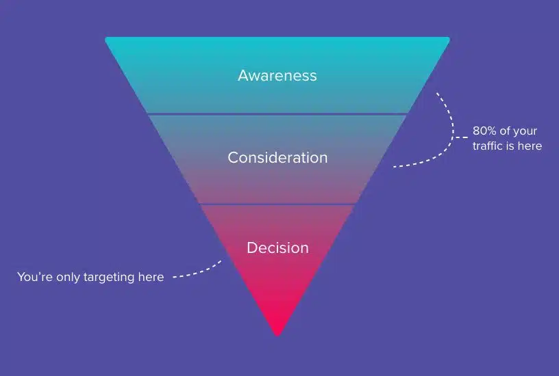
By offering valuable content in exchange for their contact information, you can start a relationship and stay top of mind through email nurturing campaigns. This can dramatically increase your total number of leads, we’ve seen 1,000% increases from this method alone.
3. Clarify Your Messaging
If, upon visiting your website, it’s not immediately clear what you do and for whom, you need to clarify your messaging. With the global economy, you have more competitors than ever. Prospects want to find the best solution for their unique situation. If your message isn’t clear and doesn’t tell your prospect, “We’re exactly who you’re looking for,” you’ll miss lead generation opportunities.
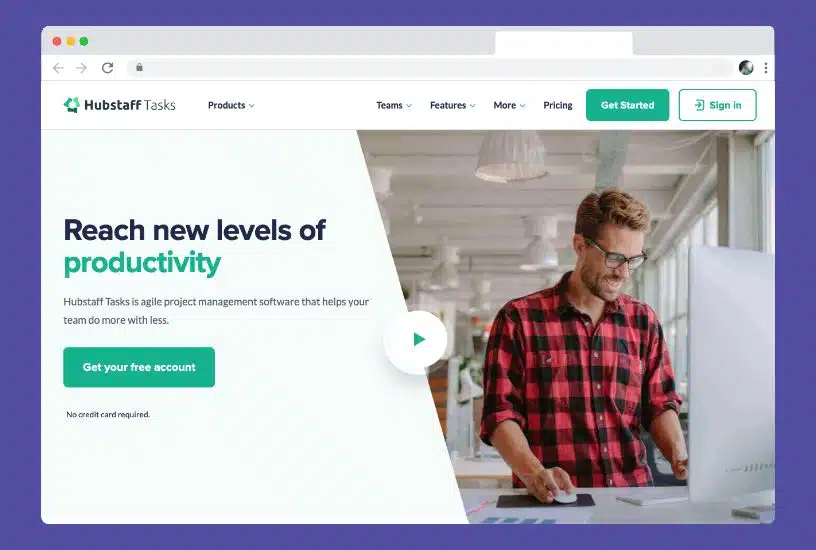
Start by talking to your existing clients. Find out why they chose you and what they feel is most compelling. Narrow your messaging and make it clear where you specialize. The more tailored it feels to your ideal customer profile, the better it will perform.
4. Repeat Your Prospects Problems Back to Them
When looking for solutions to a problem, we tend to trust the one who can best describe our problem. This makes prospects feel like we understand what they’re going through and creates trust that we know how best to solve it.
Consider using the PAS (Problem-Agitate-Solution) framework on your home, product, or service pages. PAS is a sales and marketing technique that helps effectively communicate an understanding of the problem, the consequences your prospects fear, and how your products or services will solve the problem and prevent said consequences.
The PAS framework consists of three key components:
- Problem: Identify the problem that the product or service aims to solve. This helps to establish the need for the product or service and create a sense of urgency for the potential customer.
- Agitate: This step involves highlighting the negative consequences of not addressing the problem. By agitating the problem and creating a sense of discomfort, businesses can motivate potential customers to take action and find a solution.
- Solve: Finally, the PAS framework offers a solution to the problem. This step highlights the product’s or service’s benefits and demonstrates how it can effectively solve the problem identified in the first step.
5. Improve Your Micro Calls to Action
Immediately after landing on your website, users must decide: Do I stay or leave?
Half of the work in keeping users on your website is properly offering clear messaging (see items 3 and 4.) The other half of the work is having the right “micro calls to action.”
Calls to action are anywhere you specifically ask a user to do something. “Click here” and “Contact us” are two common examples of calls to action. Not all calls to action are equal, you’ll have big calls to action where you’re asking users to take a significant step, like making a purchase or filling out a lead form. You’ll also have small calls to action where you ask users to take another step. These are “micro calls to action.”
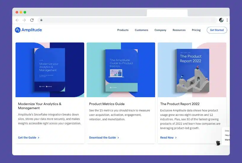
Effective micro calls to action will keep users on the site by getting them to take a logical next step, building momentum, and keeping them on your site.
There are two ways to improve your micro-calls to action. First, you can identify what content most users want and include an immediately visible button. Secondarily, you can make sure your micro calls to action clearly describe the benefits users get by clicking. For example, “Learn More” is vague, where “Learn How To Save Money” is much more compelling.
If you want to really optimize your CTAs consider running some split tests using Google Optimize.
7. Improve Your Primary Calls to Action
Once you’ve optimized your micro calls to action, it’s time to optimize your primary calls to action. These calls to action align with your big website goals like generating leads, sales, attracting volunteers, etc…

These are often the most important elements on your website. We’ve seen 100% engagement increase by optimizing these calls to action. There are three areas to optimize:
Placement
Make sure the CTA is prominent and easy to find: The CTA should be prominently displayed on the page and easy for visitors to locate. It should stand out from the surrounding content and be placed in a prominent location on the page, such as above the fold or in the center of the screen.
Messaging
Use action-oriented language: The CTA should use language that clearly communicates the desired action, such as “Sign up now” or “Buy now.” Avoid vague or passive language, as it may not effectively motivate visitors to take action.
Lead with the benefits users will get by taking action. Instead of saying “Contact Us” you can say “Get a Free Assessment,” this conveys there will be a valuable outcome of getting in touch.
Make sure to address common objections. You can be sure that most users will have concerns or hesitations about moving forward, maybe they don’t want to be hard sold, waste their time, or make the wrong decision. Address these concerns within the copy of your call to action.
Visibility
Use contrasting colors: Using colors that contrast with the surrounding content can help the CTA stand out and grab the visitor’s attention.
Use white space effectively: Proper white space around the CTA can help it stand out and make it more noticeable.
Test different versions: It can be helpful to experiment with different versions of the CTA to see which one performs best. Try using different colors, sizes, or languages to see which version generates the most conversions.
8. Improve Your “Halo Effect.”
The Halo Effect is the tendency for a positive first impression to influence their opinion moving forward positively. This means if someone’s first impression of your site is good, they will think higher of your company from that point forward (even with future visits.)
Aesthetics matter. The look and feel should reassure your target audience of your website. It should look professional and align with their expectations, for example, if they’re looking for an expensive solution, your website should look expensive. If they’re looking for a local business, your website shouldn’t present you as a large corporation.
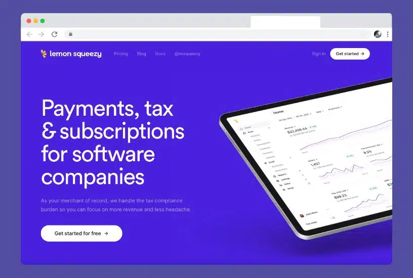
The best way to assess the halo effect of your website is to do a “five-second test,” where you show subjects your website for five seconds and then ask them to describe what they remember. It gives you a strong understanding of your website’s first impression.
9. Simplify Your Website
The more mental effort your website requires, the fewer leads it will generate. Two important psychological principles speak to this phenomenon, Ego Fatigue, and Hick’s Law. Ego Fatigue is the idea that making decisions and taking actions requires mental energy. When mental energy is low, your ability to make decisions or take action is severely diminished.
Hick’s Law states that the more options you have, the harder it is to make a decision. Every element, page, and link on your site is an option to focus on, read, or interact with. Complex websites require more effort to use and are less effective.
Review your website and remove all content, pages, and elements not essential to your target audience and business goals. Consider creating simplified and dedicated landing pages for your advertising campaigns.
10. Incorporate Persuasive Design Patterns
The most effective websites are designed with an understanding of psychology and persuasive design patterns. These common patterns influence human behavior by leveraging sub and semi-conscious triggers left-over from our survival-focused ancestors.
For example, you could leverage the fear of loss. We’re naturally primed to fear losing what we have more than gaining something new. So if you were an insurance company, you could focus your messaging around preventing the loss of your health, home, or personal items.
Another effective persuasive design pattern is using signs of authority. We instinctively trust authority figures, which is why the military and police wear uniforms. If you can include signs of authority, including awards, certifications, and associations, you’ll instill more trust in your prospects.
Conclusion
We’ve used these ten strategies to increase our client’s leads dramatically. Review your current website and traffic and assess which strategy will impact the most. If you’re still having trouble, it may be time to think about a website redesign or an update to your digital marketing strategies. reach out to us, and we’ll conduct a free audit to determine how to increase your leads significantly.