- Web Design
- WordPress
- Updated 01/30/2025
Astra Pro with Gutenberg Review – Practical Application
Summarize this post
At 3.7 Designs we have an array of strategies we use to solve business problems. For example, when it comes to redesigning a website we might recommend recommend a completely custom design that starts with a design discovery engagement. Typically this process can take three to six months with ample time upfront to research the industry landscape, target audience, stakeholders, etc…
Other times, we recommend the opposite, a quick redesign with “just enough” design research and levying existing tools and content. We call this a “launchpad” website, which is a term originally coined by HubSpot.
A launchpad website is launched in 4 – 6 weeks instead of 4 – 6 months. You quickly create a significantly improved site that will perform better right away and can be the basis of continual improvement over time. To facilitate this speed you typically need to utilize existing themes or “page builders” instead of going full custom.
From this perspective, we approach building launchpad websites from one of three strategies:
- Using a premium theme with little customization (something like StudioPress)
- Creating a “Semi-custom” design but rely on a page builder for unique layouts
- Using a premium page builder theme like Divi, Elementor, etc…
We’re always looking for better tools throughout all areas of our business. Having heard lots of positive things about Astra Pro such as incredibly fast load times, great flexibility and WCAG 2.0 accessibility we decided to give it a shot along with Gutenberg as the page builder.
Situation
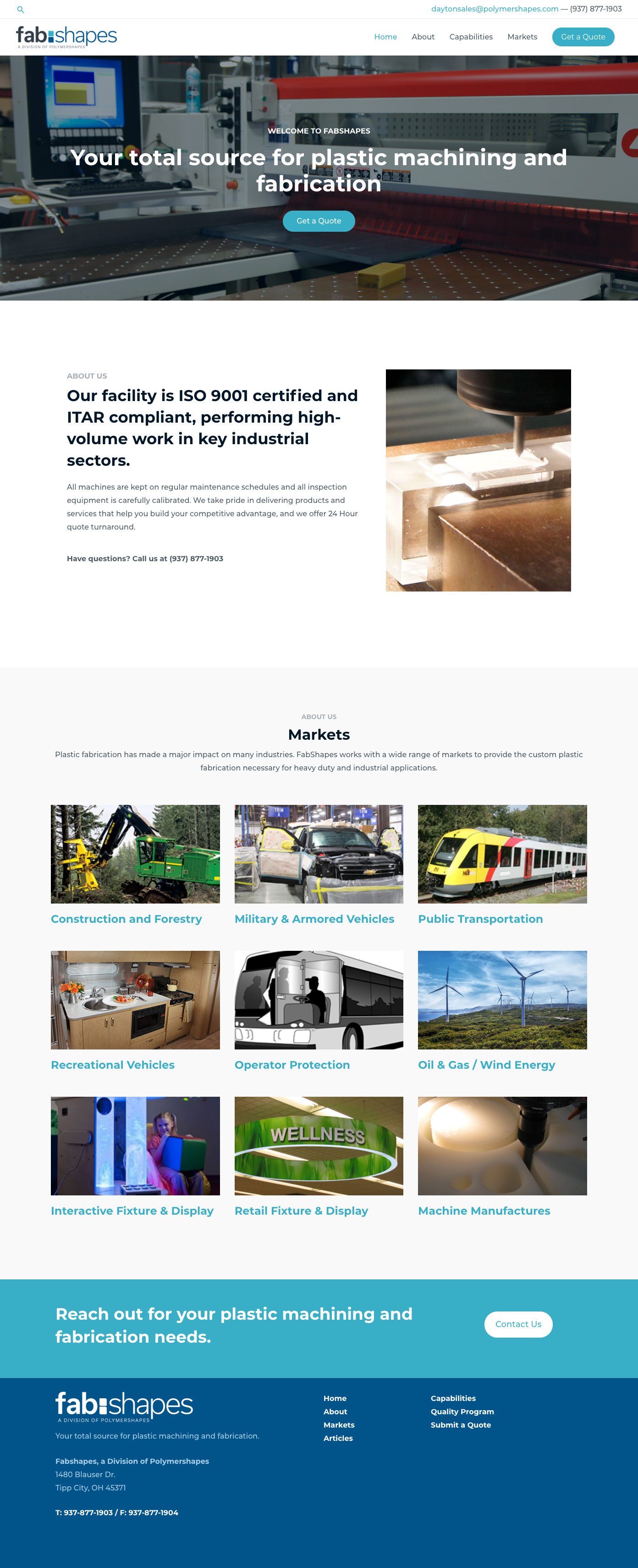
We started a new project with a custom plastic manufacturing company. The company previously was an entity of the parent company, but strategically they decided to create a stand alone brand.
As a quick go to market strategy they cloned the parent company website, changed the branding, built out a few pages of content and launched a site there were less than thrilled with.
The site didn’t convert well and the WordPress theme used was cumbersome and difficult to build off of.
Slow, bloated, underperforming… it was not a long term solution.
Solution
Astra was immediately on our radar because of it’s fast loading speeds. We also wanted to use Gutenberg for longevity (at this point we don’t see Gutenberg going away.)

We started by importing one of the Astra starter sites. This first step cut down on design and configuration time as we had a consistent theme to work from and could duplicate existing sections rather than design new ones from from scratch.
This process went extremely quick. We weren’t creating new content, which allowed us to build out new pages simply by copying, pasting and using reusable blocks. Customizations were limited to minor changes for brand consistency and more appropriate imagery.
Using Gutenberg as a Page Builder
Astra Pro uses the Ultimate Addons for Gutenberg plugin to improve the capabilities of Gutenberg and make it more inline with a robust page builder. It has some great blocks such as:
- Section / container (very useful)
- Advanced columns (much more configurable)
- Advanced heading (more options, subheads, overlines, etc…)
- Icon list
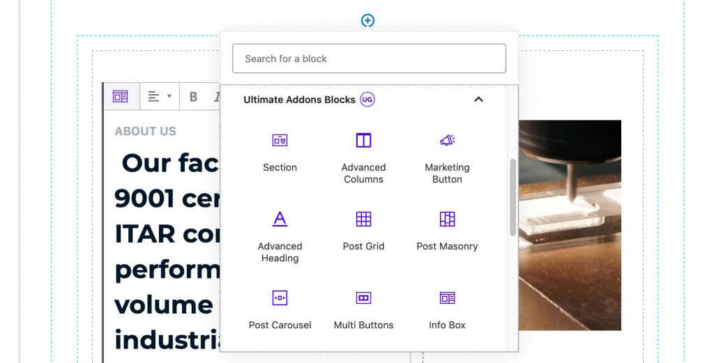
Overall the new blocks fill much of the gaps that vanilla Gutenberg has when it comes to creating rich layouts.
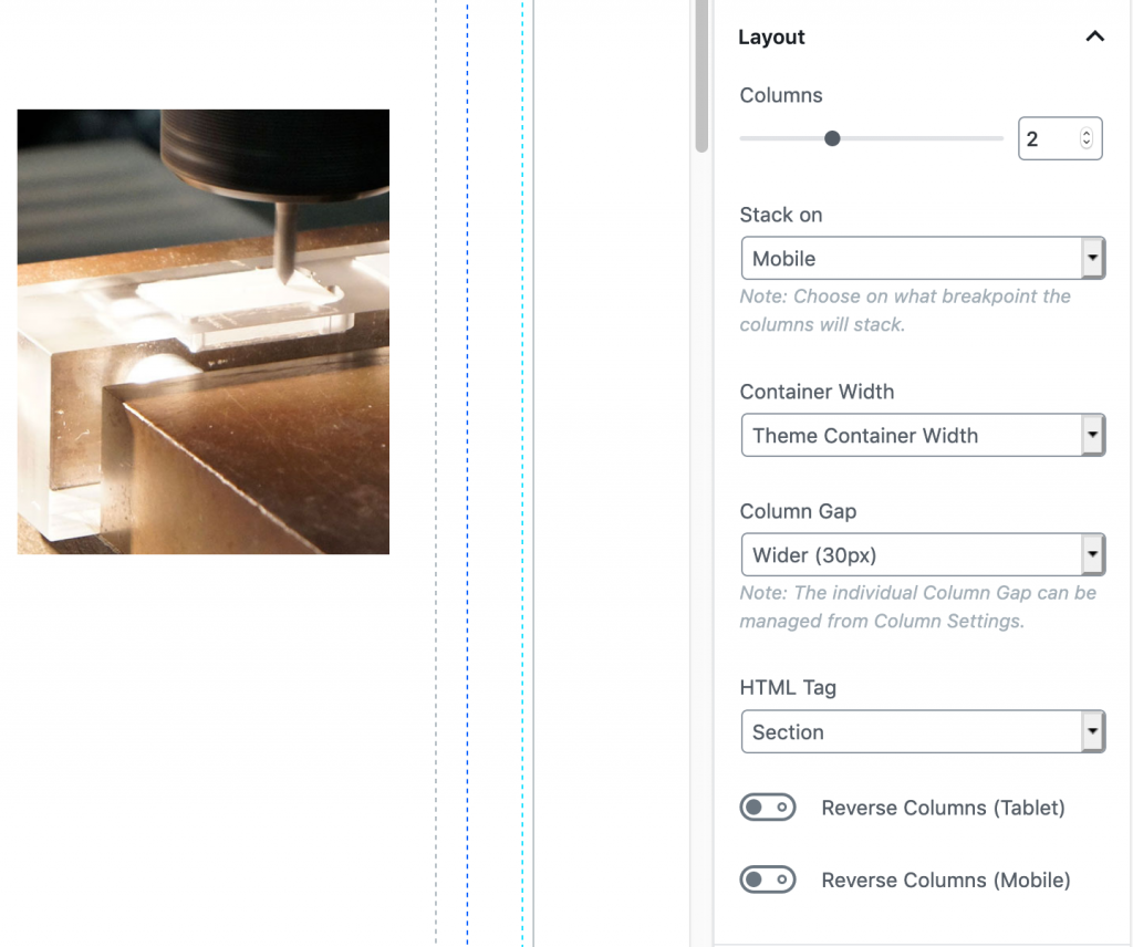
The layout options within the blocks are extremely robust when it comes to responsive design. You can easily control at which point columns collapse and even change the order of elements at different breakpoints.
Astra Free vs Astra Pro
You might be aware that there are both free and paid versions of Astra. Having worked with both I’d highly recommend Pro. It allows significantly more control over key areas of the site like your header, footer, and allows you to have custom layouts for different areas of the site. This is very important if you want a custom footer for example on your blog or blog posts.
Challenges
Overall we were very impressed with the Astra Pro and Gutenberg stack as a Launchpad website solution. We only ran into a couple of challenges.
Consistency
More an issue with Gutenberg than Astra or the UAG plugin, it’s difficult to keep the design consistent across all pages.
This is because there is little ability to define “default” styles across all blocks and elements. For example, any block that has a button element associated (like an infobox, multiple button block, etc…) requires you reinput all the settings for border radius, color, hover states, etc..
Saving reusable blocks makes this significantly easier, but still requires you go through this process for each block type.
Editor Experience
The Gutenberg editor experience is somewhere between a page builder and the classic WordPress editor. It’s certainly closer to a real world representation of what your pages will look like, but it always feels like a rough implementation. This is in part due to only a portion of CSS rules being loaded into Gutenberg and the fact that the Gutenberg editing screen has a handful of fixed interface elements confining the visual real estate.
Inline Code
Being purists it does bother us somewhat that visual configurations are executed by adding inline CSS to the page. Now in all fairness this is how most page builder operate. On a small site with whitespace compression the performance hit is minimal, but it would be nice to have a cleaner solution.
The Result

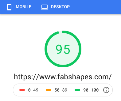
Using Astra Pro and Gutenberg we redesigned and launched the site in a three weeks from start to finish. We’ve already seen a higher conversion rate, blazing fast load times, and extremely high Google Pagespeed scores.
