
Blog
Does your website need to be beautiful?
When I first started designing websites in the 1990s, I focused most of my attention on creating striking visuals. In my defense, I was typically designing gaming websites with only the occasional local business… but my goal was always to design a site that looked “cool.”
In the early 2000s I stumbled across a website called “A List Apart,” a digital publication for web professionals. It was filled with content about other important design factors like usability, accessibility, and code quality.
My eyes had been opened. Design was more than just what something looks like.
I’ve been designing with that in mind ever since…
…but does that mean beauty isn’t an important factor? Let’s discuss.
Does a beautiful website out perform one that’s not?
While beauty is subjective, we actually have a surprising amount of data to suggest that “beautiful” websites perform better than equivalent “not-so-beautiful” sites (trying to be polite.)
In 1995 researchers Masaaki Kurosu and Kaori Kashimura from Hitachi tested 26 variations of an ATM UI, asking participants to rank each iteration on ease of use and aesthetic appeal.
They found a strong correlation between aesthetic appeal and perceived ease of use. This has since become known as “the asthetic-usability effect.” Simply put, when a subject is interacting with an interface they find visually appealing they are more tolerant of minor usability issues. As a result, they consider the interface easier to use.
Aesthetic value extends beyond
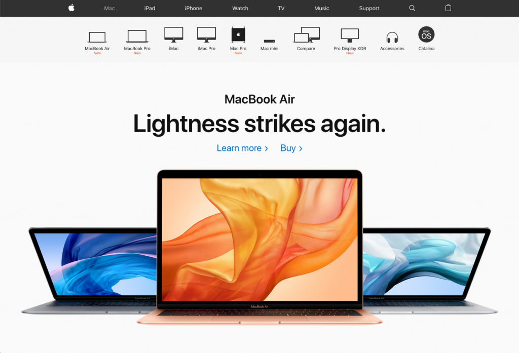
A positive first impression can increase overall satisfaction where a negative first impression can be the reason for someone to leave. Our own studies have demonstrated that just changing the hero image on your homepage can result in a 40% increase in average time on site.
We’ve redesigned single landing pages to be more aesthetically pleasing, keeping the content and elements the exact same, and saw a 30% increase in conversion rate.
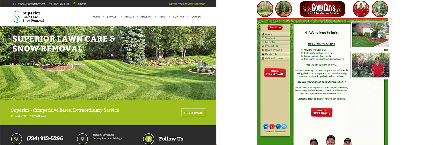
This is likely because nearly half of all customers assess the credibility of a website based on the the visual appeal of the design, such as layout, typographic, color, and imagery.
Why do beautiful websites perform better?
Humans are highly emotional beings. Most of our actions are influenced by subconscious emotion-based thoughts which are later justified with logic.
When we visit a website, we subconsciously analyze our experience with the same fight, flight, or safety instincts used in the physical world. An aesthetically pleasing website “feels” safe. An aesthetically displeasing website “feels” dangerous.
A design that appeals to our personal tastes validates our sense of self.
These emotional reactions subconsciously influence our behavior and change our likelihood to stay on the site and ultimately convert.
We’ve written more in depth about the psychology of emotional design if you’d like more detail.
So yes, visual appeals matters… but it’s not that simple.
Who’s opinion matters most?
If you were to put all of our clients into a room and had them evaluate each others websites, they would all love their own site and likely hate elements of everyone else’s.
Design is extremely personal. I’ve heard people claim exact opposites with extreme confidence and authority.
“Large hero images are pure vanity they just slow down the page” vs “The most important thing is a large, impactful hero image.”
“Websites should require as little scrolling as possible, pages should be short and simple.” vs “We need to minimize clicks, users can scroll to find the information they want.”
You get the picture…
So who’s opinion matters most? The person paying for the site? The professional designer?
Turns out, neither.
Your target audience’s opinion is what matters
We’ve already established that:
- Beauty is important
- Some people will find a particular aspect of a website beautiful, others won’t.
How do you design a beautiful website if you’re not sure if people will love or hate it? By turning to your target audience.
It might be a hard pill to swallow, but your design preferences are mostly irrelevant. That goes for the designer too.
What matters most is the people you want to engage with (and turn into customers.) I’ve designed several sites that don’t appeal to me. The design we landed at felt cliche and heavy handed (in my opinion.)
The target audience loved it.
How to design for your target audience
Designing for an audience that has dramatically different taste than you can be daunting, but it is possible. Through design research and a clear strategy, a custom website design can be crafted beautifully.
Spend the time to research the target audience. Actually talk to them. Find the websites they like. See how do they decorate their homes. Find out what products they buy and love.
With your findings create a model of their preferences (e.g. a persona) so you can evaluate the design through the audiences eyes instead of your own.
As we’ve established, a website perceived as beautiful will outperform one that’s not in most situations… but it has to be designed for your audience’s taste, not your own.
Reference: First Impressions Matter: Why Great Visual Design is Essential