
Blog
Principles of Effective Web Design
Design is a critical aspect of website success, despite the abundance of “ready for you” templates and site builders. Using off-the-shelf WordPress themes or Square Space templates can be a quick way to get an attractive site up and running, but it doesn’t mean the website will be successful.
This isn’t to say that these tools cannot be effective; rather, there is more to an effective website than an attractive visual layer.
So what makes a website successful? I’ve already eluded to the answer—design.
Not design in the “make it attractive” sense, although there is certainly value in making your website attractive. I am talking about design from the perspective of strategically building a site around your goals and the needs of the audience that will interact with it.
While this may sound overwhelming, there are six fundamental principles that, if followed, will lead to a more effective website. Websites designed around these principles generate more leads and more sales, are regarded more highly by users and reflect better on the brand or organization behind them.
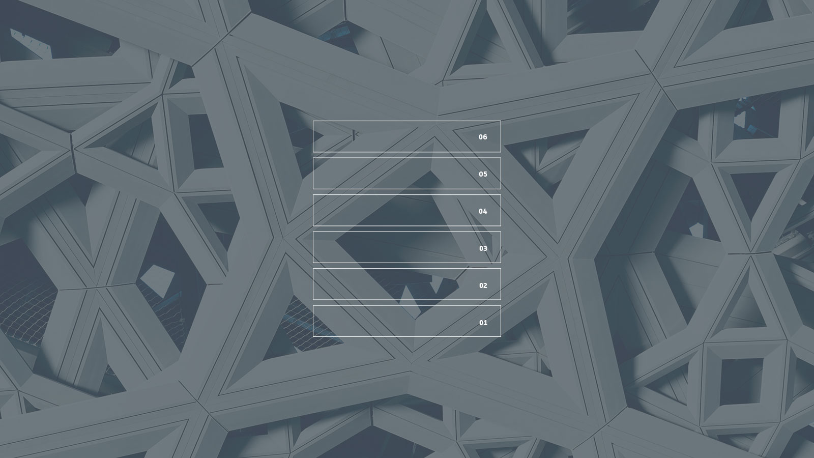
What are these six principles?
- Objectives
- Reliability
- Usability
- Value
- Messaging
- Emotion

Internally we refer to these principles as the Six Layers of Design and it’s a methodology we use to direct everything we do, from web design to defining our business processes.
Let’s review each of these principles in more detail.
Objectives
If you don’t know where you’re going, you’ll never get to your desired destination. Similarly, your website will never be successful if you don’t know what you want out of it.
This may sound obvious but in my experience this is a place where most people get it wrong. If asked “What do you want out of your website?” some will refer to features not outcomes. There is an important difference between the two.
This may sound obvious, but in my experience, it’s where most people get it wrong. If asked, “What do you want out of your website?” some will refer to features, not outcomes. There is an important difference between the two.
For example, someone might say, “We need a place to push out important news and updates about our business.”
That is a feature.
Behind the feature is an objective. If you dig deeper, you might uncover that the reason the business wants to publish news and updates is to promote trade shows that the business is attending. As it happens, trade shows are an important part of their marketing strategy, and they convert 50% of people who visit their booth.
So the real objective is to increase sales, with a sub-objective of increasing trade show leads.
Before anything else, you need to define your objectives. What do you want out of the website, and how will you measure it? If you can’t think of a way to measure it—or if the measurement is binary (yes or no)—then it’s probably not a good objective.
Reliability
Reliability is often overlooked, yet it is a critically important principle of effective web design. An unreliable solution is an ineffective one. Speaking bluntly, it doesn’t matter how great your eCommerce website looks if no one can reliably make a purchase.
Every design decision has some impact on reliability. A large hero image can certainly increase user engagement. It can also cause loading problems for users with poor connection quality.
Designs should also consider edge cases when thinking about reliability. An edge case is a situation that only occurs through unpredicted or abnormal use. While you can’t design around the possibility of all extreme circumstances, you certainly can put thought into how the design can degrade gracefully.
What happens when an image doesn’t load? Is the text still legible with no background image? What happens if the user is vision impaired? Is color blind? Uses a screen reader? Is using outdated technology?
If some of these questions sound like they are related to web accessibility, that’s because they are.
Ultimately, the design of your site should perform reliably across a wide range of situations and contexts. That means it should be as accessible as possible and should perform well under different use cases, technologies and devices.
Usability
Ask anyone you know if websites should be easy to use, and they’ll say yes. In fact, one of the most common complaints about websites is “I can’t find the content I’m looking for.” Yet so many sites struggle with usability issues. Why does this happen?
The most common reasons I’ve seen include:
- Low prioritization of usability
- Not understanding how users think
- Failure to respect the ROI of usability
- Overcomplicating the design
I won’t belabor the point in this article, but keep in mind that usability is extremely important; users won’t stick around if the effort required to accomplish the task at hand is too high.
Value
A website can be functional, reliable and usable but still not be valuable. What does this mean? A user can find what they’re looking for, only to find out that it is not actually all that helpful.
People visit websites because they have a goal in mind. This goal could be utilitarian, like learning more about potential solutions to a problem. Alternatively, the goal could be more mundane, like temporary entertainment to pass the time.
Regardless of the type of goal, if your website doesn’t help the user accomplish their goal, they won’t find value in it. Conversely, the more you help users accomplish their goal, the more highly they will regard your site (and your brand as a result).
Having valuable content that aligns with the user’s needs is a good starting point, but don’t let your creativity end there. Consider what tools or resources you can provide that might make the user better at what they’re doing.
For example, if you sell bullet resistant security products, users might visit your site to try to determine what type of solution is best for them. While you might have lots of content on material types, thicknesses and ratings, a simple product configurator could help the user identify what they need quickly. They may even download a spec sheet to share with the rest of their team.
Messaging
Anything you design that can be perceived by the senses (heard, seen, felt, tasted, smelled, etc.) communicates with the end user based on their sensory perception. On the web, this is most often thought of from a visual perspective.
Simply put, a website can be aesthetically pleasing yet still look completely wrong. Consider a serious technology company that deals with important legal considerations but uses a website design that is made up of bright colors and cartoon characters. Users visiting the site will probably get the wrong idea about the company and decide to go elsewhere.
It’s important that visual tone, imagery, typography and colors all work together to convey the right message. What that message is will depend on the brand you’re designing for.
Emotion
Humans are emotional beings—maybe more so than many people realize. While we consider ourselves conscious, logical beings, we often act out of emotion, only to justify it afterward with logic.
There are three areas of the brain:
- Reptilian brain
- The limbic system
- Neocortex
The reptilian and limbic systems are subconscious and extremely fast-acting. The neocortex controls conscious thought and is slow.
All experiences and senses start at the subconscious portions of the brain and work up to conscious thought. This means that everything you experience is first processed and interpreted by subconscious thought and is later processed through conscious thought.
So when you visit that website and something feels off, but you can’t put your finger on it, that’s your subconscious brain identifying “danger” patterns and telling you to be cautious.
The point is that you need to identify what emotional response you want to elicit from your target audience. Once this is identified, you need to carefully execute your design to so that it actually elicits that response.
Conclusion
If you want to get better results from your website, regardless of medium or target audience, the Six Layers of Design should direct every decision you make in the design process.