
Blog
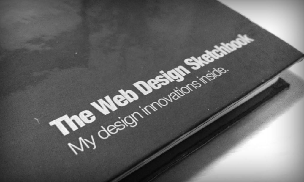
The Web Design Sketchbook, Version Three
Early December 2008 was when I first held a prototype of what I would later call “The Web Design Sketchbook” in my hands. It was pretty rough, had been printed using an old, slowly dying ink jet printer and was bound using a $100 Office Max binding machine. Despite its lackluster, I was ecstatic. Not because I expected (or wanted) to become right off it, because it was something I wanted to use and couldn’t find a suitable solution for. There is something indescribably fulfilling about creating a product that serves your needs all while knowing others surely have the same problem.
Earlier this month I held the third “production” version in my hand and experienced a similar feeling. This new version, hard bound and simplified, feels special. There is something about it that makes me want to take it to meetings and use it to brainstorm nightly. Granted, I am admittedly biased, but I know it can help others too. Sketching undeniably improves design.
Sketching Improves Design
For much of my career I dismissed designing on paper because I couldn’t get the sketches to look as “cool” as my interfaces in Photoshop. This mindset demonstrates my prior misunderstanding of design. I didn’t find sketching helpful because I couldn’t sketch cool textures, drop shadows and 3D buttons. I felt those were the elements that made design effective.
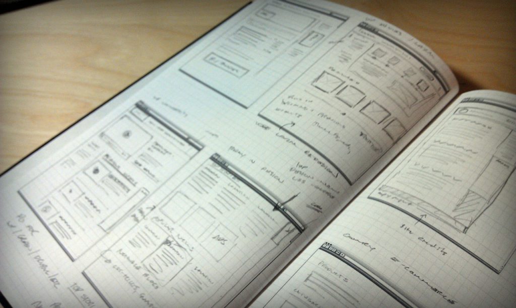
I will confess I began sketching because I saw some very detailed sketches that were practically works of art. The designer had even used drafting markers to add color and depth to the sketches! I wanted a book of sketches that I could use as a coffee table book at my office. In my mind clients would look through the book in awe as they waited for meetings. So I started sketching. While I never ended up putting my sketchbooks out for clients to look through I got something much better out of it.
Sketching lead to an epiphany. My focus and understanding of design shifted. Rather than thinking about what effects I was going to use, I began thinking about the best way to present content. This expanded into thinking about what content should be on the page in the first place. I realized what it looked like was not as important as what was on the page and how it was organized. Design isn’t adding a coat of paint of the walls, it’s deciding where the walls should go.
This new-found respect for designing on paper eventually led to the creation of The Web Design Sketchbook.
Version Three
My goal with the latest version was to arrive at something that felt special, less whiteboard-esk (my original approach.) I realized the sketchbook would house the users grand ideas, strategies and be the start to new websites, companies and ventures. It should feel like an “innovation diary” rather than a throw away item. This lead to simplification. We took out the 12 column grid and switched to an open boxed grid. The white soft cover was removed and a deep black hardcover used in its place. It was shrunk from a notebook size and made into a diary or Moleskin size.
I am very pleased with the latest version. I truly believe designing from paper will improve any designers work, regardless if you use my tool or printer paper. I urge you to try it, just a handful of times. See where it gets you.
